Composition and Functionality of the Graph Report Item
The Graph is a powerful and complex report item that displays a variety of elements to adequately display visual information as required.
Visual Structure
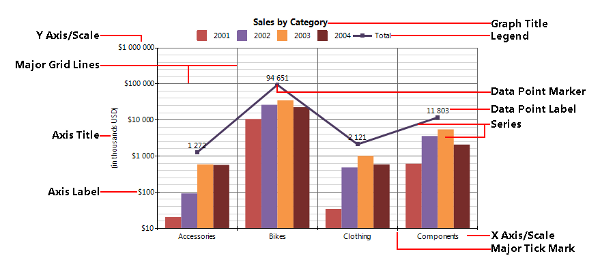
The following image displays combined Column and Line charts in a Graph item with a Cartesian coordinate system.

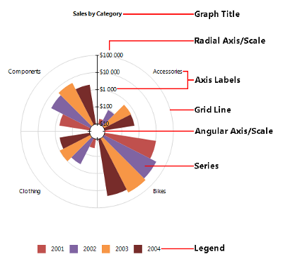
The following image shows a Rose (Bar) chart in a Graph item with a Polar coordinate system.

Graph vs. Table
The Graph is a data report item and, similarly to the Table item, allows you to summarize data by the CategoryGroups and SeriesGroups hierarchical dimensions.
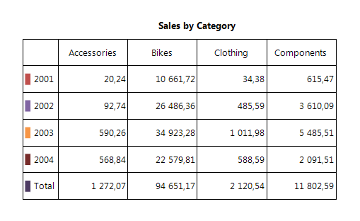
The following images visually compare the data representation offered by the Graph and Table report items:


Depending on its series type, the Graph enables you to display one or more measures. Like the other data-based report items, the Graph connects to a single data source and provides additional options for sorting and filtering the input data, binding, conditional formatting, and so on.
Conceptually, both report items use the same multidimensional data model:
- The ColumnGroups in the Table are identical to the CategoryGroups of the Graph.
- The RowGroups in the Table are identical to the SeriesGroups of the Graph.
- The Cells in the body of the Table definition are identical to the Series definitions of the Graph.
Category Group
The CategoryGroups hierarchy defines the data points in the Graph series. For example, if you have a group by product categories in the CategoryGroups hierarchy, the number of the different categories will determine how many data points the series will have at runtime. If the product categories consist of Accessories, Bikes, Components, and Clothing categories, the series in the Graph will have four data points.
Series Group
The SeriesGroups hierarchy defines the series at runtime. For example, if you have a group by the Year field in the SeriesGroups hierarchy, the number of the different years will determine how many series will appear on the Graph. If the Year field contains the years 2001, 2002, 2003, and 2004, the Graph will display four series for every series definition that is bound to this group.
Series Data
The Graph series display aggregated data to visualize one or more measures. At runtime, the intersection between the SeriesGroups and the CategoryGroups hierarchy members defines the data points in the series. For each data point, one or more aggregate functions are calculated to define the value or coordinates of the data points.
Depending on the series type, the Graph can visualize one or more measures:
- The Bar and Area series, including all derived subtypes, such as Pie, Doughnut, Bar, Column, and so on, represent single measures.
- The Range series, such as the Range Bar and Range Area, emphasize the distance between two values or measures.
- The Line series including all derived subtypes, such as Scatter, show the correlation between three different measures.
Coordinate Systems
The Graph item uses a two-dimensional coordinate system that uniquely identifies the position of each data point. Each coordinate system consists of two reference lines called "coordinate axes" (or just "axes") and an "origin".
The Graph provides support for the Cartesian and Polar two-dimensional coordinate systems. Since there is a direct conversion between the two coordinate systems, they are interchangeable in the Graph report item. The coordinates of the data points in the Graph are represented by the (x, y) pair that for the Polar coordinate system is converted to (ϴ, r), that is, (x, y) ⇔ (ϴ, r).
The coordinate system also defines the default appearance and style of the two axes.
Cartesian
In a Cartesian coordinate system, each point is defined by an ordered pair of two coordinates which are the distances of the point to the two perpendicular axes.
The Cartesian coordinate system provides the following axes:
- X axis—The horizontal axis.
- Y axis—The vertical axis. The data point in the Cartesian coordinate system is represented by an ordered pair of two coordinates (x, y).
Polar
A Polar coordinate system is used where each point on a plane is determined by a distance from the origin (called the radial coordinate or radius) and an angle from a fixed direction (the angular coordinate, polar angle, or azimuth).
The Polar coordinate system provides the following axes:
- Angular axis—The circular axis for the angular coordinate.
-
Radial axis—The axis for the radial coordinate. The data point in the Polar coordinate system is represented by an ordered pair of two coordinates (
r,ϴ).
Axes
The coordinate axis represents a single dimension of the coordinate system.
An axis consists of the following elements:
- Scale—Defines how the data is projected on the axis.
- Tick marks—Major and minor, represent the periodic graduations.
- Labels—The numerical or categorical indications accompanying the tick marks.
- Title—The title of the axis, usually a brief description of the dimension.
- Grid lines—Within the Graph, a grid of lines may appear to aid the visual alignment of data. You can enhance the grid by visually emphasizing the lines at regular or significant graduations. The emphasized lines are then called major grid lines and the remainder are minor grid lines.
For more information on styling the axes, refer to the article on formatting the axes of the Graph report item.
Scales
Scales define how the data is projected on the corresponding axis, that is, how the data from the user domain is converted to coordinates.
According to the type of the input data, the Graph supports the following scale types:
- NumericalScale—Represents a scale with a continuous domain of numbers, such as, integer numbers (Int16, Int32, Int64) or floating point numbers (Single, Double), and so on.
- LogarithmicScale—A numerical scale that applies a logarithmic transformation with a given base to the input data.
- DateTimeScale—Represents a scale with a continuous domain of DateTime values.
- CategoryScale—Represents an ordinal scale with a discrete domain such as names and categories.
Series
A Graph Series represents a series of data points that constitute an individual measurement. This section lists the series types supported by the Graph report item.
Graph Series support Tooltips. The Tooltips are related to the data points of the Series. Therefore, in LineSeries, the DataPointStyle.Visible should be True and the Data Point Marker MarkerSize should be non-zero to have the Tooltips appear in the preview.
Bar Charts
Bar charts display data points as bars to show comparisons between categories. One axis of the chart shows the specific categories being compared, and the other axis represents a discrete value.
You can arrange the Bar series in different ways to emphasize various aspects of the data:
- Clustered Bar Graphs—Bars are clustered in groups of two or more series.
- Stacked, Stacked 100% Bar Graphs—Show the bars divided into subparts to display a cumulative effect.
In a Cartesian coordinate system the bars have a rectangular shape and can be horizontal (Bar chart) or vertical (sometimes called Column chart).
In a Polar coordinate system, the bars appear in a wedge shape. If the series are arranged on the radial axis, that is, the wedges start from the radial axis and go by the angular axis, the result is a Pie chart. Otherwise, if the bars are arranged by the angular axis, the result is a Rose chart.
Line Charts
Line charts display a series of data points connected by straight or smooth line segments. Data points are represented by markers that can vary by shape (circle, square, diamond, cross, and so on) and can display a third variable or measure with its size (also known as Bubble charts).
When a Line series is projected on a Polar coordinate system, the result is also known as a Radar or Spider Line chart. Line series may be stacked to show a cumulative effect (stacked or stacked 100%).
Area Charts
Area charts are similar to the Line series. Area series display series of data points connected by straight or smooth line segments too but the area below the line is colored to indicate the volume.
When an Area series is projected on a Polar coordinate system, the result is also known as a Radar or Spider Area chart. Area series may be stacked to show a cumulative effect (stacked or stacked 100%).
Range Bar Charts
Range Bar charts are similar to the Bar series. However, the bars do not start from the axis but at a given value. The Range Bar emphasizes the distance between two values or measures.
Range Area Charts
Range Area charts are similar to the Area series. However, the bottom point does not start from the axis but at a given value. The Range Area emphasizes the distance between two values/measures.
Legend
When the data appearing in a chart contains multiple variables, the chart may include a legend. The legend contains a list of the displayed chart variables and an example of their appearance. Legend content allows the user to identify the data from each variable in the Graph.
For more information on styling the legend, refer to the article on formatting the legend of the Graph report item.
Title
The Graph report item can have one or more titles that provide a brief description of what the displayed data refers to.
For more information on styling the title, refer to the article on formatting the title of the Graph report item.