Creating and Customizing Polar Charts
A Polar chart displays series as sets of data points that are grouped by category on a 360-degree circle and represent the values by the distance of the point as measured from the center of the circle.
The farther the data point is from the center, the greater its value is. Category labels are displayed on the perimeter of the chart.
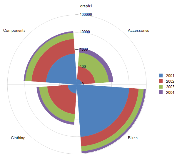
The following image displays a Rose Polar chart:
Types
The Graph supports the following Polar chart types:
- Line Polar Charts—A Polar chart in which the data points are connected by a line.
- Area Polar Charts—A Polar chart in which the data points are connected by a line with the area below the line filled with color.
- Rose Polar Charts—A Polar chart in which the data points are represented by bars drawn in a polar coordinate system.
Creating Radar Polar Charts with the Radar Chart Wizard
In this section, you will learn how to create a Rose chart with our Rose Chart Wizard. This is a variation of the Polar (Radar) Chart type and is located under the Other Charts in the main menu.
We are going to display the LineTotal of the Product Categories by Years. The final report will look like the image above.
The sample report will use a pre-defined SqlDataSource that connects to the example AdventureWorks database. The query that returns the needed fields is the following:
SELECT
    [Production].[ProductCategory].[Name] AS 'Category',
    [Sales].[SalesOrderHeader].[OrderDate],
    [Sales].[SalesOrderDetail].[LineTotal]
FROM
    [Production].[Product] INNER JOIN
    [Production].[ProductSubcategory] ON [Production].[Product].[ProductSubcategoryID] = [Production].[ProductSubcategory].[ProductSubcategoryID] INNER JOIN
    [Production].[ProductCategory] ON [Production].[ProductSubcategory].[ProductCategoryID] = [Production].[ProductCategory].[ProductCategoryID] INNER JOIN
    [Sales].[SalesOrderDetail] ON [Production].[Product].[ProductID] = [Sales].[SalesOrderDetail].[ProductID] INNER JOIN
    [Sales].[SalesOrderHeader] ON [Sales].[SalesOrderDetail].[SalesOrderID] = [Sales].[SalesOrderHeader].[SalesOrderID] AND [Sales].[SalesOrderDetail].[SalesOrderID] = [Sales].[SalesOrderHeader].[SalesOrderID] AND
    [Sales].[SalesOrderDetail].[SalesOrderID] = [Sales].[SalesOrderHeader].[SalesOrderID]
To create the Polar chart by using the Polar Chart Wizard:
-
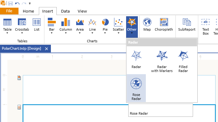
Add Rose Chart as shown in the image below:
-
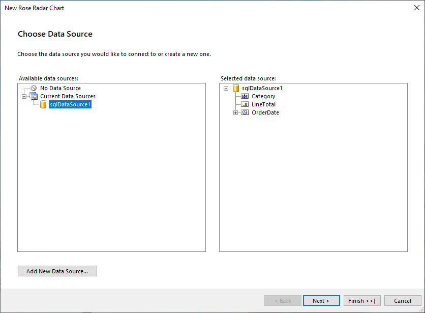
Select the SqlDataSource, or create it with the Add New Data Source... button and by using the query above:
-
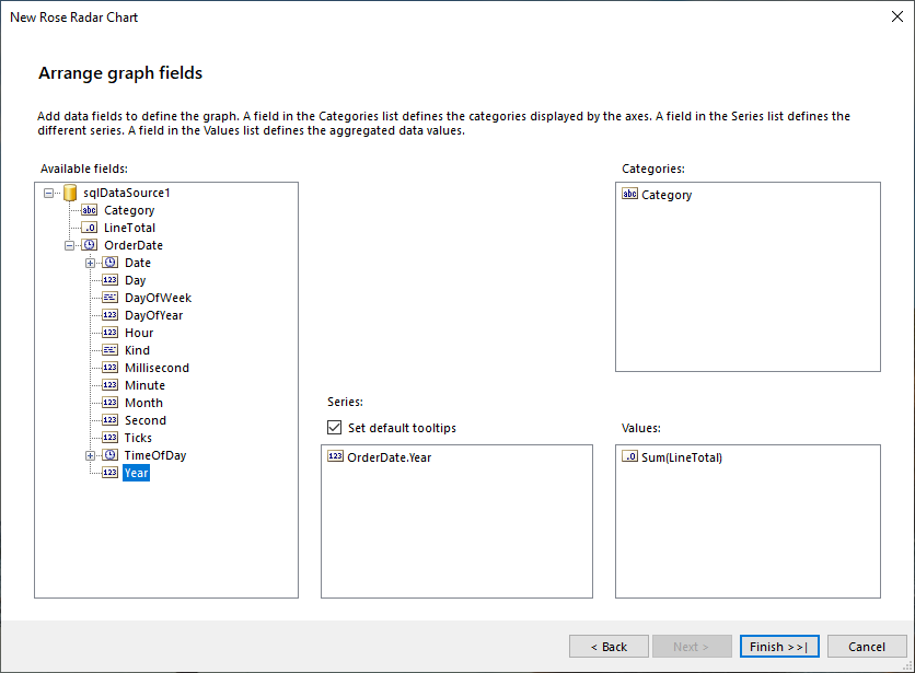
Arrange the Rose Chart:
- Drag the Category field to Series.
- Drag the OrderDate.Year field to Categories.
- Drag the LineTotal field to Values. The wizard will automatically apply the
Sumaggregate function.
The
LineTotalvalue is large, so let's change theData > Yexpression ofbarSeriesthat is currently=Sum(Fields.LineTotal)to=ISNULL(Sum(Fields.LineTotal), 0) / 1000.0. Note that aNullcheck is also included and theNullvalues to be replaced with a0(zero).-
The
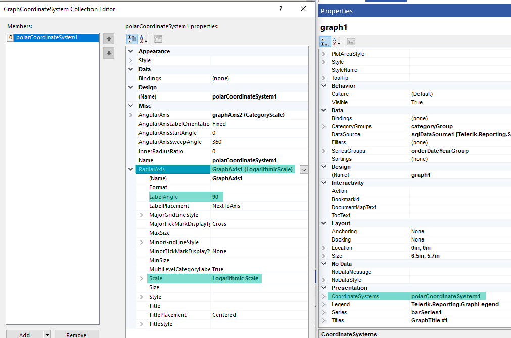
LineTotalvalues for theBikescategory are significantly higher than the other three categories, so let's use a Logarithmic Scale for theRadialAxisto improve the user experience:- Select the Graph > Presentation > CoordinateSystems, and click on the ellipses (...) beside the property. This action will open the GraphCoordinateSystem Collection Editor.
- Go to the RadialAxis property and select
from the drop-down. - Expand the RadialAxis1 property and change the LabelAngle to 90 degrees to improve the appearance.
The following image with the proper fields highlighted shows how the above settings look in the designer:
To see the full implementation of the sample report, refer to the PolarChart.trdp project on GitHub.
Creating Radar Polar Charts Manually
This section will show how to manually create a Polar chart.
1. Add the Graph
To add a new Graph report item to the report, refer to the article getting started with the Graph report item.
2. Set the SeriesGroups Hierarchy
Now you can set the SeriesGropus hierarchy of the Stacked Area chart:
- Open the SeriesGroups collection editor and click Add.
- Set the Groupings to
=Fields.OrderDate.Year. - Set the Sortings to
=Fields.OrderDate.Year. - Set the Name to
seriesGroup1.
3. Set the CategoryGroups Hierarchy
Next, you will have to define the CategoryGroups hierarchy of the Stacked Area chart:
- Open the CategoryGroups collection editor and click Add.
- Set the Groupings to
=Fields.Category. - Set the Sortings to
=Fields.Category. - Set the Name to
categoryGroup1.
4. Configure the Coordinate System
Here you will specify the coordinate system details:
- Open the CoordinateSystems collection editor and Add a new PolarCoordinateSystem.
- Leave the Name to
polarCoordinateSystem1. - Set the RadialAxis to New Axis Logarithmic Scale.
- Set the AngularAxis to New Axis with Category Scale.
5. Configure the Series
In this step, you will configure the series of the chart:
- Open the Series collection editor and Add new BarSeries.
- Set the CategoryGroup to categoryGroup1.
- Set the SeriesGroup to seriesGroup1.
- Set the CoordinateSystem to polarCoordinateSystem1.
- Set the ArrangeMode to Clustered.
- Set the Y value to
=ISNULL(Sum(Fields.LineTotal), 0) / 1000.0.
6. Style the Appearance
To set the color palette, format the labels, define the values of the legend, and elaborate on any other styling options, refer to the section on formatting the Graph.
Design Considerations
Polar charts are most commonly used to graph polar data where each data point is determined by an angle and a distance.