Visual Studio Item Templates
Currently Item Templates are available only for Visual Studio on Windows.
There are several predefined item templates for Visual Studio included in the UI for Xamarin suite which come by default with the installation of the product. You can directly include them in your Xamarin Forms project and use them as footprints for similar scenarios in your application. This article provides more information on the different templates included and the controls which they utilize.
The Item Templates are installed through a Visual Studio extension file(vsix) which can be found in the VSExtensions folder of your local installation.
Adding Item Templates to your project
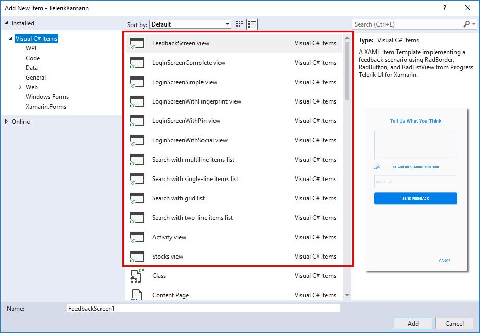
As these item templates will be automatically added when you run the UI for Xamarin installation, you can find them when you try adding a new item to your Xamarin Forms project, as shown in Figure 1.
Figure 1: Adding a custom item to your Xamarin Forms project
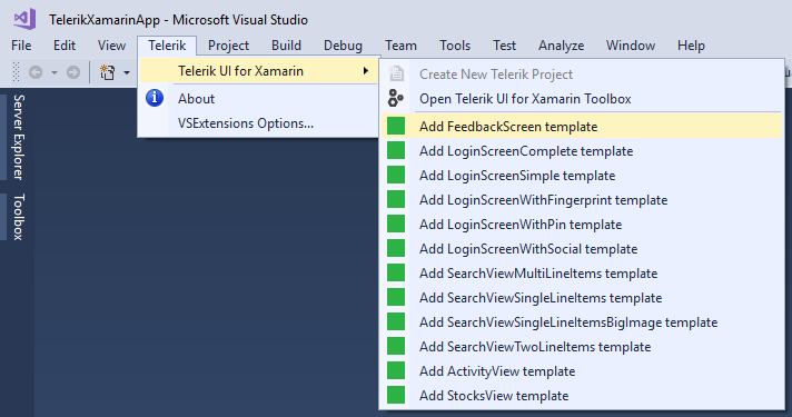
You can also add them through the Telerik menu of Visual Studio as shown in Figure 2:
Figure 2: Adding a custom item to your Xamarin Forms project through Telerik menu:
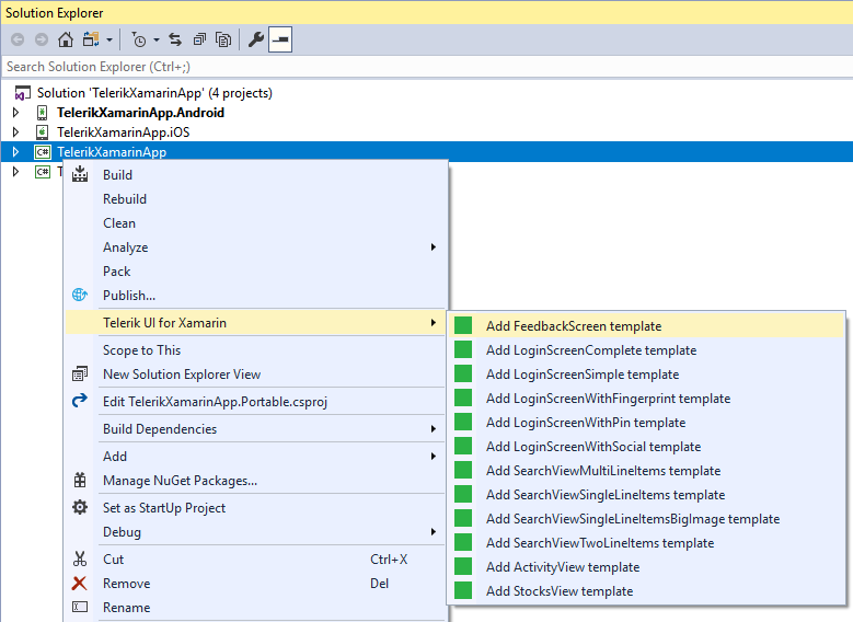
Or through the context menu of your Visual Studio project:
Figure 3: Adding a custom item to your Xamarin Forms project through the context menu:
Views
The available item templates are listed below:
Stocks View
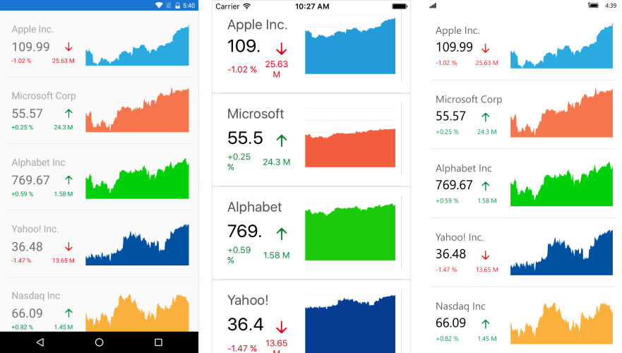
The Stocks View represents a list of several companies and information related to their stocks such as current price, trends, percentage difference, etc. The main controls which are utilized are the RadListView and RadCartesianChart controls. Figure 2 shows the default appearance of the view.
Figure 4: Stocks View's default appearance
Activity View
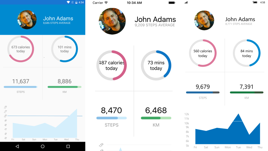
The Activity View provides an information regarding a specific user and information regarding his daily physical activity such as calories burned, average steps and active time. The view utilizes the RadCartesianChart, RadRadialGauge and RadHorizontalGauge controls. Figure 3 shows the default appearance of the Activity View:
Figure 5: Activity View's default appearance
Search View
There are several Search View custom items which show the same setup with a slightly different visualization. All of the item templates use the RadAutoComplete and RadListView controls with different modifications in order to achieve a diverse look. The RadAutoComplete control is used to filter the visible collection according to a certain user input.
Multiline Items
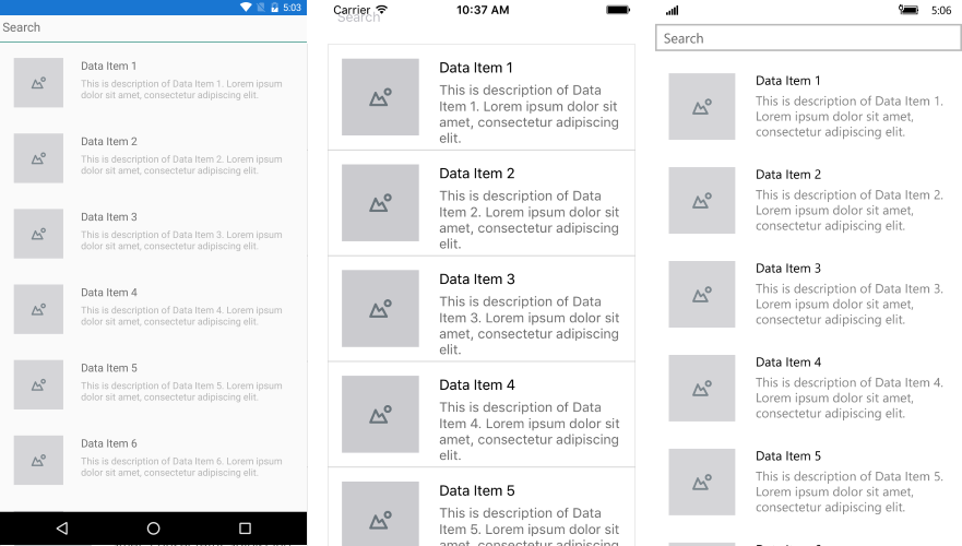
In the SearchViewMultiLineItems template, the items within the RadListView have multiple line description.
Figure 6: Search View Multiline Items
Singleline Items
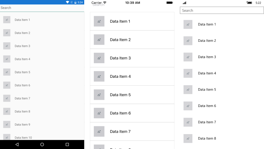
In the SearchViewSingleLineItems template, only a single line of information regarding the specific item is present.
Figure 7: Search View Singleline Items
Singleline Items Big Image
The SearchViewSingleLineItemsBigImage template is similar to the SearchViewSingleLineItems template, however, the look of the item within the RadListView is slightly tweaked for a distinctive appearance that emphasizes on the image.
Figure 8: Search View Singleline Items Big Image
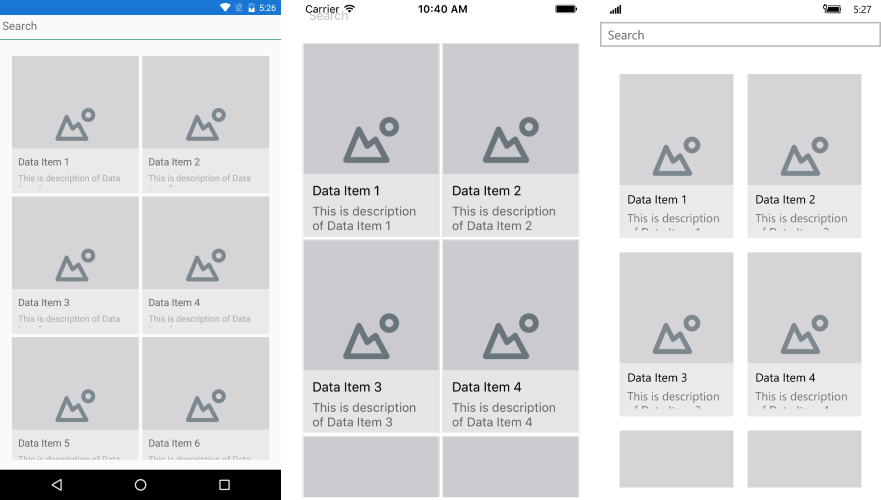
Twoline Items
The SearchViewTwoLinesItems template once again shows a different approach of modifying RadListView's ItemTemplate.
Figure 9: Search View Twolines Items
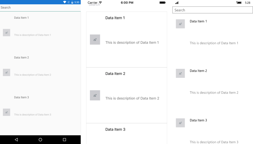
Login Screen
The Login Screen templates provide various options for entering user credentials, such as with fingerprint, with pin or integrating a social login. There are 5 different scenarios available, so you could choose the one that best suits your requirements. The templates use RadEntry, RadButton, RadBorder, and RadCheckBox components from Progress Telerik UI for Xamarin.
The image below shows LoginComplete template:
Figure 10: Login Complete Screen

Feedback Screen
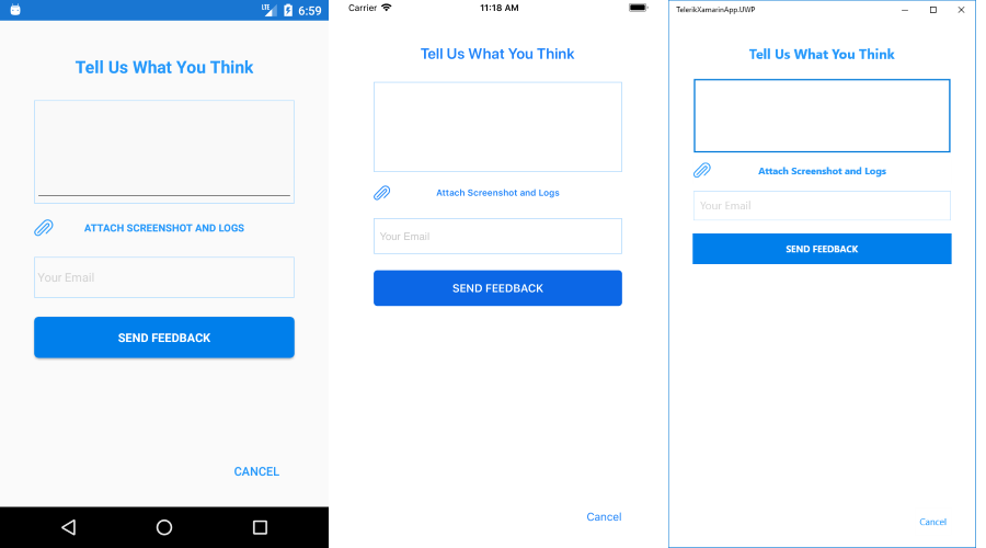
The Feedback Screen template implements a feedback scenario for receiving comments, notes or recommendations (and attachments) from the end users regarding the app. The template uses RadBorder, RadButton and RadListView from Progress Telerik UI for Xamarin.
Figure 11: Feedback Screen
