Overview
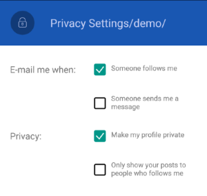
Telerik RadCheckBox for Xamarin is a checkbox control which enables users to make a choice between two mutually exclusive options. The user’s selection is indicated by a check mark, and when a user clicks the checkbox its appearance and state change.
Figure 1: RadCheckBox Overview

Key features
- Indeterminate state support: RadCheckBox provides an additional indeterminate state which indicates the control is neither checked nor unchecked, for more details go here.
- Color customization: You will be able to set various Color properties to make changes to the look of different parts of the CheckBox control, check here for more details.
- Stroke Width customization: You will have the option to customize the layout of the CheckBox, including the borders and the check mark, read more here.
- Different sizes: You will be able to set the dimension of the CheckBox by adjusting only one property - the Length property, check the details here.
- Commands support: CheckBox exposes a Commands collection that allows you to register custom commands with each control’s instance, read more here.
- Theming Support: RadCheckBox comes with built-in theming support that allows you to easily build slick interfaces with the look-and-feel of a predefined theme. See the Theme color keys here