New to Telerik UI for WPF? Download free 30-day trial

Styling Validation ToolTips in RadGridView

Before reading this topic, you might find it useful to get familiar with RadGridView’s validation functionality.

RadGridView has two validation layers: UI and data. An interface such as IDataErrorInfo is used by the data layer validation and RadGridView's role here is just to update the underlying value via binding at the right moment.

Error validation template comes from WPF framework.

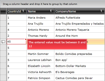
Figure 1: The default validation tooltip

Telerik WPF DataGrid Validation-Tooltip

RadGridView supports different validation modes and the validation tooltip depends on different factors. Visually all tooltips are the same, but they appear on different elements. In edit mode, a validation tooltip depends on the editor and GridViewEditorPresenter element. GridViewEditorPresenter is a generic container for all type of editors. In view mode, a validation tooltip depends on the cell and on the row.

In order to customize GridViewEditorPresenter you can check the Styling the GridViewEditorPresenter article.

When data is being validated on the property level, the default error template for WPF appears. This is a thin red line around the control. In the world of WPF you can easily restyle the validation error template of any control.

An exception of this rule are the MS controls that could be styled in all Telerik themes. They inherit the same look and feel presented for each theme, as part of the Telerik theme suite.

To learn how to customize any Telerik theme, see the Setting a Theme (Using Implicit Styles) article.

RadGridView's validation tooltip styles are located in Telerik.Windows.Controls.GridView.xaml; those related to editors are in the respective theme XAML markup file.

There are two approaches you can follow in order to extract the ControlTemplates of the validation tooltip:

The recommended approach for editing ControlTemplates is using Implicit Styles.

The default XAML markup for GridViewCell’s validation tooltip uses the Office_Black theme:

Example 1: GridViewCell validation tooltip in the Office_Black theme

<ControlTemplate x:Key="GridViewCell_ValidationToolTipTemplate" TargetType="ToolTip"> 
 
. . . 
 
<ItemsControl ItemsSource="{TemplateBinding Content}"> 
    <ItemsControl.ItemTemplate> 
        <DataTemplate> 
            <Border MinHeight="22" 
                    Background="{StaticResource GridView_ValidationTooltipBackground}" 
                    BorderBrush="{StaticResource GridView_ValidationTooltipOuterBorder}" 
                    BorderThickness="1" 
                    CornerRadius="{StaticResource GridView_ValidationTooltipCornerRadius}"> 
                            <Border BorderBrush="{StaticResource GridView_ValidationTooltipInnerBorder}" 
                                    BorderThickness="1"> 
                    <TextBlock Margin="4 1" MaxWidth="250"  
                               Foreground="{StaticResource GridView_ValidationTooltipForeground}"  
                               Text="{Binding}" TextWrapping="Wrap"/> 
                </Border> 
            </Border> 
        </DataTemplate> 
    </ItemsControl.ItemTemplate> 
    <ItemsControl.ItemsPanel> 
        <ItemsPanelTemplate> 
            <StackPanel/> 
        </ItemsPanelTemplate> 
    </ItemsControl.ItemsPanel> 
</ItemsControl> 
 
. . . 
 
</ControlTemplate> 

Default XAML markup for GridViewEditorPresenter’s validation tooltip uses the Office_Black theme:

Example 2: GridViewEditorPresenter validation tooltip in Office_Black theme

<ControlTemplate x:Key="GridViewEditorPresenter_ValidationToolTipTemplate" TargetType="ToolTip"> 
 
. . . 
 
<Border MinHeight="22" 
        Background="{StaticResource GridView_ValidationTooltipBackground}" 
        BorderBrush="{StaticResource GridView_ValidationTooltipOuterBorder}" 
        BorderThickness="1" 
        CornerRadius="{StaticResource GridView_ValidationTooltipCornerRadius}"> 
    <Border BorderBrush="{StaticResource GridView_ValidationTooltipInnerBorder}"   BorderThickness="1"> 
        <TextBlock Margin="4 1" MaxWidth="250"  
                   Foreground="{StaticResource   GridView_ValidationTooltipForeground}"  
                   Text="{TemplateBinding Content}" TextWrapping="Wrap"/> 
    </Border> 
</Border> 
 
. . . 
 
</ControlTemplate> 

Default XAML markup for GridViewRow’s validation tooltip uses the Office_Black theme:

Example 3: GridViewRow validation tooltip in Office_Black theme

<ControlTemplate x:Key="GridViewRow_ValidationToolTipTemplate" TargetType="ToolTip"> 
 
. . . 
 
<ItemsControl ItemsSource="{TemplateBinding Content}"> 
    <ItemsControl.ItemTemplate> 
        <DataTemplate> 
            <Border 
                    MinHeight="22" 
                    Background="{StaticResource GridView_ValidationTooltipBackground}" 
                    BorderBrush="{StaticResource GridView_ValidationTooltipOuterBorder}" 
                    BorderThickness="1" 
                    CornerRadius="{StaticResource GridView_ValidationTooltipCornerRadius}"> 
                    <Border BorderBrush="{StaticResource GridView_ValidationTooltipInnerBorder}" BorderThickness="1"> 
                    <TextBlock Margin="4 1" MaxWidth="250" Foreground="{StaticResource GridView_ValidationTooltipForeground}" Text="{Binding}" TextWrapping="Wrap"/> 
                </Border> 
            </Border> 
        </DataTemplate> 
    </ItemsControl.ItemTemplate> 
<ItemsControl.ItemsPanel> 
    <ItemsPanelTemplate> 
        <StackPanel/> 
    </ItemsPanelTemplate> 
</ItemsControl.ItemsPanel> 
</ItemsControl> 
 
. . . 
 
</ControlTemplate> 

See Also

In this article