Styling Cells
In this article, we discuss various approaches to style the RadGridView cells:
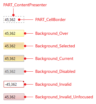
To get the most of this article, make sure you are already familiar with the Template Structure of the GridViewCell.
GridViewCell template structure
Styling all RadGridView Cells
The examples from this article assume that the RadGridView is set up as demonstrated in its Getting Started article.
To style all RadGridView cells of an application, create a style that targets the GridViewCell element.
You have two options:
To create an empty style and set it up on your own.
To copy the default style of the control and modify it.
Styling all cells of an application
<Application.Resources>
    <ResourceDictionary>
        <!-- If you use NoXaml dlls set the BasedOn property of the Style: BasedOn="{StaticResource GridViewCellStyle}" -->
        <Style TargetType="telerik:GridViewCell">
            <Setter Property="VerticalContentAlignment" Value="Top"/>
            <Setter Property="HorizontalContentAlignment" Value="Center"/>
            <Setter Property="Background" Value="#ffcc00"/>
        </Style>
    </ResourceDictionary>
</Application.Resources>
If you're using Implicit Styles, base your style on the
GridViewCellStylethat is defined for the corresponding theme.
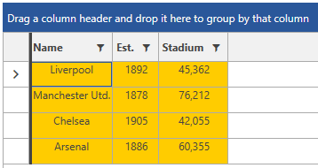
RadGridView with styled cells in the Office2016 theme
Setting a Column's CellStyle
You can also style RadGridView Cells by creating an appropriate Style for the GridViewCell element and setting it as the CellStyle property of the respective GridView Column.
Setting a column's CellStyle
<Grid>
    <Grid.Resources>
        <!-- If you use NoXaml dlls set the BasedOn property of the Style: BasedOn="{StaticResource GridViewCellStyle}" -->
        <Style x:Key="GridViewCellStyle" TargetType="telerik:GridViewCell">
            <Setter Property="VerticalContentAlignment" Value="Top"/>
            <Setter Property="HorizontalContentAlignment" Value="Center"/>
            <Setter Property="Background" Value="#ffcc00"/>
        </Style>
    </Grid.Resources>

    <telerik:RadGridView ItemsSource="{Binding Clubs}"
                         AutoGenerateColumns="False"
                         GroupRenderMode="Flat">
        <telerik:RadGridView.Columns>
            <telerik:GridViewDataColumn DataMemberBinding="{Binding Name}"
                Header="Name"
                CellStyle="{StaticResource GridViewCellStyle}" />
        </telerik:RadGridView.Columns>
    </telerik:RadGridView>
</Grid>
Setting a Column's CellStyleSelector
You could also use a column's CellStyleSelector property to style cells differently based on a specific condition. For more details about this approach, see the CellStyleSelector article.
Setting the SelectedBackground of the Cell
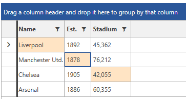
You can set the Background of the selected cell by setting the SelectedBackground property of the GridViewCell element.
Setting the SelectedBackground of the GridViewCell
<Application.Resources>
    <ResourceDictionary>
        <!-- If you use NoXaml dlls set the BasedOn property of the Style: BasedOn="{StaticResource GridViewCellStyle}" -->
        <Style TargetType="telerik:GridViewCell">
            <Setter Property="SelectedBackground" Value="Bisque" />
        </Style>
    </ResourceDictionary>
</Application.Resources>
Setting the BorderBrush of the CurrentCell
You can set the BorderBrush of the current cell, by setting the CurrentBorderBrush property of the GridViewCell.
The following example demonstrates how to set the BorderBrush of the current cell to transparent.
Setting the CurrentBorderBrush of the GridViewCell
<Application.Resources>
    <ResourceDictionary>
        <!-- If you use NoXaml dlls set the BasedOn property of the Style: BasedOn="{StaticResource GridViewCellStyle}" -->
        <Style TargetType="telerik:GridViewCell">
            <Setter Property="CurrentBorderBrush" Value="Transparent" />
        </Style>
    </ResourceDictionary>
</Application.Resources>
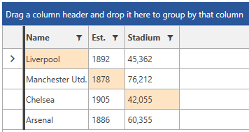
After you have set the
CurrentBorderBrushtoTransparent, if you start navigating through the cells with the keyboard, you will be able to see the FocusVisual border. If you want to hide it as well, you can set theFocusVisualStyleof the GridViewCell to null through a style similar to the above example.
Setting the MouseOverBackground of the Cell
You can change the MouseOver Background of the cells through the MouseOverBackground property of the GridViewCell. This is demonstrated in the following example.
Setting the MouseOverBackground of the GridViewCell
<Application.Resources>
    <ResourceDictionary>
        <!-- If you use NoXaml dlls set the BasedOn property of the Style: BasedOn="{StaticResource GridViewCellStyle}" -->
        <Style TargetType="telerik:GridViewCell" >
            <Setter Property="MouseOverBackground" Value="Pink" />
        </Style>
    </ResourceDictionary>
</Application.Resources>
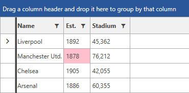
In order for the MouseOverBackground of the cell to take effect, set the SelectionUnit of RadGridView to
MixedorCell.
Setting the HighlightedBackground of the Cell
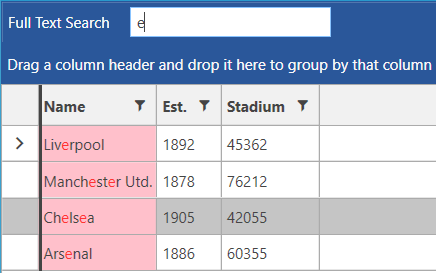
You can change the highlighted background color of a matched GridViewCell element when search as you type is performed. This color can be modified through the HighlightedBackground property.
Setting the HighlightedBackground of the GridViewCell
<Application.Resources>
    <ResourceDictionary>
        <!-- If you use NoXaml dlls set the BasedOn property of the Style: BasedOn="{StaticResource GridViewCellStyle}" -->
        <Style TargetType="telerik:GridViewCell" >
            <Setter Property="HighlightedBackground" Value="Pink"/>
        </Style>
    </ResourceDictionary>
</Application.Resources>
