Templates Structure
To learn how to style Telerik UI controls, you can read the common topics about Setting a Theme (Using Implicit Styles)
Using Implicit Styles gives you the ability to easily extract and edit the default ControlTemplates of the controls. You can follow this article for two different approaches about how to extract the ControlTemplates.
Like most controls, RadGridView also allows you to template it in order to change the control from the inside. Except for templating the whole control, you can template parts of it or even independent controls related to it. This help article will make you familiar with the:
RadGridView
PART_MasterGridContainer - hosts the elements of the template; represents the border of the RadGridView and is of type Border.
HierarchyBackground - provides columns and rows for the template elements; represents the background of the RadGridView and is of type Grid.
PART_GroupPanel - represents the Group Panel and is of type GridViewGroupPanel.
PART_ItemsScrollViewer - represents the control that handles the different types of rows (e.g., Header Row, Footer Row, New Row) and is of type GridViewScrollViewer.
PART_GridViewVirtualizingPanel - displays the data items of the RadGridView and is of type GridViewVirtualizingPanel.
PART_ScrollPositionIndicator - represents the scrolling indicator that appears when using deferred scrolling in the RadGridView and is of type ScrollPositionIndicator.
PART_FrozenColumnsPreview - represents the drag preview of the dragable element that is used for freezing the RadGridView columns.
PART_GridViewLoadingIndicator - represents the indicator that appears when the RadGridView is loading its data.
GridViewCell
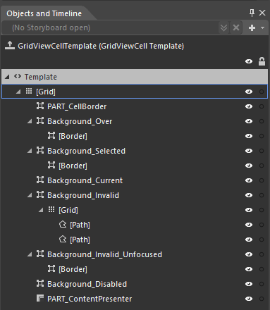
Grid - hosts the elements of the template and is of type Grid.
PART_CellBorder - hosts the elements of the template; represents the border and the background of the GridViewCell and is of type Border.
Background_Over - represents the outer border of the cell, when the mouse is over it, and is of type Border.
[Border] - represents the inner border and the background of the cell, when the mouse is over it, and is of type Border.
Background_Selected - represents the outer border of the cell, when it is selected, and is of type Border.
[Border] - represents the inner border and the background of the cell, when it is selected, and is of type Border.
Background_Current - represents the outer border of the cell, when it is current, and is of type Border.
Background_Invalid - represents the outer border of the cell, when it is invalid, and is of type Border.
[Grid] - hosts the validation tooltip template of the cell and is of type Grid.
Background_InvalidUnfocused - represents the outer border of the cell, when it enters an invalid unfocused state, and is of type Border.
[Border] - represents the inner border and the background of the cell, when it enters an invalid unfocused state, and is of type Border.
Background_Disabled - represents the background of the cell, when it is disabled, and is of type Border.
PART_ContentPresenter - displays the content of the cell and is of type ContentPresenter.
GridViewMergedCell
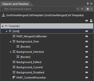
Grid - hosts the elements of the template and is of type Grid.
PART_MergedCellBorder - represents the outer border of the merged cell and is of type Border.
Background_Over - represents the outer border of the header, when the mouse is over it, and is of type Border.
[Border] - represents the inner border and the background of the merged cell, when the mouse is over it, and is of type Border.
Background_Selected - represents the outer border of the merged cell, when it is selected, and is of type Border.
[Border] - represents the inner border and the background of the merged cell, when it is selected, and is of type Border.
Background_Edited - represents the background of the merged cell, when it is edited, and is of type Border.
Background_Current - represents the outer border of the merged cell, when it is current, and is of type Border.
Background_Disabled - represents the background of the merged cell, when it is disabled, and is of type Border.
PART_ContentPresenter - displays the content of the merged cell and is of type ContentPresenter.
GridViewHeaderCell
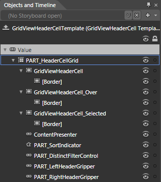
PART_HeaderCellGrid - hosts the elements of the template and is of type Grid.
GridViewHeaderCell - represents the outer border of the header and is of type Border.
[Border] - represents the inner border and the background of the header and is of type Border.
GridViewHeaderCell_Over - represents the outer border of the header, when the mouse is over it, and is of type Border.
[Border] - represents the inner border and the background of the header, when the mouse is over it, and is of type Border.
GridViewHeaderCell_Selected - represents the outer border of the header, when it is selected, and is of type Border.
[Border] - represents the inner border and the background of the header, when it is selected, and is of type Border.
ContentPresenter - displays the content of the header and is of type ContentPresenter.
PART_SortIndicator - represents the sort indicator icon of the header and is of type Path.
PART_DistinctFilterControl - represents the filtering control inside the header and is of type FilteringDropDown.
PART_LeftHeaderGripper - implements the resizing of the header and is of type Thumb.
PART_RightHeaderGripper - implements the resizing of the header and is of type Thumb.
GridViewFooterCell
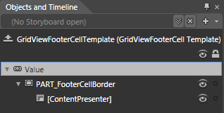
PART_FooterCellBorder - hosts the template elements; represents the border and the background of the footer and is of type Border.
[ContentPresenter] - displays the content of the footer and is of type ContentTemplate.
GridViewRow
grid - hosts the elements of the GridViewRow template and is of type SelectiveScrollingGrid.
SelectionBackground - represents the default background of the row and is of type Border.
Background_Over - represents the outer border of the row, when the mouse is over it, and is of type Border.
[Border] - represents the inner border and the background of the row, when the mouse is over it, and is of type Border.
Background_Selected - represents the outer border of the row, when it is selected, and is of type Border.
[Border] - represents the inner border and the background of the row, when it is selected, and is of type Border.
Background_Invalid - represents the outer border of the row, when it is invalid, and is of type Border.
[Border] - represents the inner border and the background of the row, when it is invalid, and is of type Border.
[GridViewToggleButton] - represents the button that expands the row and is of type GridViewToggleButton.
[Border]
PART_DataCellsPresenter - displays the cells of the row and is of type DataCellsPresenter.
PART_RowBorder - represents the border at the bottom of the row and is of type Border.
[Border] - represents the border and the background of the hierarchy container and is of type Border.
PART_HierarchyChildPresenter - displays the hierarchy children and is of type ContentPresenter.
PART_DetailsPresenter - represents the row's details and is of type DetailsPresenter.
PART_IndentPresenter - represents the indent of the row and is of type IndentPresenter.
PART_IndicatorPresenter - hosts the elements of the row's indicator and represents its outer border. It is of type Border.
[Border] - represents the inner border and the background of the row's indicator and is of type Border.
[Grid] - hosts the different indicators and is of type Grid.
ErrorIndicator - hosts the Paths for the indicator when the row is invalid. It is of type Grid.
[Path]
NavigationIndicator - hosts the Paths for the indicator, when the row is selected. It is of type Grid.
[Path]
EditIndicator - hosts the Paths for the indicator when the row is being edited. It is of type Grid.
[Path]
GridViewHeaderRow
[SelectiveScrollingGrid] - hosts the elements of the GridViewHeaderRow template and is of type SelectiveScrollingGrid.
PART_GridViewHeaderRowBorder - represents the outer border of the GridViewHeaderRow and is of type Border.
[Border] - represents the inner border and the background of the GridViewHeaderRow and is of type Border.
PART_DataCellsPresenter - displays the GridViewHeaderCells and is of type DataCellsPresenter.
PART_IndicatorPresenter - represents the outer border of the GridViewHeaderRow's indicator and is of type Border.
[Border] - represents the inner border and the background of the GridViewHeaderRow's indicator and is of type Border.
PART_IndentPresenter - displays the indent cells of the GridViewHeaderRow and is of type IndentPresenter.
PART_HierarchyIndentPresenter - represents the outer border of the GridViewHeaderRow's hierarchy indent cell and is of type Border.
[Border] - represents the inner border and the background of the GridViewHeaderRow's hierarchy indent cell and is of type Border.
GridViewGroupRow/GroupHeaderRow

PART_GroupExpanderGrid - hosts the elements of the template and is of type Grid.
ToggleButtonBorder - hosts the header element of the group; represents the background and the outer border of the group header and is of type Border.
ToggleInnerButtonBorder - represents the inner border of the group header and is of type Border.
[Grid] - provides a few columns for the visual elements to be arranged in and is of type Grid.
[Border] - hosts the list with the results of the aggregate functions and is of type Border.
[AggregateResultsList] - displays the results of the aggregate functions and is of type AggregateResultsList.
IconOuterBorder - represents the background and the outer border for the expander icon and is of type Border.
IconInnerBorder - represents the inner border for the expander icon and is of type Border.
ExpanderButton - a Path that represents the expander icon.
HeaderButton - represents the clickable area for the whole group header and is of type ToggleButton.
[ToggleButton] - represents the clickable area for the group header's content and is of type ToggleButton.
[ContentPresenter] - represents the content of the group header and is of type ContentPresenter.
PART_IndicatorPresenter - represents the outer border of the group row indicator and is of type Border.
[Border] - represents the inner border and the background of the group row indicator and is of type Border.
[IndentPresenter] - hosts the indent cells for the group row and is of type IndentPresenter.
Content - hosts the expandable content of the group and is of type Border.
[StackPanel] - arranges the elements of the group's expandable content.
PART_GridViewVirtualizingPanel - displays the items inside the group and is of type GridViewVirtualizingPanel.
Footer - represents the footer row of the group and is of type GridViewGroupFooterRow.
GridViewGroupPanel
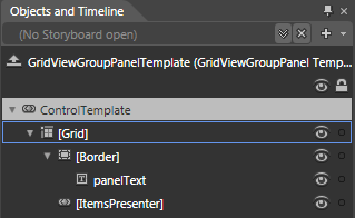
[Grid] - hosts the elements of the GridViewGroupPanel and is of type Grid.
[Border] - represents the borders and the background of the GridViewGroupPanel and is of type Border.
panelText - represents the default text displayed in the GridViewGroupPanel and is of type TextBlock.
[ItemsPresenter] - hosts the GridViewGroupPanelItems and is of type ItemsPresenter.
GridViewGroupPanelItem
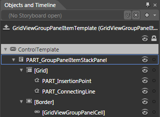
PART_GroupPanelItemStackPanel - hosts the elements of the GridViewGroupPanelItem's template and is of type StackPanel.
[Grid] - hosts the indicators of the GridViewGroupPanelItem and is of type Grid.
PART_InsertionPoint - a Path that represents the indicator displayed when rearranging GridViewGroupPanelItems in the GridViewGroupPanel.
PART_ConnectingLine - a Path that represents the line that connects this GridViewGroupPanelItem with the previous one (if any).
[Border] - hosts the controls that represent the item and is of type Border.
GridViewGrouPanelCell - represents the visual for the GridViewGroupPanelItem and is of type GridViewGroupPanelCell.
GridViewGroupFooterCell
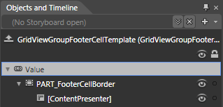
PART_FooterCellBorder - represents the background and the border of the GridViewGroupFooterCell and is of type Border.
[ContentPresenter] - hosts the content of the GridViewGroupFooterCell and is of type ContentPresenter.
DetailsPresenter
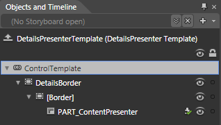
DetailsBorder - hosts the elements of the template; represents the outer border of the DetailsPresenter and is of type Border.
[Border] - represents the inner border and the background of the DetailsPresenter and is of type Border.
PART_ContentPresenter - displays the content of the DetailsPresenter and is of type ContentPresenter.
FilteringControl
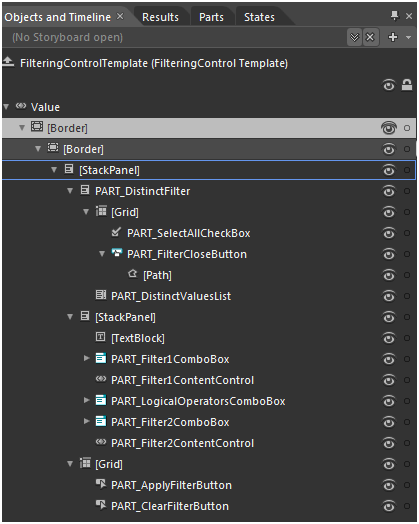
[Border] - represents the outer border of the FilteringControl and is of type Border.
[Border] - represents the inner border of the FilteringControl and is of type Border.
StackPanel
PART_DistinctFilter - the stack panel that holds the SelectAll checkbox, the distinct values listbox and the CloseButton.
Grid
PART_SelectAllCheckBox - the SelectAll checkbox.
PART_FilterCloseButton - represents the CloseButton of the FilteringControl.
PART_DistinctValuesList - the listbox that hosts the DistinctValues for the FilteringControl.
StackPanel - contains the field filters.
TextBlock
PART_Filter1ComboBox - the combobox containing the available operators.
PART_Filter1ContentControl - the control where you type your filter value.
PART_LogicalOperatorsComboBox - the logical operators combobox (contains AND & OR operators).
PART_Filter2ComboBox - the combobox containing the available operators.
PART_Filter2ContentControl - the control where you type your filter value.
Grid
PART_ApplyFilterButton - represents the button that you can use to apply filtering.
PART_ClearFilterButton - represents the button that you can use to clear filtering.
FilteringDropDown
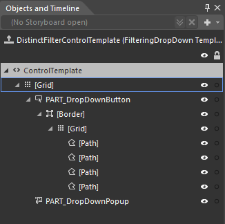
Grid
PART_DropDownButton - represents the funnel button that you need to click to display the dropdown.
Border
Grid
Path - the outer border for the filtering icon.
Path - the background for the filtering icon.
Path - the outer border for the filtering icon, when filtering is applied.
Path - the background for the filtering icon, when filtering is applied.
PART_DropDownPopup - the filtering popup.
GridViewNewRow
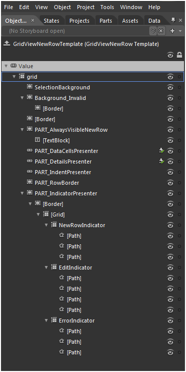
Grid - hosts the elements of the GridViewNewRow template and is of type SelectiveScrollingGrid.
SelectionBackground - represents the default background of the row and is of type Border.
Background_Invalid - represents the outer border of the row, when it is invalid, and is of type Border.
[Border] - represents the inner border and the background of the row, when it is invalid, and is of type Border.
PART_AlwaysVisibleNewRow- represents the default linear background of the GridViewNewRow that is always visible when ShowInsertRow is set to true and it is of type Border.
TextBlock- hosts the “Click here to add new item” text and is of type TextBlock.
PART_DataCellsPresenter - displays the cells of the row and is of type DataCellsPresenter.
PART_DetailsPresenter - represents the row's details and is of type DetailsPresenter.
PART_IndentPresenter - represents the indent of the row and is of type IndentPresenter.
PART_RowBorder - represents the border at the bottom of the row and is of type Border.
PART_IndicatorPresenter - hosts the elements of the row's indicator and represents its outer border. It is of type Border.
[Border] - represents the inner border and the background of the row's indicator and is of type Border.
[Grid] - hosts the different indicators and is of type Grid.
ErrorIndicator - hosts the Paths for the indicator, when the row is invalid. It is of type Grid.
[Path]
NewRowIndicator - hosts the Paths for the default indicator. It is of type Grid.
[Path]
GridViewSearchPanel
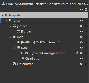
Grid - Hosts the elements of the Search Panel and the border elements.
Border - Surrounds the elements of the Search Panel.
Border - Represents the inner border and the background of the Search Panel.
Grid - The Grid control that hosts the TextBox and the ClearButton.
TextBlock - Contains the label for the TextBox.
PART_SearchAsYouTypeTextBox - The element that contains the searching criteria.It is of type TextBox.
ClearButton - Used to clear the content of the TextBox element. It is of type RadButton.
CloseButton - Represents the element used to collapse the Search Panel. It is of type RadPathButton.