Styling Invalid Row in RadGridView
Before reading this topic, you might find it useful to get familiar with RadGridView’s validation functionality.
RadGridView's styles are located in Themes.Implicit{your theme}\Themes\Telerik.Windows.Controls.GridView.xaml file.
To edit the default invalid row style, you can extract the ControlTemplate of the GridViewRow. You can check the Edit the ControlTemplates help article which describes how you can get the default template of the controls. In the extracted template, you can navigate to the Border element with x:Name="Background_Invalid" and modify its properties as desired.
In case you use different themes and the user can change them at runtime, you will have to extract and modify the default template of the GridViewRow for each theme that you are using.
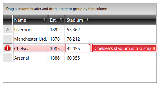
Figure 1: The default invalid row
To learn how to customize any Telerik theme, see the Setting a Theme (Using Implicit Styles) article.