Styling Group Panel
Before reading this topic, you might find it useful to get familiar with the Template Structure of the GridViewGroupPanel and GridViewGroupPanelItem.
In this article we will discuss the following topics:
Figure 1: GridViewGroupPanel template structure
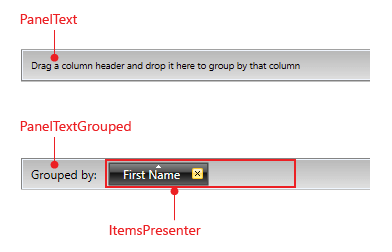
Figure 2: GridViewGroupPanelItem template structure
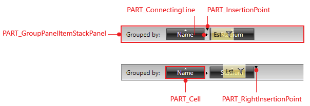
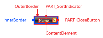
Figure 3: GridViewGroupPanelCell template structure
Targeting the GridViewGroupPanel Element
In order to style all RadGridView group panels of an application, you should create an appropriate style targeting the GridViewGroupPanel element.
You have two options:
To create an empty style and set it up on your own.
To copy the default style of the control and modify it.
To learn how to modify the default GridViewGroupPanel style, please refer to the Modifying Default Styles article.
Example 1: Styling all group panels of an application
<Style TargetType="{x:Type telerik:GridViewGroupPanel}">
    <Setter Property="MinHeight" Value="50"/>
    <Setter Property="BorderThickness" Value="3"/>
</Style>
If you're using Implicit Styles, you should base your style on the GridViewGroupPanelStyle.
Targeting the GridViewGroupPanelItem Element
You could also style all group panel items by creating a style, targeting the GridViewPanelItem element, like so:
Example 2: Styling all group panel items of an application
<Style TargetType="{x:Type telerik:GridViewGroupPanelItem}">
    <Setter Property="Padding" Value="10"/>
    <Setter Property="FontSize" Value="20" />
</Style>
If you're using Implicit Styles, you should base your style on the GridViewGroupPanelItemStyle.
Targeting the GridViewGroupPanelCell Element
The GridViewGroupPanelItem wraps the GridViewGroupPanelCell control, which represents the visual item in the Group Panel. If you want to style it, you should create the appropriate style, targeting the GridViewGroupPanelCell element.
Example 3: Styling the GridViewGroupPanelCell element
<Style TargetType="{x:Type telerik:GridViewGroupPanelCell}">
    <Setter Property="Background" Value="Red" />
    <Setter Property="BorderBrush" Value="Yellow" />
    <Setter Property="BorderThickness" Value="2" />
</Style>
If you're using Implicit Styles, you should base your style on the GridViewGroupPanelCellStyle.
Setting RadGridView's GroupPanelStyle and GroupPanelItemStyle
RadGridView exposes two properties of type Style - GroupPanelStyle and GroupPanelItemStyle. They are applied to the Group Panel and its items.
Example 4: Setting RadGridView's GroupPanelStyle and GroupPanelItemStyle
<telerik:RadGridView GroupPanelStyle="{StaticResource GroupPanelStyle}"
GroupPanelItemStyle="{StaticResource GroupPanelItemStyle}" />
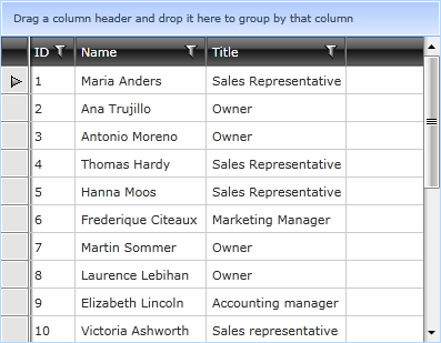
Figure 4: RadGridView with styled group panel
GroupPanelForeground and GroupPanelBackground
A simple way to change the group panel's foreground and background is through RadGridView's GroupPanelForeground and GroupPanelBackground properties. Example 5 shows how this can be done.
Example 5: Setting RadGridView's GroupPanelForeground and GroupPanelBackground
<telerik:RadGridView GroupPanelForeground="White"
GroupPanelBackground="Blue" />