Basic Grouping
RadGridView provides a built-in grouping functionality, which allows the user to easily group the data by one or more columns.
The groups of RadGridView can be programmatically expanded and collapsed. This is demonstrated in the Programmatic Grouping topic.
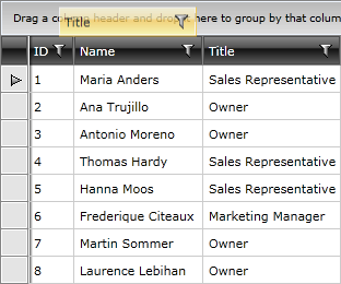
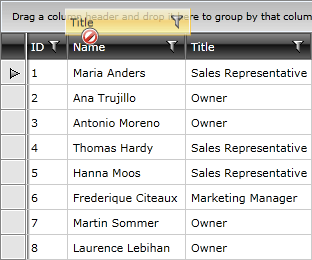
In order to group data the user has to just drag the desired column to GridViewGroupPanel located at the top of RadGridView. If RadGridView is not grouped, a hint is shown in GridViewGroupPanel.
Figure 1: Dragging a column to the GridViewGroupPanel
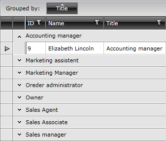
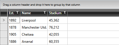
After dropping the selected header in the grouping area, the text message will be replaced with a rectangle that represents the selected header and the data will be properly grouped.
Figure 2: RadGridView after grouping
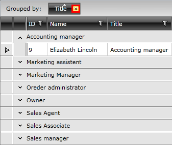
To remove the grouping just click the close button of the rectangle or drag it out of the grouping area.
Figure 3: Removing the grouping
The data can be grouped by more than one column. To do that just drag another column into the grouping area and the data will be grouped against these two criteria. To learn more about the multi-column grouping take a look at the Multi-Column Grouping topic.
GridViewColumn exposes a property ShowColumnWhenGrouped. It indicates whether the column should be visible or not when RadGridView is grouped by this same column. By default its value is True and the column will remain visible.
As of Q3 2012 we have introduced a new rendering mode of RadGridView - Flat. The default GroupRenderMode is Nested, and the new one is Flat. When you set the Flat mode, the GridView will render rows one below the other. This leads to a very good perfromance when the grid is grouped on several levels and has a lot of data. You can also refer to the Grouping Modes article.
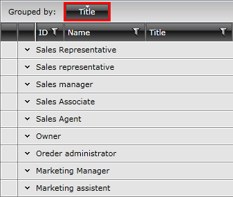
RadGridView also provides the user with a way to sort the groups of data. To do that the user just has to click on the rectangle that represents the grouping column. By default, when the data is grouped, the groups are sorted Ascending. When the sort direction of the rectangle is None the groups are sorted depending on the data they contain.
Figure 4: Sorting RadGridView when grouping is applied
Sort Group by Aggregate
You can download a runnable project on how to sort a group by defined aggregate functions from our online SDK repository: SortGroupByAggregate.
Sort Group by Different Property
You can download a runnable project on how to sort a group by a different property from our online SDK repository: SortGroupByDifferentProperty.
You can also check the SDK Samples Browser that provides a more convenient approach in exploring and executing the examples in the Telerik XAML SDK repository.
GroupMemberPath
Each GridViewColumn has a property called GroupMemberPath. This property can be used to specify the column to group on a property different from the bound one.
For example, you can configure the column to be grouped on the Name property although the bound property is Title:
Example 1 : Set GroupMemberPath for a certain column
<telerik:GridViewDataColumn DataMemberBinding="{Binding Title}"
                GroupMemberPath="Name" />
Grouping Modes
As of Q3 2012 we have introduced a new GroupRenderMode of RadGridView . It has two options:
Nested Mode: It is the default one and it will nest GridViewGroupRows into one another when you have grouping on many levels. This may lead to a poor performance when the grid is grouped on several levels and has a lot of data. The visual element representing the grouped row is GridViewGroupRow.
Flat Mode: This mode simply renders rows one below the other. This leads to a very good perfromance when the grid is grouped on several levels and has a lot of data. The visual element representing the grouped row is GroupHeaderRow.
Please note that when you use the Flat Mode, you should work with GroupHeaderRow, not GridViewGroupRow.
Reorder Columns when Ungrouping
The ShouldReorderColumnsOnUngrouping property controls whether the columns' DisplayIndex will be changed when the user drags a group cell onto a header cell. The default value is False - when the user ungroups, the display indexes of the columns prior to the grouping will not be changed. When set to True, if the user drops the group cell onto one of RadGridView's header cells, the columns will be reordered based on the drop position.
Figure 5: Dragging the group cell over a header cell
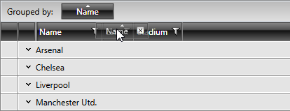
Figure 6: The reordered columns when ShouldReorderColumnsOnUngrouping is True
Disabling Grouping
As of R2 2018 the grouping operation can be disabled for all columns of the control. This can be done through the CanUserGroupColumns property of RadGridView. If the property is set to False at runtime and there is a grouping applied prior it, the user will not be able to neither, ungroup the control nor to reorder the GroupPanelCells in the GroupPanel.
There are two ways to disable the built-in grouping of RadGridView. The first one is at RadGridView level via the ShowGroupPanel property. By setting it to False the grouping area gets hidden and the column headers have nowhere to be dropped. The default value is True.
Example 2: Disable Grouping
<telerik:RadGridView x:Name="radGridView" ShowGroupPanel="False"/>
Figure 7: RadGridView with disabled grouping
The second way is to disable it on column level via IsGroupable property. When set to False the column is not allowed to be dropped in the grouping area.
Example 3: Disable grouping for specific column
<telerik:GridViewDataColumn DataMemberBinding="{Binding Title}"
                Header="Title"
                UniqueName="Title"
                IsGroupable="False" />
Example 3: Disable grouping for a specific column
this.radGridView.Columns["Title"].IsGroupable = false;
Me.radGridView.Columns("Title").IsGroupable = False
Figure 8: RadGridView with disabled grouping for a specific column
If an IValueConverter is applied to the DataMemberBinding of a certain column, Grouping will respect it and create Group names according to the converted values. Thus, the appearance of duplicated groups will be avoided. In the case of filtering the RadGridView control, on the other hand, the converted values would not be respected.
Events
There are two events that are raised, when the data in RadGridView is grouped. The first one is Grouping event and it is raised before the data is grouped. The second one is Grouped event and it is raised when the data has been already grouped. You can find more information about them here.
Styling and Appearance
RadGridView provides you with several ways to style the default look and appearance of the built-in grouping functionality. You can manipulate the grouping area at the top of RadGridView. To learn how to do this take a look at the Modifying the Grouping Panel topic.
You can easily change the appearance of the group row by just setting GroupRowStyle property. To learn how to use it take a look at the Styling the Group Row topic.
You can also manipulate the visual appearance of the group footers. Just set the GroupFooterCellStyle property of the GridViewColumn to an appropriate style.
You can also manipulate the visual appearance of the group footers. Just configure GroupFooterCellStyle property of GridViewColumn to an appropriate style.
To learn more about the group footers take a look at the Group Footers topic.
To learn how to style them take a look at the Styling the Group Footers topic.