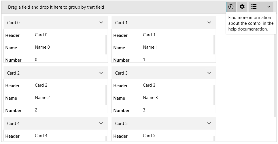
New to Telerik UI for WPF? Download free 30-day trial

Control Panel

The control panel of RadCardView allows you to include additional settings UI next to the Data Field Descriptors Button.

The feature is useful in case you want to include a custom settings panel and implement the corresponding actions.

To enable the control panel, use the ControlPanelItems property of RadCardView. This allows you to define CardViewControlPanelItem elements, which are proxies that hold information about the corresponding visual element that will be created.

The following example is an extended version of the sample from the Getting Started article.

Example 1: Defining GridViewControlPanelItems

<telerik:RadCardView x:Name="cardView" CardHeaderBinding="{Binding Header}" MinorLength="140"> 
    <telerik:RadCardView.ControlPanelItems> 
        <cardView:ControlPanelItemCollection> 
            <cardView:CardViewControlPanelItem> 
            <cardView:CardViewControlPanelItem.ButtonContent> 
                <telerik:RadGlyph Glyph="&#xe401;" /> 
            </cardView:CardViewControlPanelItem.ButtonContent> 
            <cardView:CardViewControlPanelItem.Content> 
                <TextBlock Text="Find more information about the control in the help documentation." 
                    MaxWidth="150" TextWrapping="Wrap" Padding="6" /> 
            </cardView:CardViewControlPanelItem.Content> 
            </cardView:CardViewControlPanelItem> 
            <cardView:CardViewControlPanelItem ButtonTooltip="Descriptor Settings"> 
            <cardView:CardViewControlPanelItem.ButtonContent> 
                <telerik:RadGlyph Glyph="&#xe13a;" /> 
            </cardView:CardViewControlPanelItem.ButtonContent> 
            <cardView:CardViewControlPanelItem.Content> 
                <telerik:RadListBox ItemsSource="{Binding ElementName=cardView, Path=DataFieldDescriptors}"> 
                <telerik:RadListBox.ItemTemplate> 
                    <DataTemplate> 
                    <CheckBox Content="{Binding Header}" IsChecked="{Binding IsVisible, Mode=TwoWay}" /> 
                    </DataTemplate> 
                </telerik:RadListBox.ItemTemplate> 
                </telerik:RadListBox> 
            </cardView:CardViewControlPanelItem.Content> 
            </cardView:CardViewControlPanelItem> 
        </cardView:ControlPanelItemCollection>                
    </telerik:RadCardView.ControlPanelItems> 
</telerik:RadCardView> 

cardView: points to xmlns:cardView="clr-namespace:Telerik.Windows.Controls.Data.CardView;assembly=Telerik.Windows.Controls.Data".

Figure 1: CardView Control Panel

WPF RadCardView CardView Control Panel

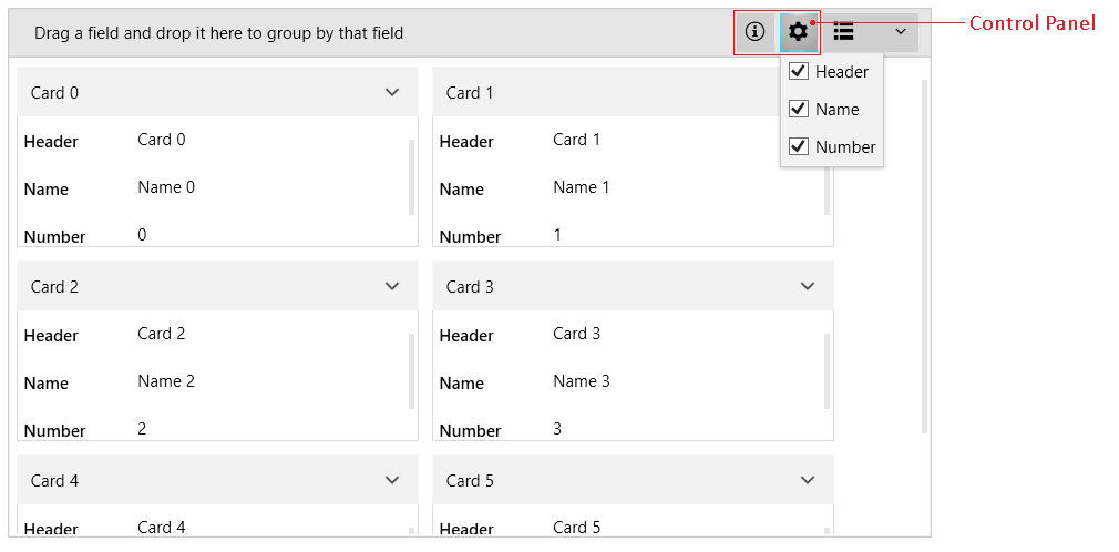
The control panel item visual element is a RadDropDownButton.

To set a tooltip for the button, use the ButtonTooltip property of CardViewControlPanelItem.

To set the content of the button, use the ButtonContent property of CardViewControlPanelItem.

To set the drop down content of the button, use the Content property of CardViewControlPanelItem.

Both Content and ButtonContent are of type object where you can use a business model or directly an UI element as in Example 1. In addition to those properties, you can set the corresponding ContentTemplate and ButtonContentTemplate properties of CardViewControlPanelItem.

Using Data Templates

CardViewControlPanelItem allows you to provide objects to the Content and ButtonContent properties. Then, you can use the ContentTemplate and ButtonContentTemplate properties to define the corresponding UI.

The following example is an extended version of the sample from the Getting Started article.

Example 2: Defining ButtonContentTemplate and ContentTemplate

<Grid> 
    <Grid.Resources> 
        <telerik:StringToGlyphConverter x:Key="StringToGlyphConverter" /> 
        <DataTemplate x:Key="ControlPanelItemButtonContentTemplate"> 
            <telerik:RadGlyph Glyph="{Binding Converter={StaticResource StringToGlyphConverter}}" /> 
        </DataTemplate> 
        <DataTemplate x:Key="ControlPanelItemContentTemplate"> 
            <TextBlock Text="{Binding}" MaxWidth="150" 
                       TextWrapping="Wrap" Padding="6" /> 
        </DataTemplate> 
    </Grid.Resources> 
    <telerik:RadCardView x:Name="cardView"    
                 CardHeaderBinding="{Binding Header}"  
                 MinorLength="140"> 
        <telerik:RadCardView.ControlPanelItems> 
            <cardView:CardViewControlPanelItem ButtonContent="&#xe401;"  
                                               Content="Find more information about the control in the help documentation." 
                                               ButtonContentTemplate="{StaticResource ControlPanelItemButtonContentTemplate}" 
                                               ContentTemplate="{StaticResource ControlPanelItemContentTemplate}"/> 
            <cardView:CardViewControlPanelItem ButtonContent="&#xe13a;"  
                                               Content="Define some custom UI in the template." 
                                               ButtonContentTemplate="{StaticResource ControlPanelItemButtonContentTemplate}" 
                                               ContentTemplate="{StaticResource ControlPanelItemContentTemplate}"/> 
        </telerik:RadCardView.ControlPanelItems> 
    </telerik:RadCardView> 
</Grid> 

Figure 2: CardView Control Panel with Data Templates

WPF RadCardView CardView Control Panel with Data Templates

See Also

In this article