Card Layout
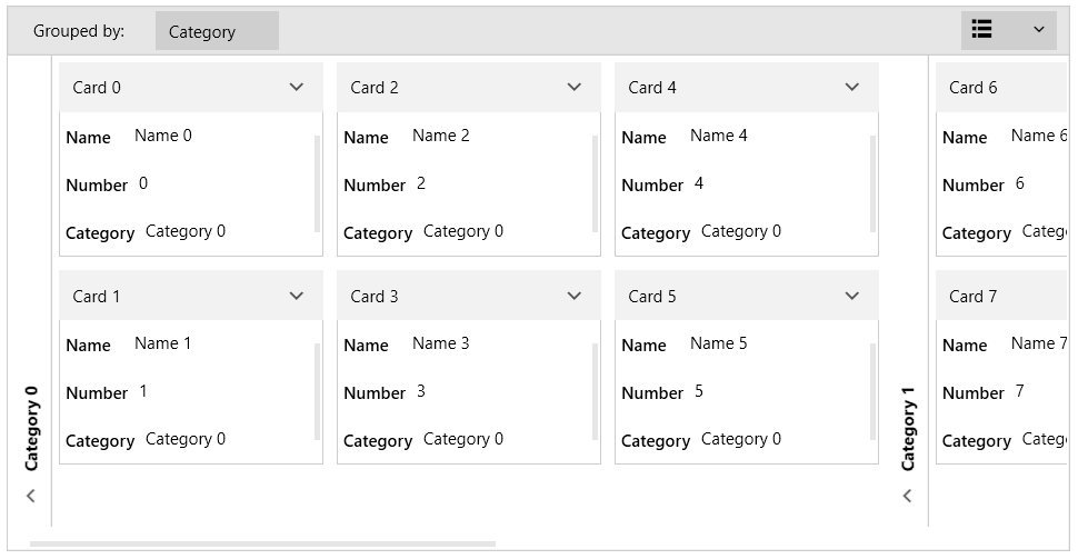
RadCardView supports two orientation based layouts arranged in rows or columns.
The layout is controlled with the CardLayout property of RadCardView. The default property value is set to Rows. In this case, the cards are arranged horizontally. When the there is no more space, the cards are arranged in the next available row. The property can be set also to Columns. In this case, the cards are arranged vertically. When there is no more space, the cards are arranged in the next available column.
Example 1: Setting cards layout
<telerik:RadCardView CardLayout="Columns" />
Figure 1: Rows layout (default)
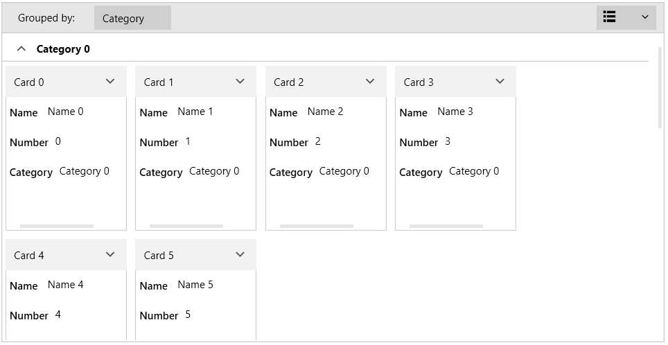
Figure 2: Columns layout
The size of the cards is controlled with the MajorLength and MinorLength properties of RadCardView. When the CardLayout is Rows the MajorLength is applied to the card's width and the MinorLength to the card's height. When the CardLayout is Columns the MajorLength is applied to the card's height and the MinorLength to the card's width.
Read more about the MajorLength and MinorLength properties in the Customizing Cards article.