Grouping
RadCardView supports grouping via the UI or in code, in case you are using ICollectionView as the ItemsSource.
Figure 1: RadCardView groups
The control internally works with a QueryableCollectionView instance. If you set the ItemsSource of the RadCardView that is not a QueryableCollectionView, then the original collection is wrapped in a QueryableCollectionView instance. This way grouping is supported even if you use a more basic IEnumerable implementation, like List<T> or ObservableCollection<T>.
Grouping in the UI
The data items can be grouped by dragging a data field descriptor from the data field descriptors list to the group panel area.
Figure 2: Dragging data field descriptor
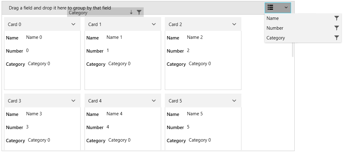
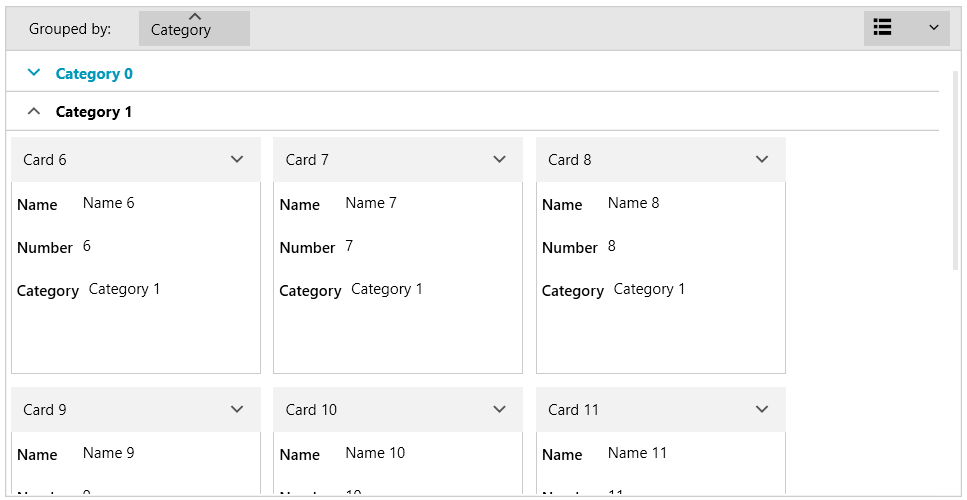
Figure 3: Grouped RadCardView
The RadCardView groups support sorting by clicking onto the associated group member button. To disable this, set the CanUserSortGroups property to False.
Example 1: Setting the CanUserSortGroups property
<telerik:RadCardView CanUserSortGroups="False" />
Programmatic Grouping
The following example shows how to setup RadCardView, populate it a QueryableCollectionView and add GroupDescriptors in code.
Example 2: Defining the model
public class CardInfo
{
    public string Header { get; set; }
    public string Name { get; set; }
    public int Number { get; set; }
    public string Category { get; set; }
}

public class MainViewModel
{
    public ObservableCollection<CardInfo> Items { get; private set; }
    public QueryableCollectionView CollectionView { get; private set; }

    public MainViewModel()
    {
        int counter = 0;
        Items = new ObservableCollection<CardInfo>();
        for (int g = 0; g < 3; g++)
        {
            for (int i = 0; i < 6; i++)
            {
                Items.Add(new CardInfo()
                {
                    Header = "Card " + counter,
                    Name = "Name " + counter,
                    Number = counter,
                    Category = "Category " + g
                });
                counter++;
            }
        }

        CollectionView = new QueryableCollectionView(Items);
        CollectionView.GroupDescriptors.Add(new GroupDescriptor() { Member = "Category" });
    }
}
Read the QueryableCollectionView to see how to use the GroupDescriptors collection of the QueryableCollectionView.
Example 3: Setting the DataContext
public MainWindow()
{
    InitializeComponent();
    this.DataContext = new MainViewModel();
}
Example 4: Setting up the view
<telerik:RadCardView ItemsSource="{Binding CollectionView}" CardHeaderBinding="{Binding Header}" />
Events
The grouping operations invoke several events that can be used to customize the grouping. Read more in the Events article.
Customizing Grouping UI
The group panel area can be customized using several public properties. To hide the area, set the ShowGroupPanel property to False. Read more in the Customizing Groups article.
Example 5: Setting the ShowGroupPanel property
<telerik:RadCardView ShowGroupPanel="False" />