Getting Started with WPF CardView
This tutorial will walk you through the creation of a sample application that contains a RadCardView control.
Adding Telerik Assemblies Using NuGet
To use RadCardView when working with NuGet packages, install the Telerik.Windows.Controls.Data.for.Wpf.Xaml package. The package name may vary slightly based on the Telerik dlls set - Xaml or NoXaml
Read more about NuGet installation in the Installing UI for WPF from NuGet Package article.
With the 2025 Q1 release, the Telerik UI for WPF has a new licensing mechanism. You can learn more about it here.
Adding Assembly References Manually
If you are not using NuGet packages, you can add a reference to the following assemblies:
- Telerik.Licensing.Runtime
- Telerik.Windows.Controls
- Telerik.Windows.Controls.Data
- Telerik.Windows.Controls.Input
- Telerik.Windows.Data
You can find the required assemblies for each control from the suite in the Controls Dependencies help article.
Defining the RadCardView
To display data in the control, provide a collection of business objects and assign it to the ItemsSource property of RadCardView.
The following example shows how to setup a basic card model and populate the ItemsSource of the control.
Example 1: Creating card model
public class CardInfo
{
    public string Header { get; set; }
    public string Name { get; set; }
    public int Number { get; set; }
}
Example 2: Defining the control in XAML
<telerik:RadCardView x:Name="cardView"
                     CardHeaderBinding="{Binding Header}"
                     MinorLength="140"/>
Example 3: Populating the control with data
public MainWindow()
{
    InitializeComponent();
    var source = new ObservableCollection<CardInfo>();
    for (int i = 0; i < 6; i++)
    {
        source.Add(new CardInfo() { Header = "Card " + i, Name = "Name " + i, Number = i });
    }
    this.cardView.ItemsSource = source;
}
Figure 1: RadCardView example
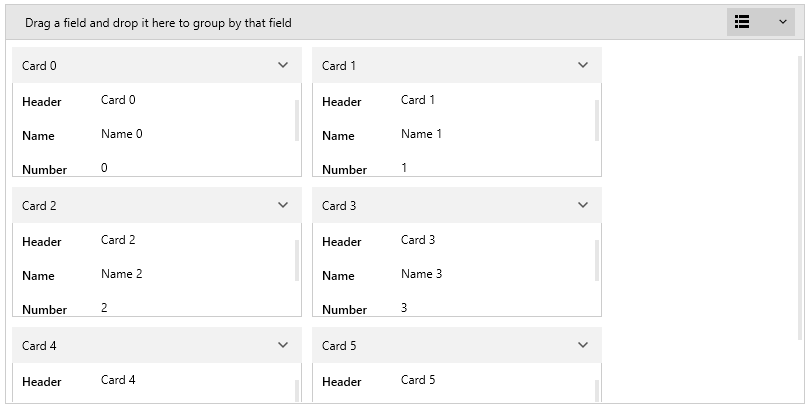
The example shows also how to tell what is the property displaying the card headers (via the CardHeaderBinding property) and the height of the cards (via the MinorLength property). The MinorLength will apply to the height or the width of the cards based on the CardLayout property value.
Manual Data Field Generation
By default the RadCardView cards will auto-generate data fields for each public property of the card's model class. To interfere with this process, you can use the AutoGeneratingDataFieldDescriptor event of the control, where the data field generation can be canceled or customized. Additionally, you can set the AutoGenerateDataFieldDescriptor property to False and define the data fields manually via the RadCardView's DataFieldDescriptors collection. Read more in the Data Field Descriptor article.
Data Manipulation
There are several mechanisms to customize the displayed data. You can filter, sort or group it. Additionally, when a card is selected, you can edit its data fields using the built-in UI. Read more about those features in the Features section of the documentation.
Setting a Theme
The controls from our suite support different themes. You can see how to apply a theme different than the default one in the Setting a Theme help article.
Changing the theme using implicit styles will affect all controls that have styles defined in the merged resource dictionaries. This is applicable only for the controls in the scope in which the resources are merged.
To change the theme, you can follow the steps below:
Choose between the themes and add reference to the corresponding theme assembly (ex: Telerik.Windows.Themes.Material.dll). You can see the different themes applied in the Theming examples from our WPF Controls Examples application.
-
Merge the ResourceDictionaries with the namespace required for the controls that you are using from the theme assembly. For the RadCardView, you will need to merge the following resources:
- Telerik.Windows.Controls
- Telerik.Windows.Controls.Data
- Telerik.Windows.Controls.Input
- Telerik.Windows.Data
Example 2 demonstrates how to merge the ResourceDictionaries so that they are applied globally for the entire application.
Example 2: Merge the ResourceDictionaries
<Application.Resources>
    <ResourceDictionary>
        <ResourceDictionary.MergedDictionaries>
            <ResourceDictionary Source="/Telerik.Windows.Themes.Material;component/Themes/System.Windows.xaml"/>
            <ResourceDictionary Source="/Telerik.Windows.Themes.Material;component/Themes/Telerik.Windows.Controls.xaml"/>
            <ResourceDictionary Source="/Telerik.Windows.Themes.Material;component/Themes/Telerik.Windows.Controls.Input.xaml"/>
            <ResourceDictionary Source="/Telerik.Windows.Themes.Material;component/Themes/Telerik.Windows.Controls.Data.xaml"/>
        </ResourceDictionary.MergedDictionaries>
    </ResourceDictionary>
</Application.Resources>
Alternatively, you can use the theme of the control via the StyleManager.
Figure 4 shows a RadCardView with the Material theme applied.
Figure 4: RadCardView with the Material theme
Telerik UI for WPF Learning Resources
- Telerik UI for WPF CardView Component
- Getting Started with Telerik UI for WPF Components
- Telerik UI for WPF Installation
- Telerik UI for WPF and WinForms Integration
- Telerik UI for WPF Visual Studio Templates
- Setting a Theme with Telerik UI for WPF
- Telerik UI for WPF Virtual Classroom (Training Courses for Registered Users)
- Telerik UI for WPF License Agreement