Keyboard Support
RadRibbonView provides a keyboard navigation mechanisms using key tips and the arrow keys. You can enable this feature by setting the KeyTipService.IsKeyTipsEnabled attached property on the RadRibbonView control to True.
You can access the KeyTipService control through an alias pointing to the Telerik.UI.Xaml.Controls namespace:
xmlns:telerik="using:Telerik.UI.Xaml.Controls"
Example 1: Enabling RibbonView Key Tips
<telerik:RadRibbonView x:Name="radRibbonView"
                       ApplicationName="RibbonViewApplication"
                       telerik:KeyTipService.IsKeyTipsEnabled="True" />
Example 2: Setting access text to a particular control
<telerik:RadRibbonView x:Name="radRibbonView"
                       ApplicationName="RibbonViewApplication"
                       telerik:KeyTipService.IsKeyTipsEnabled="True">
    <telerik:RadRibbonView.Backstage>
        <telerik:RadRibbonBackstage telerik:KeyTipService.AccessText="B" />
    </telerik:RadRibbonView.Backstage>
</telerik:RadRibbonView>
When you start navigating with the arrows, the key tips will be hidden. Navigating with the arrow keys will handle the appropriate KeyUp/Down/PreviewDown events fired for the RadRibbonView.
KeyTipService Properties
The KeyTipsService class allows you to enable/disable key tips for the RadRibbonView control. It exposes the following properties that allow you to customize the keyboard navigation:
-
ActivationMode: Gets/sets the the predefined event on which the KeyTips and KeyboardNavigation are executed. The property is of type Telerik.Windows.Controls.RibbonView.KeyTips.ActivationMode enum and exposes the following options:
- PreviewKeyDown: The keyboard navigation is activated when the PreviewKeyDown event of RadRibbonView is fired.
- KeyDown: The keyboard navigation is activated when the KeyDown event is fired.
- KeyUp (default value): The keyboard navigation is activated when the KeyUp event is fired.
AccessText: Gets/sets the key tip activation text.
AltAccessText: Gets/sets alternative key tip activation text. This property is applicable only to the RadRibbonGroup and affects the DialogLauncherCommand.
-
AccessKey: Gets/sets the combination of keys to be used for displaying the key tips. By default the key tips are displayed by pressing ALT. This property should be defined in the RadRibbonView definition:
Example 3: Setting combination of access keys
<telerik:RadRibbonView x:Name="radRibbonView" ApplicationName="RibbonViewApplication" telerik:KeyTipService.AccessKey="Ctrl+Alt+Z" telerik:KeyTipService.IsKeyTipsEnabled="True"> </telerik:RadRibbonView> -
AccessKeys: Property of type IEnumerable
and it gets/sets a collection of KeyGestures that can be used to trigger the KeyTips display. Please note that the AccessKeys property can only be set in code either in code-behind or in a ViewModel. This is because a KeyGesture cannot be defined in XAML.
If both AcessKey and AccessKeys properties are set, the value of the AcessKey property will be ignored.
-
Activated: Used to define additional logic that can be implemented when using the keyboard navigation.
Example 4: Subscribe to the Activated event
    <telerik:RadRibbonView telerik:KeyTipService.IsKeyTipsEnabled="True">
        <telerik:RadRibbonTab Header="Home" telerik:KeyTipService.AccessText="H">
            <telerik:RadRibbonGroup Header="Home group">
                <telerik:RadRibbonButton CollapseToSmall="WhenGroupIsSmall"
                            CollapseToMedium="WhenGroupIsMedium" telerik:KeyTipService.AccessText="B"
                            IsAutoSize="True" x:Name="HomeButton1"
                            Size="Large" Click="HomeButton1_Click"
                            Text="Admin" >
                    <telerik:KeyTipService.Activation>
                        <telerik:KeyTipActivation Activated="KeyTipActivation_Activated" />
                    </telerik:KeyTipService.Activation>
                    <telerik:RadRibbonButton.LargeIcon>
                        <SymbolIcon Symbol="Admin"/>
                    </telerik:RadRibbonButton.LargeIcon>
                </telerik:RadRibbonButton>
            </telerik:RadRibbonGroup>
        </telerik:RadRibbonTab>
    </telerik:RadRibbonView>
Example 5: Showing MessageBox in the Activated event handler
In the example above, the KeyTipActivation.Activated() event handler will fire as soon as the HomeButton1 key tip is activated. This means that you can implement custom logic that will be executed before the button's Click() event is fired.private void KeyTipActivation_Activated(object sender, Telerik.Windows.RadRoutedEventArgs e) { MessageBox.Show("The key tip of the "+(e.OriginalSource as RadRibbonButton).Text.ToString() + "was activated."); } private void HomeButton1_Click(object sender, RoutedEventArgs e) { MessageBox.Show((sender as RadRibbonButton).Text.ToString() + "was clicked."); } -
IsKeyboardNavigationEnabled: Gets or sets whether keyboard navigation is enabled for a particular control. Setting this property to false on a UIElement will lead to the element being skipped while navigating using the keyboard's Up/Down/Right/Left keys.
Example 4: Disabling navigation through specific items using the Left/Right keys
    <telerik:RadRibbonView telerik:KeyTipService.IsKeyTipsEnabled="True" >
        <telerik:RadRibbonTab Header="Home" telerik:KeyTipService.AccessText="H">
            <telerik:RadRibbonGroup Header="Home group">
                <telerik:RadRibbonButton CollapseToSmall="WhenGroupIsSmall"
                    CollapseToMedium="WhenGroupIsMedium" telerik:KeyTipService.AccessText="B"
                    IsAutoSize="True" x:Name="HomeButton1" telerik:KeyTipService.IsKeyboardNavigationEnabled="false"
                    Size="Large"
                    Text="Admin"/>
                <telerik:RadRibbonButton CollapseToSmall="WhenGroupIsSmall"
                    CollapseToMedium="WhenGroupIsMedium"
                    IsAutoSize="True"
                    Size="Large"
                    Text="User"/>
                <telerik:RadRibbonButton CollapseToSmall="WhenGroupIsSmall"
                    CollapseToMedium="WhenGroupIsMedium"
                    IsAutoSize="True"
                    Size="Large"
                    Text="Account" />
            </telerik:RadRibbonGroup>
        </telerik:RadRibbonTab>
    </telerik:RadRibbonView>
Specific behaviors of IsKeyboardNavigationEnabled property when set to false:
- When set on RadRibbonView: The attached property will not work for this control.
- When set on RadRibbonTab: The control will be skipped from navigation using the Up/Down/Right/Left keyboard keys but will be accessible through the key tips behavior.
- When set on RadRibbonGroup: The control will be skipped from navigation using the Up/Down/Right/Left keyboard keys. Elements inside the group will not inherit this property.
- When set on RadRibbonButton: The control will be skipped from navigation using the Up/Down/Right/Left keyboard keys.
- When set on Application Menu/ Backstage: The application button will be skipped from the navigation using the Up/Down/Right/Left keyboard keys.
- When set on Quick Access Toolbar: The control will be skipped from navigation using the Up/Down/Right/Left keyboard keys. Elements inside the group will not inherit this property.
- When set on Items Controls: The control will be skipped from navigation using the Up/Down/Right/Left keyboard keys. There's no need to set this property to the child elements.
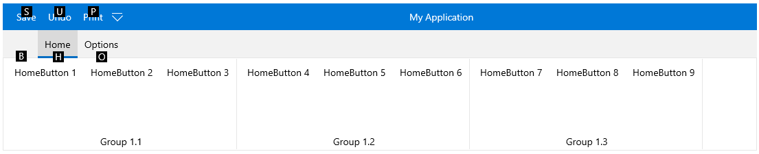
Activating Key Tips
Example 6: Activating key tips behavior
<telerik:RadRibbonView Margin="20" x:Name="radRibbonView" telerik:KeyTipService.IsKeyTipsEnabled="True">
    <telerik:RadRibbonView.Backstage>
        <telerik:RadRibbonBackstage telerik:KeyTipService.AccessText="B" />
    </telerik:RadRibbonView.Backstage>
    <telerik:RadRibbonView.QuickAccessToolBar>
        <telerik:QuickAccessToolBar>
            <telerik:RadRibbonButton Foreground="Gray"
                                telerik:KeyTipService.AccessText="S"
                                Text="Save" />
            <telerik:RadRibbonButton Foreground="Gray"
                                telerik:KeyTipService.AccessText="U"
                                Text="Undo" />
            <telerik:RadRibbonButton Foreground="Gray"
                                telerik:KeyTipService.AccessText="P"
                                Text="Print" />
        </telerik:QuickAccessToolBar>
    </telerik:RadRibbonView.QuickAccessToolBar>
    <telerik:RadRibbonTab Header="Home" telerik:KeyTipService.AccessText="H">
        <telerik:RadRibbonGroup Header="Group 1.1" telerik:KeyTipService.AccessText="A">
            <telerik:RadRibbonButton telerik:KeyTipService.AccessText="Z" Text="HomeButton 1" />
            <telerik:RadRibbonButton telerik:KeyTipService.AccessText="X" Text="HomeButton 2" />
            <telerik:RadRibbonButton telerik:KeyTipService.AccessText="C" Text="HomeButton 3" />
        </telerik:RadRibbonGroup>
        <telerik:RadRibbonGroup Header="Group 1.2" telerik:KeyTipService.AccessText="S">
            <telerik:RadRibbonButton telerik:KeyTipService.AccessText="W" Text="HomeButton 4" />
            <telerik:RadRibbonButton telerik:KeyTipService.AccessText="E" Text="HomeButton 5" />
            <telerik:RadRibbonButton telerik:KeyTipService.AccessText="R" Text="HomeButton 6" />
        </telerik:RadRibbonGroup>
        <telerik:RadRibbonGroup Header="Group 1.3" telerik:KeyTipService.AccessText="D">
            <telerik:RadRibbonButton telerik:KeyTipService.AccessText="G" Text="HomeButton 7" />
            <telerik:RadRibbonButton telerik:KeyTipService.AccessText="M" Text="HomeButton 8" />
            <telerik:RadRibbonButton telerik:KeyTipService.AccessText="N" Text="HomeButton 9" />
        </telerik:RadRibbonGroup>
    </telerik:RadRibbonTab>
    <telerik:RadRibbonTab Header="Options" telerik:KeyTipService.AccessText="O"/>
</telerik:RadRibbonView>
When a control's keytip is activated, the action associated with the control will be executed:
Using a keytip of a RibbonTab will select the tab.
Using a keytip of a RibbonSplitButton/RibbonDropDownButton will open the DropDown content of the button.
Using a keytip of a RibbonGallery control will open the gallery.
Using a keytip of a RibbonButton/RibbonRadioButton/RibbonToggleButton will execute the button's command or Click() event.
Using a keytip on a collapsed RibbonGroup will expand the group.
You can navigate back through the layers of the keytips using Esc key.