Attributes Support
PropertyGrid supports several attributes that can be used in the underlying data model in order to modify the UI.
Display Attribute
The Display attribute can be used to specify the information that describes the associated property. This information will be displayed in the data field visual generated for the property definition. This attribute is part of the System.ComponentModel.DataAnnotations assembly. It provides the following settings:
-
Name—The value to be displayed instead of the property name. -
Description—The property description to be displayed in the Property Description Panel. -
GroupName—The value to be assigned to theGroupNameof the associatedPropertyDefinition. -
Order—The order index of the property.
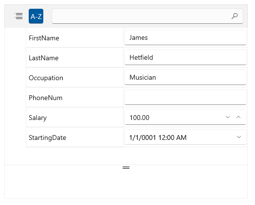
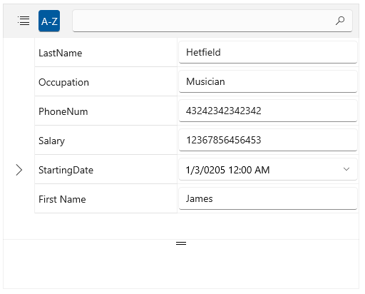
Using the Display attribute
[Display(Name = "First Name", Description = "The employee's first name", GroupName = "GroupA", Order = 5)]
public string FirstName { get; set; }
Browsable Attribute
The Browsable attribute specifies whether a property should be displayed or not. Setting the constructor's argument to false will hide the property from the UI.
Using the Browsable attribute
[Browsable(false)]
public string FirstName { get; set; }
ReadOnly Attribute
The ReadOnly attribute specifies whether the property this attribute is bound to is read-only or read/write. Setting the constructor's argument to true will make the property in the UI readonly.
Using the ReadOnly attribute
[ReadOnly(true)]
public string FirstName { get; set; }
Editor Attribute
PropertyGrid provides support for the Telerik attribute EditorAttribute that enables the user to define an editor for each property directly in its definition. The attribute provides the following properties:
EditorType—Specifies the type of the editor used for the property.TargetProperty—Defines the property of the custom editor that will be used for the binding.-
EditorStyle—Sets the style of the UI component used for hosting the custom editor. Its values can be:DropDown—A dropdown button the content of which is the custom editor to be displayed.Modal—A button that shows a modal dialog window with the custom editor inside.None(default value)—The editor will be placed directly in property field visual and no special UI element will be used.
Using the Editor attribute
[Editor(typeof(RadNumericBox), "Value")]
public double Salary { get; set; }
EditorAttribute class provides several constructors that can be used to adjust the editor. The previous example shows how to provide the editor's type and the property (in that case Value) that should be bound to the property in the data model (in the case the Salary property).