Override Theme Settings at Run Time
This article demonstrates how to change the style for a specific element state without losing the applied style for the rest of the states.
By default, when you set a certain RadProperty in code, this setting will have a higher priority, called Local, than the setting introduced in the theme, which sets with Style priority (see RadObject). As a result, if you set the BackColor of a button’s FillPrimitive in code, even though the theme defines other colors for other states (hover, pressed), these will not be applied, as the Local setting has higher priority than the Style setting. With the API discussed in this article, you will be able to override the styles defined in the theme, and set the desired property value with priority Style.Hence, the rest of the defined styles in the theme will still work as expected.
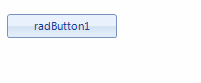
Here is an example. By default, RadButton, like most of the visual items in the UI for WinForms suite has hover state coming from the theme.
Consider the case in which you should change the BackColor for a RadButton. To achieve it, you will probably use the following code snippet:
this.radButton1.ButtonElement.ButtonFillElement.BackColor = Color.Red;
this.radButton1.ButtonElement.ButtonFillElement.GradientStyle = GradientStyles.Solid;
Me.RadButton1.ButtonElement.ButtonFillElement.BackColor = Color.Red
Me.RadButton1.ButtonElement.ButtonFillElement.GradientStyle = GradientStyles.Solid
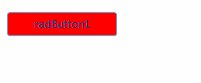
As a result, you will obtain the desired BackColor. However, the hover state will be lost.
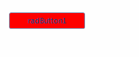
The local value, applied to the BackColor property, overrides the applied style coming from the theme.
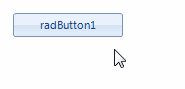
To handle this, you can use the RadItem.SetThemeValueOverride method by specifying the associated state.
this.radButton1.ButtonElement.SetThemeValueOverride(Telerik.WinControls.Primitives.FillPrimitive.BackColorProperty,
    Color.Red, "", typeof(Telerik.WinControls.Primitives.FillPrimitive));
this.radButton1.ButtonElement.SetThemeValueOverride(Telerik.WinControls.Primitives.FillPrimitive.GradientStyleProperty,
    GradientStyles.Solid, "", typeof(Telerik.WinControls.Primitives.FillPrimitive));
Me.RadButton1.ButtonElement.SetThemeValueOverride(Telerik.WinControls.Primitives.FillPrimitive.BackColorProperty, _
                                                  Color.Red, "", GetType(Telerik.WinControls.Primitives.FillPrimitive))
Me.RadButton1.ButtonElement.SetThemeValueOverride(Telerik.WinControls.Primitives.FillPrimitive.GradientStyleProperty, _
                                                  GradientStyles.Solid, "", GetType(Telerik.WinControls.Primitives.FillPrimitive))
The GetAvailableVisualStates method returns a list of the string representation of the applicable states for this element. These can be used as separate states or combined. When combining, use the dot notation e.g. IsDefault.MouseOver.
List<string> visualStates = this.radButton1.ButtonElement.GetAvailableVisualStates();
Dim visualStates As List(Of String) = Me.RadButton1.ButtonElement.GetAvailableVisualStates()
Note that the normal state is represented by an empty string.
In case you need to change the hover color, you can use a similar approach:
this.radButton1.ButtonElement.SetThemeValueOverride(Telerik.WinControls.Primitives.FillPrimitive.BackColorProperty,
    Color.Yellow, "MouseOver", typeof(Telerik.WinControls.Primitives.FillPrimitive));
this.radButton1.ButtonElement.SetThemeValueOverride(Telerik.WinControls.Primitives.FillPrimitive.GradientStyleProperty,
    GradientStyles.Solid, "MouseOver", typeof(Telerik.WinControls.Primitives.FillPrimitive));
Me.RadButton1.ButtonElement.SetThemeValueOverride(Telerik.WinControls.Primitives.FillPrimitive.BackColorProperty, _
                                                  Color.Yellow, "MouseOver", GetType(Telerik.WinControls.Primitives.FillPrimitive))
Me.RadButton1.ButtonElement.SetThemeValueOverride(Telerik.WinControls.Primitives.FillPrimitive.GradientStyleProperty, _
                                                  GradientStyles.Solid, "MouseOver", GetType(Telerik.WinControls.Primitives.FillPrimitive))
Here is an example how to combine states for RadToggleButton
this.radToggleButton1.ButtonElement.SetThemeValueOverride(Telerik.WinControls.Primitives.FillPrimitive.BackColorProperty,
    Color.Aqua, "ToggleState=On.MouseOver", typeof(Telerik.WinControls.Primitives.FillPrimitive));
this.radToggleButton1.ButtonElement.SetThemeValueOverride(Telerik.WinControls.Primitives.FillPrimitive.GradientStyleProperty,
    GradientStyles.Solid, "ToggleState=On.MouseOver", typeof(Telerik.WinControls.Primitives.FillPrimitive));
Me.RadToggleButton1.ButtonElement.SetThemeValueOverride(Telerik.WinControls.Primitives.FillPrimitive.BackColorProperty, _
                                                        Color.Aqua, "ToggleState=On.MouseOver", GetType(Telerik.WinControls.Primitives.FillPrimitive))
Me.RadToggleButton1.ButtonElement.SetThemeValueOverride(Telerik.WinControls.Primitives.FillPrimitive.GradientStyleProperty, _
                                                        GradientStyles.Solid, "ToggleState=On.MouseOver", GetType(Telerik.WinControls.Primitives.FillPrimitive))
You can use the ResetThemeValueOverrides method if you need to reset the applied style for a specific state of the element.