RichTextEditor Toolbar
The .NET MAUI RichTextEditor control comes with various editing capabilities. With the help of the RadRichTextEditorToolbar, you can enable the users to effortlessly edit HTML content. The default toolbar includes items for all the available text formatting options. Alternatively, you can customize the shown editing options according to your needs.
By default, the RadRichTextEditorToolbar Items are auto-populated. You can change this by setting the RadRichTextEditorToolbar boolean AutoGenerateItems property to False. In this case, you will need to manually define the available editing options. For more details, check Custom Toolbar article.
To attach the RichTextEditor control to the RadRichTextEditorToolbar control, you need to set the RichTextEditor (from type RadRichTextEditor) property. All toolbar items execute their actions against the specified rich text editor.
The Toolbar is part of Telerik UI for .NET MAUI, the most comprehensive UI suite for .NET MAUI! To try it out, sign up for a free 30-day trial and kickstart your cross-platform app development today.
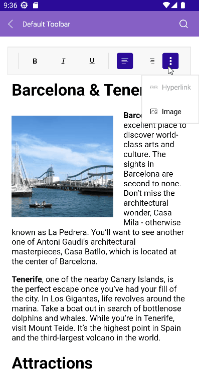
On Mobile, the RichTextEditorToolbar is horizontally scrollable, so that the toolbar items can be accessed:
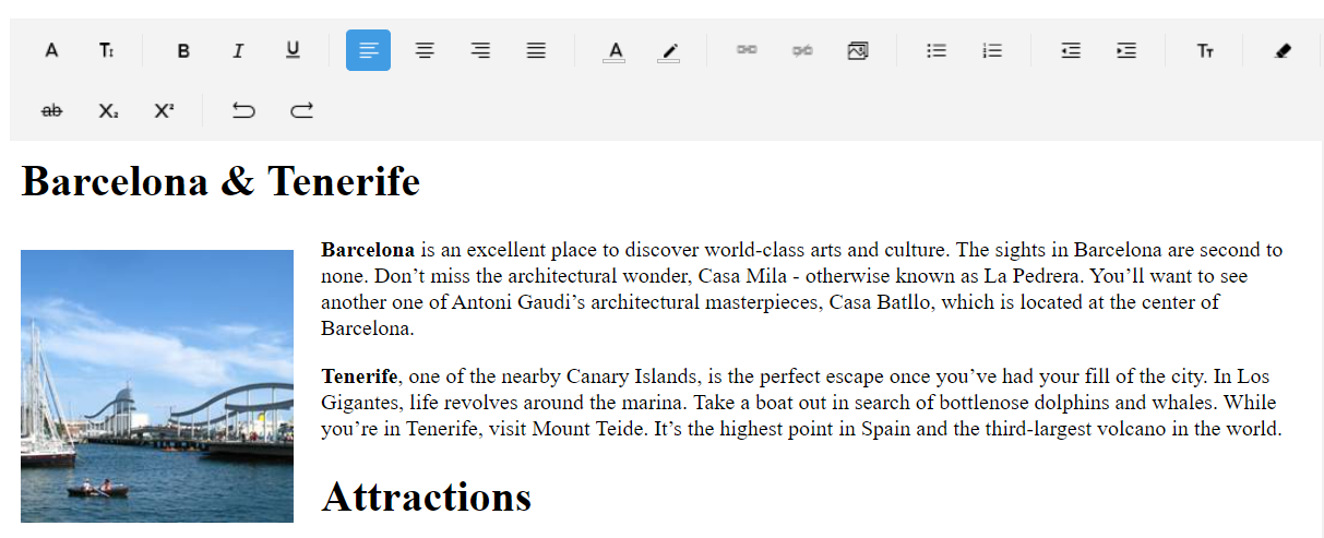
On Desktop, the toolbar items are wrapped:
Predefined Toolbar Items
The table below shows all toolbar items available for both Desktop and Mobile:
| RichTextEditor Toolbar Item | Description |
|---|---|
RichTextEditorFontFamilyToolbarItem |
Changes the font family of the text with the selected from predefiend font families. |
RichTextEditorFontSizeToolbarItem |
Chnages the font size of the text. |
SeparatorToolbarItem |
Separates the toolbar items. |
RichTextEditorBoldToolbarItem |
Bolds the text. |
RichTextEditorItalicToolbarItem |
Makes the text italic. |
RichTextEditorUnderlineToolbarItem |
underlines the text. |
RichTextEditorAlignLeftToolbarItem |
Align the content to the left of the available space. |
RichTextEditorAlignCenterToolbarItem |
Aligns the content centered in the available space. |
RichTextEditorAlignRightToolbarItem |
Align the content to the right of the available space. |
RichTextEditorAlignJustifyToolbarItem |
Distributes the content evenly in the available space. |
RichTextEditorTextColorToolbarItem |
Changes the text color of the text with a selection from predefined colors. |
RichTextEditorHighlightTextColorToolbarItem |
Changes the highlight color of the text with the selected from predefined colors. |
RichTextEditorBulletingToolbarItem |
Creates a bulleted/unordered list. |
RichTextEditorNumberingToolbarItem |
Creates a numbered/ordered list. |
RichTextEditorOutdentToolbarItem |
Moves the content of the current or selected paragraphs closer the margin of the control. |
RichTextEditorIndentToolbarItem |
Moves the content of the current or selected paragraphs farther away from the margin of the control. |
RichTextEditorTextFormattingToolbarItem |
|
RichTextEditorClearFormattingToolbarItem |
Clears all formatting for the selection. |
RichTextEditorStrikethroughToolbarItem |
Crosses out the text. |
RichTextEditorSuperscriptToolbarItem |
Makes the text small and positioned below the paragraph line. |
RichTextEditorSubscriptToolbarItem |
Makes the text small and positioned above the paragraph line. |
RichTextEditorUndoToolbarItem |
Un-does the last action. |
RichTextEditorRedoToolbarItem |
Re-does the last action. |
RichTextEditorColorPickerToolbarItem |
Allows picking a specific color from a collection of colors. |
RichTextEditorCopyToolbarItem |
Copies the selected HTML to the clipboard. |
RichTextEditorCutToolbarItem |
Cuts the selected HTML to the clipboard. |
RichTextEditorAddOrEditHyperlinkToolbarItem |
Opens a popup to add ot edit a hyperlink. |
RichTextEditorAddHyperlinkToolbarItem |
Adds a hyperlink. |
RichTextEditorRemoveHyperlinkToolbarItem |
Remove the hyperlink for the current selection. |
RichTextEditorAddOrEditImageToolbarItem |
If image is selected, a dialog opens. If image is not selected, the PickImage event fires. |
RichTextEditorHyperlinkNavigationToolbarItem |
If hyperlink is selected, navigates to the predefined toolbar items related to hyperlink operations like: Edit, Open, Remove. If huperlink is not selected, opens a popup with predefined UI for adding a hyperlink to the current selection. |
RichTextEditorImageNavigationToolbarItem |
If image is selected, navigates to the operations related to image editing like: Cut, Copy, Remove, Paste, Edit. |
Here are the all toolbar items definition:
RichTextEditor Toolbar Placement
Some specifics you'd need to take into account when placing RichTextEditorToolbar on the page:
- On Android—When you place the RichTextEditor Toolbar below the RichTextEditor, you set the Application's
WindowSoftInputModeAdjusttoResize. This setting causes the page to resize when the keyboard is shown, and in this way, if theRichTextEditorToolbaris on the bottom of the page, it will be displayed over the keyboard when it appears.
You can apply it on application level like this:
For more details, check the Soft Keyboard Input Mode on Android from .NET MAUI documentation.
- On iOS—If the
RadRichTextEditorToolbaris positioned under the keyboard, when the keyboard shows, the control is translated over the keyboard so users can access it without a problem. Due to the .NET MAUI implementation, it is important that theRadRichTextEditorToolbaris placed in a container which bounds will contain it after the control is translated over the keyboard. Otherwise, the tap and pan gestures on theRadRichTextEditorToolbarwill not work until the keyboard is hidden and the control is translated back to its original place. -
RichTextEditorToolbarmust have a greaterZIndexthan the other elements in its parent layout to be visible (and not behind other views, like RichTextEditor) when translated over the keyboard. Also, it must be contained in the bounds of its parent layout after translation. In this case, set theZIndexproperty to theRichTextEditorToolbar.
For the RichTextEditor Toolbar examples, see the SDKBrowser Demo Application and go to RichTextEditor > Toolbar.
Custom Toolbar
You can customize the toolbar by setting the AutoGenerateItems to False. Then decide which toolbar items to include. For more details on this—Review the Custom Toolbar article.