Exporting Components
The ThemeBuilder plugin for Figma allows you to export components from Figma to a ThemeBuilder project by turning them into HTML components. Once exported, they can be customized further using ThemeBuilder's user-friendly interface. You can also export styles and variables separately. However, when you export a Figma component that utilizes such styles and variables, the ThemeBuilder plugin for Figma exports them as well.
Starting with version 2024 Q4, the ThemeBuilder plugin for Figma is also available in Dev Mode.
To export the desired components:
- Launch the Export Components Wizard.
- Select a ThemeBuilder Project.
- Select the component for the export.
- Generate names for the tokens.
Step 1: Launch the Export Components Wizard
Open your design in Figma.
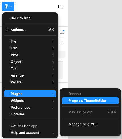
Go to the Main menu.
-
Hover over Plugins, then select Progress ThemeBuilder.
Log in with your Telerik account.
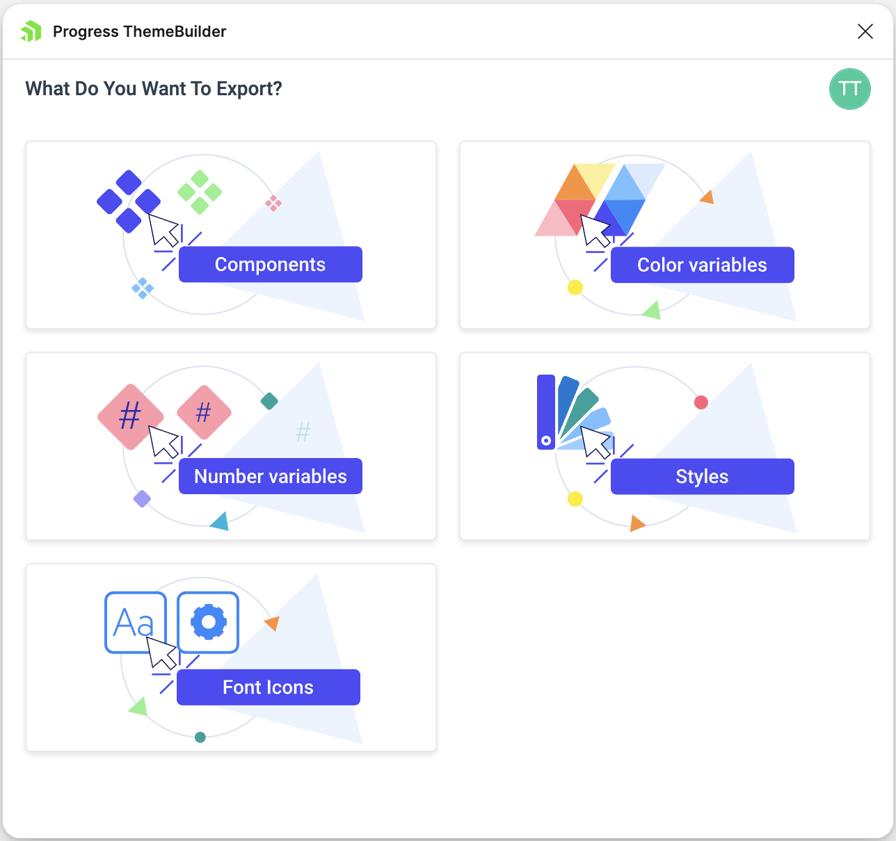
Select the Components option from the plugin screen.
Step 2: Select a ThemeBuilder Project
To begin using the Export Components Wizard, you first need to select a ThemeBuilder project where you want to export the components. If you haven't created any ThemeBuilder projects yet, you can do so by following the instructions in Creating a New ThemeBuilder Project. If you already have existing projects, choose one from the ThemeBuilder Projects screen and then click Select.
Step 3: Select a Component for the Export
Once you choose a project, you need to select the component you want to export. To do so, follow these steps:
Click on the component you want to export directly in your Figma file. If you have already selected a component before launching the plugin, you can skip this step.
Enter a name and category under which you want to export the component to ThemeBuilder. The name must be unique for the selected ThemeBuilder project. If there are existing custom component categories, they will be listed for you to choose from.
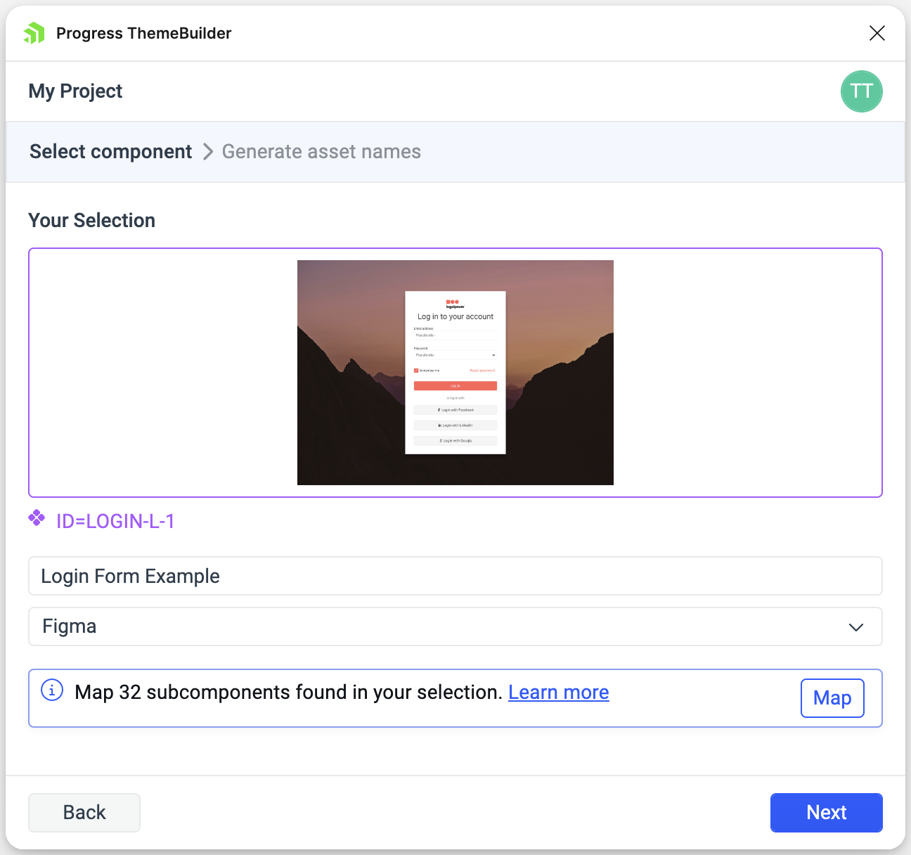
Currently, the ThemeBuilder plugin for Figma allows you to export only one component at a time.
Mapping Subcomponents (Optional)
The component you select for the export can be complex, consisting of multiple subcomponents. For instance, a form can contain inputs, labels, and buttons. With the mapping feature, you can map these inner subcomponents to existing components in your selected ThemeBuilder project. Such components could be Telerik & Kendo UI (if the project theme is based on them) or custom components.
After that, the exported HTML of the created custom component in ThemeBuilder will utilize the mapped subcomponents, instead of generating separate HTML for each one of them. To map the subcomponents, follow these steps:
Click Map to open the mapping menu.
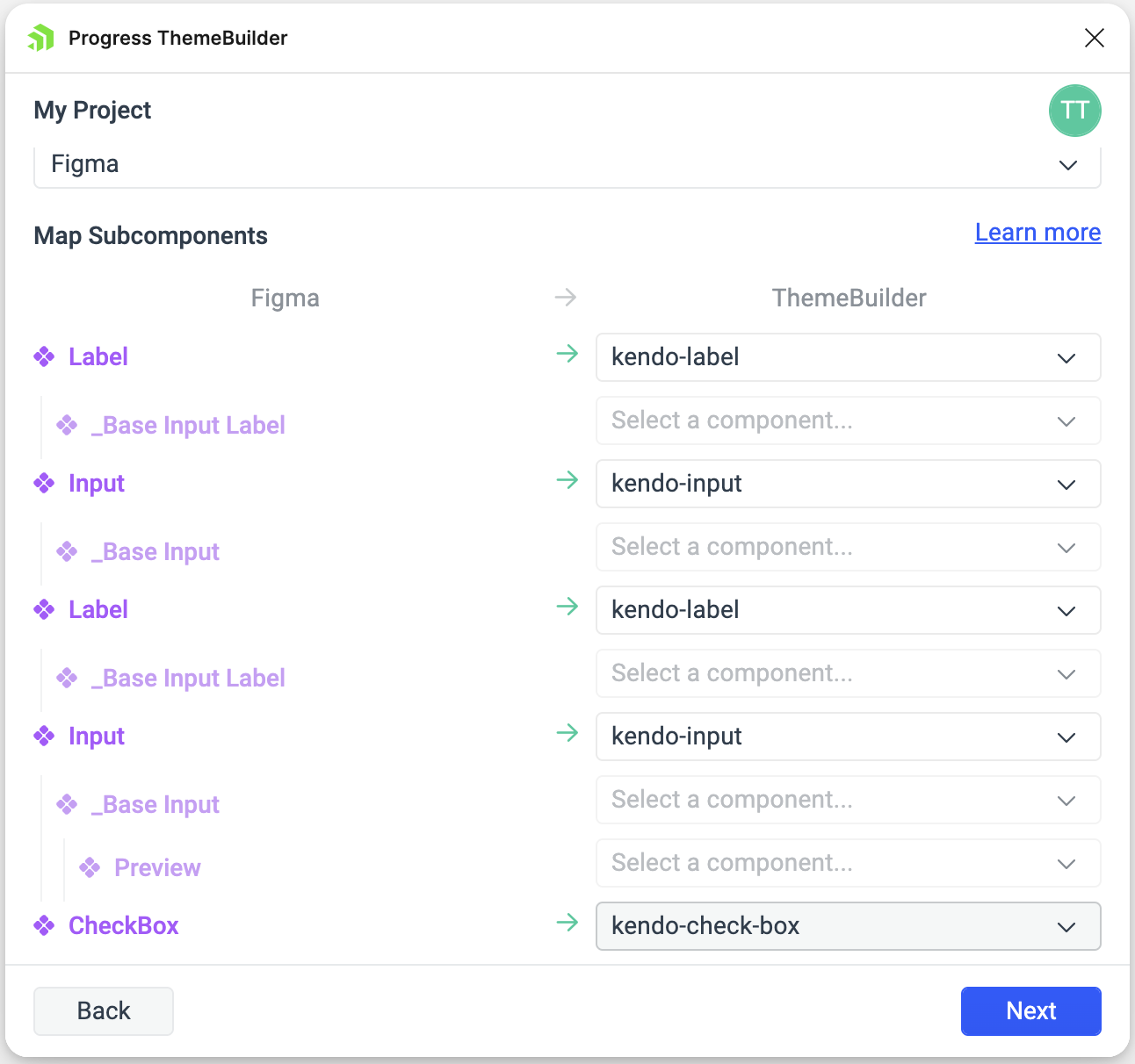
Select the subcomponents you want to reuse from the dropdowns, leaving the others unfilled.
When subcomponent is mapped, its children (if any) automatically will be disabled for further mapping, since their HTML will not be exported. You can see ths in the image below.
If the component you select to export references styles or variables that haven't been previously exported to your ThemeBuilder project, the plugin will prompt you to generate names for them. In this case, click Next to proceed. If it doesn't refer to such tokens, click Export to complete the exporting process.
Step 4: Generate Names for the Tokens
To generate names for the exported design tokens referred by the component, follow these steps:
-
Select the chips corresponding to the collection and groups you want to include. They will be appended as prefixes to the name of the token.
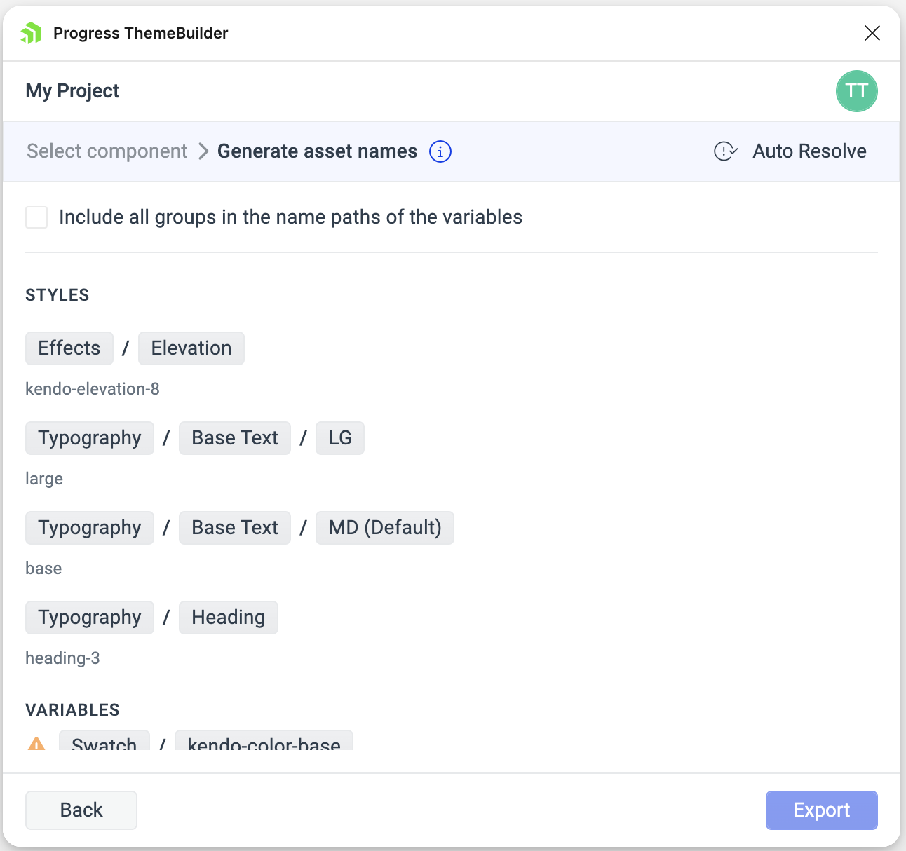
If the chosen naming scheme leads to conflicts due to some tokens sharing the same name, you will see a warning icon next to the affected token group. To resolve the issue, use either of the following approaches:
- Add more elements to the names of the affected tokens by selecting chips of additional groups in the path.
- Use the Auto Resolve button.
Click Export.
Once exported, the design components appear under the My Components section on the components canvas in ThemeBuilder.
Understanding the Export Process
During the export from Figma to ThemeBuilder, the ThemeBuilder plugin uses the names of the nodes for the components in Figma to generate class names for the HTML content. These class names serve two purposes:
- Acting as CSS selectors for the generated styles.
- Ensuring consistency between the components in ThemeBuilder and Figma when you update a component in Figma.
When you make changes to a component in Figma and re-export it to ThemeBuilder, styles with the same CSS selector are overridden to reflect the updates. For example:
- A component node in Figma named
My Button Wrapperwill be imported in ThemeBuilder as a component part with the class namemy-button-wrapper. - If the component initially has a blue background and you change it to red in Figma, re-exporting the component updates the ThemeBuilder styles for the
my-button-wrapperclass to reflect the red background automatically.
Additionally, if the exported component includes font icons, they are converted into <i> tags in the generated HTML content. If the component contains SVG icons, they are converted into <svg> tags.
Limitations
While Figma offers the freedom to make creative designs with extensive customizations, there are some limitations when translating them into code as custom HTML components and styles customizations in ThemeBuilder. Specifically:
- Figma color values: ThemeBuilder supports
solidandlinear-gradientcolor values. Other Figma color values (radial-gradient, image fill, etc.) are not exported. - Figma color styles: ThemeBuilder supports
solidandlinear-gradientFigma color styles. Other Figma color styles (radial-gradient, image fill, etc.) are not exported. - Figma variables types: ThemeBuilder allows exporting Figma
colorandnumbervariables. Other types of Figma variables are not exported and their values are used directly in custom HTML components styles. - Figma variables for not supported style properties: While Figma allows variables usage for many design customizations, ThemeBuilder supports a specific set of them. For example, Figma allows using
numbervariables for font wight, where in ThemeBuilder variable usage is not allowed for this property. In these cases, the variables values are used directly in custom HTML components styles. The list of Figma design properties with variables usage that are not supported in ThemeBuilder includes:- Font name
- Font weight
- Inner shadow - position, blur, and spread
- Drop shadow - position, blur, and spread
- Layer blur
- Background blur
- Figma nodes to HTML elements mapping - ThemeBuilder plugin currently maps Figma nodes to one of the following HTML elements -
<div>,<span>,<img>,<svg>, and<i>. - Font Awesome Official Icon Component - While designers can take advantage of easy and fast FontAwesome usage with this icons pack, these components cannot be translated to standard web font icons. Apply the recommended Figma approach for using font icons to FontAwesome to transfer them correctly to ThemeBuilder.