Icons Design Structure
To guarantee the proper export of the icons from your Figma design document to a specified ThemeBuilder project, you must follow a simple but specific design structure when drawing your SVG icons. This structure allows the ThemeBuilder plugin to correctly recognize your icons and export them as font icons to your project.
To meet the icons design structure, the ThemeBuilder plugin expects the following:
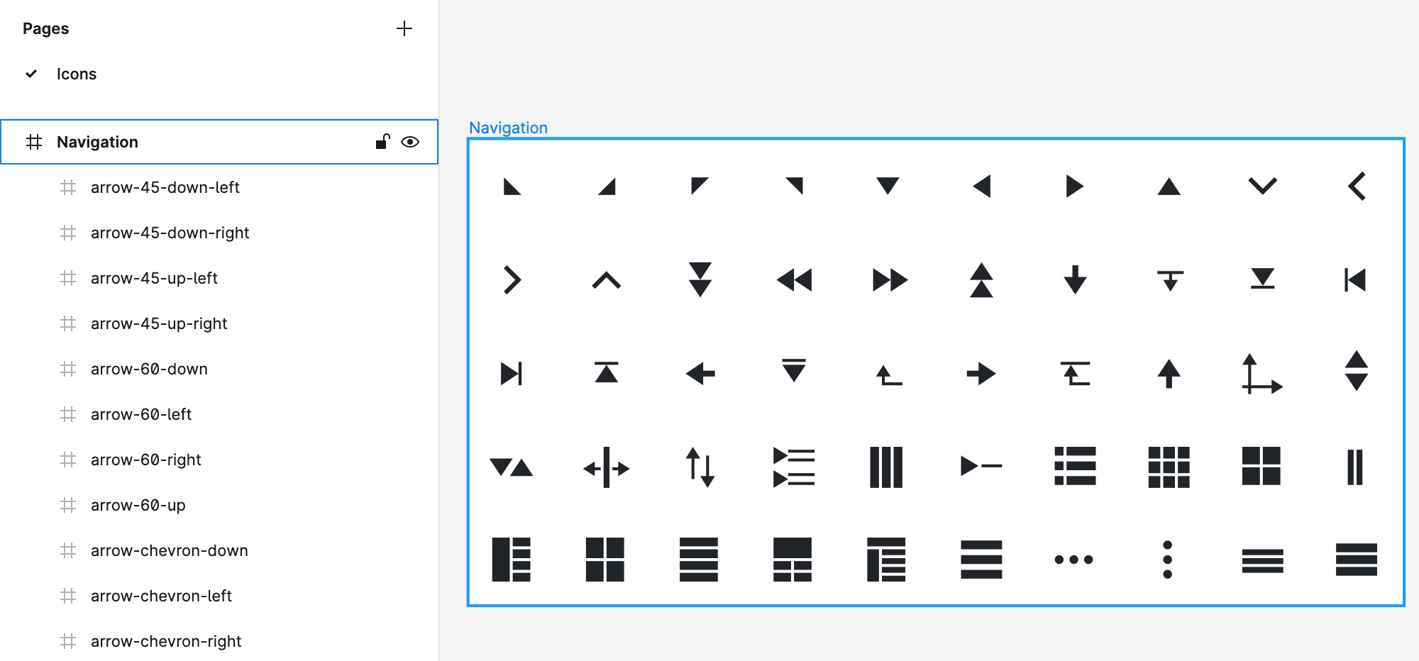
- One or several pages for your icons.
- One or several frames as direct children of the pages for the icons.
You can create a frame for each icon or logically group several icons into one frame. Each direct child of these frames will be recognized as a design icon, and the child name will be used for the icon name on export.
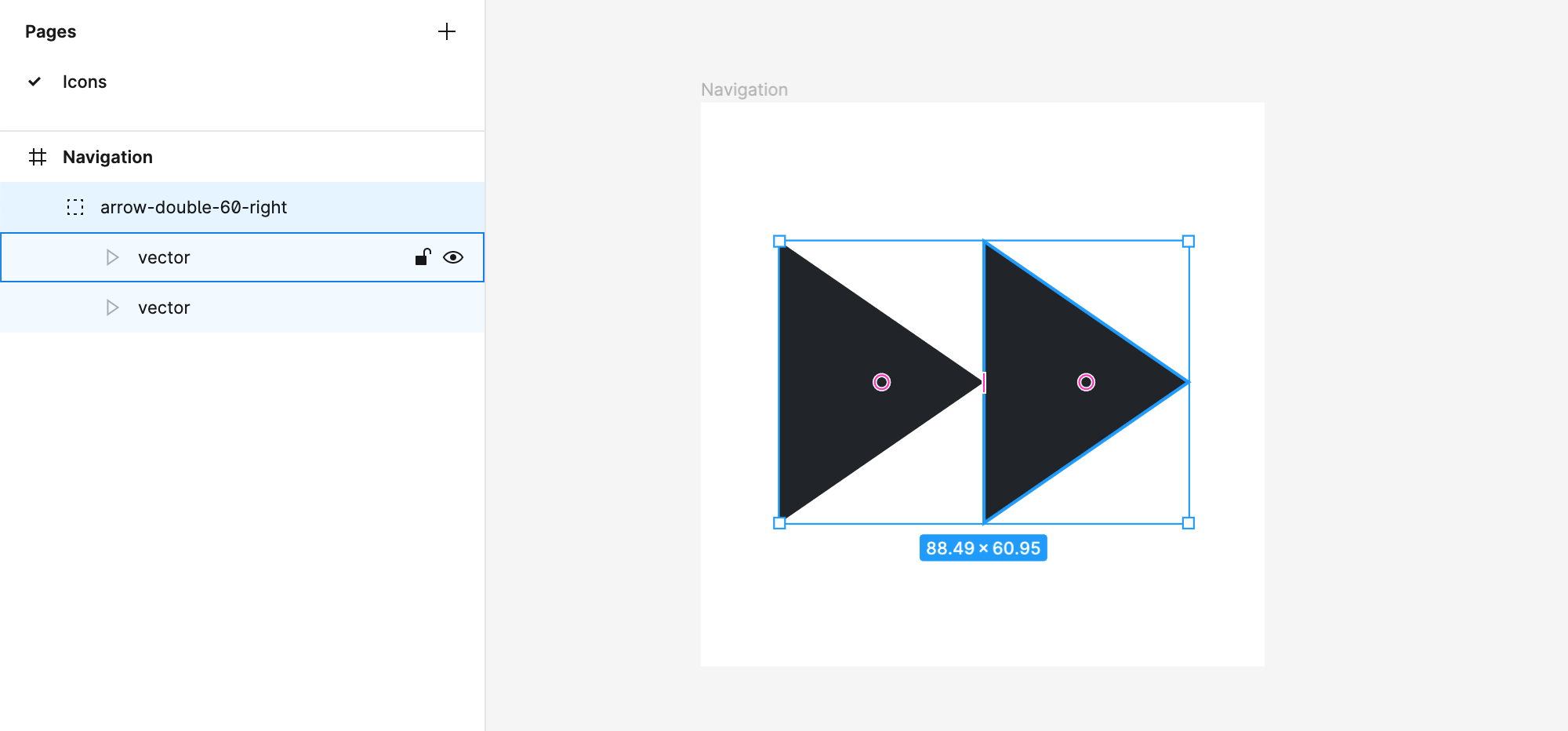
If your icon is designed with several layers and elements, you can easily group them in a single direct frame child so the group can be recognized as a single atomic icon.
When you design icons in Figma and then export them to font icons, the generated glyphs may differ from the design. As a result, the generated font icon may represent a different shape or have an unexpected color fill. The observed issue is unrelated to ThemeBuilder and has been reported by many SVG-to-font services like IconMoon, Fontello, and others. Learn how to resolve the issue here....
Creating a Sample Icon
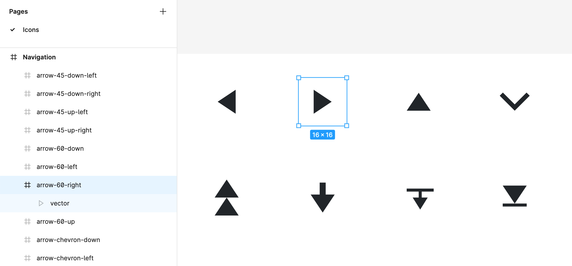
The following example demonstrates how to create an arrow-60-right navigation icon by applying the design structure that allows the seamless export of icons from Figma.
- Create a page named
Icons. - Directly on the
Iconspage, create a frame namedNavigation. - Draw your icon in the
Navigationframe as a single SVG vector. In case you use several elements, group them into a single group. - Name the SVG vector or group
arrow-60-right—this will be the name of the icon.
More Examples
Here are some more examples of proper design icons structures:
-
Icons Design—Group
-
Icons Design—Page and Frame