Creating Component Variants
Component variants in ThemeBuilder allow you to augment the collection of available component variations by adding new ones. The variants you add are based on the components that are already available in ThemeBuilder.
Out of the box, the Telerik and Kendo UI components deliver an extensive set of component variants that allow you to achieve a specific look and feel. The Button, for example, offers a number of variants based on the component's state (normal, hover, active, and others), the component's fill mode (solid, outline, and flat), the component's color theme (primary and secondary), and even more.
If the built-in variations cannot cover your requirements, you can add new component variants in two ways:
Both approaches help you achieve similar results but in a different way.
Adding Component Configuration
By adding a new component configuration, you create a new component variant by modifying the component properties provided by the theme. Such properties are, for example, size, theme color, fill mode, and border radius.
Adding component configuration is a feature first introduced with version Q2 2024 of the Telerik and Kendo UI themes. The number of UI components supporting this feature will gradually increase with the upcoming releases.
If your project is based on a Telerik and Kendo UI theme earlier than Q2 2024, the Add Configuration feature is not available.
To create a component variant by adding component configuration:
- In ThemeBuilder, select Advanced Edit.
-
Hover over the drill-down container with the desired component and select the ... button (more options).
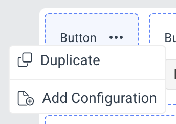
Select Add Configuration.
-
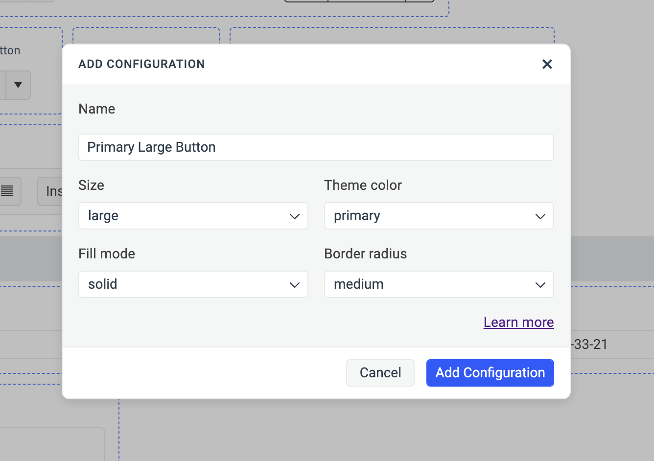
In the ADD CONFIGURATION popup:
- Enter a name for the new component variant, for example,
Primary Large Button. - Select the desired options from the dropdowns.
- Enter a name for the new component variant, for example,
Select Add Configuration to add the new component variant.
The newly created component variant with all applied options appears next to the default one. To see the applied options, select the ... button and then click See Configuration.
Duplicating a Component
When you duplicate a component, you create a new component variant by applying a new class to the existing component. You can duplicate not only the default component variants but also component variants created by adding component configuration.
To create a component variant by duplicating an existing Telerik and Kendo UI component:
- In ThemeBuilder, select Advanced Edit.
-
Hover over the drill-down container with the desired component and click the Copy icon button. If the drill-down container has a ... button, then select ... > Duplicate.
-
In the DUPLICATE popup:
- Enter a name for the new component variant, for example,
Error Button. -
Enter a class name, for example,
my-error-button—this becomes the selector for the newly created component variant.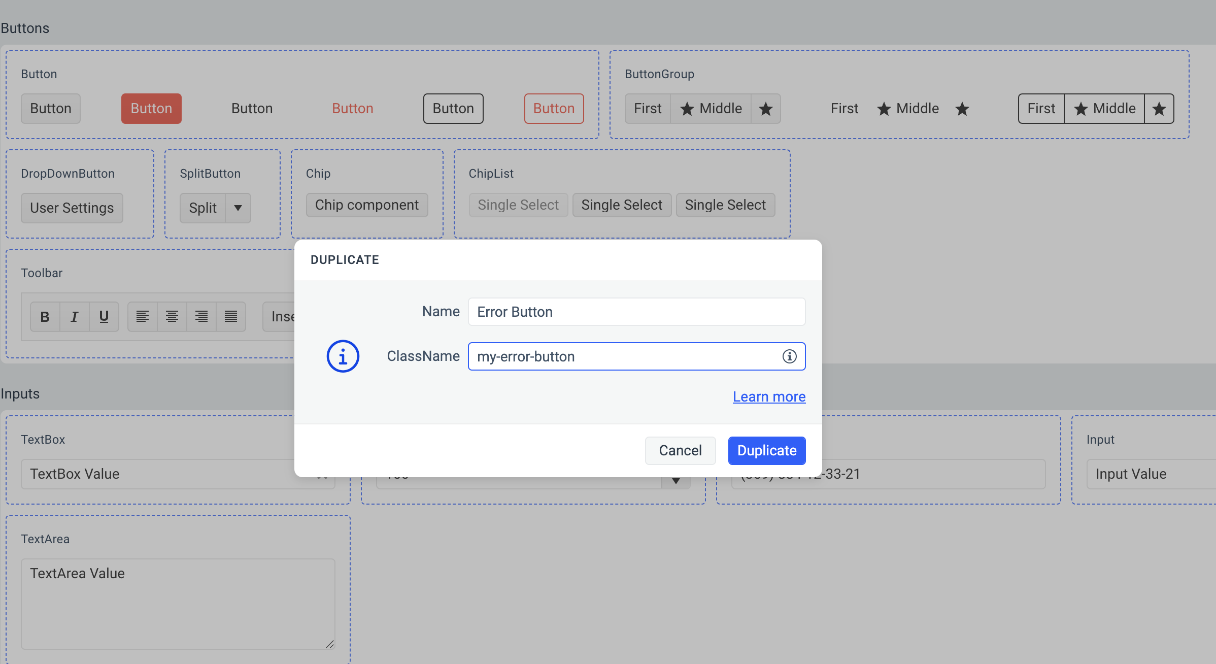
- Enter a name for the new component variant, for example,
Select Duplicate to add the new component variant.
The class name for the new component variant must be unique as it serves as a component variant selector. To deduce the complete selector for the new component variant, append the class name that you assigned to the root class of the component. For example,
.my-error-button.k-button, where the root class is.k-buttonand the class name that you assigned ismy-error-button.
Duplicating a Duplicate
You can generate additional component variants by building upon previously created and styled variants. This allows you to build upon the styles that you've already applied to a component variant. By duplicating a duplicate, you take advantage of the inheritance chain, eliminating the need to restyle the original Telerik and Kendo UI components from scratch.
To duplicate a previously created and styled component variant:
- In ThemeBuilder, select Advanced Edit.
-
Hover over your component variant and select the ... button (more options) in the upper-right corner.
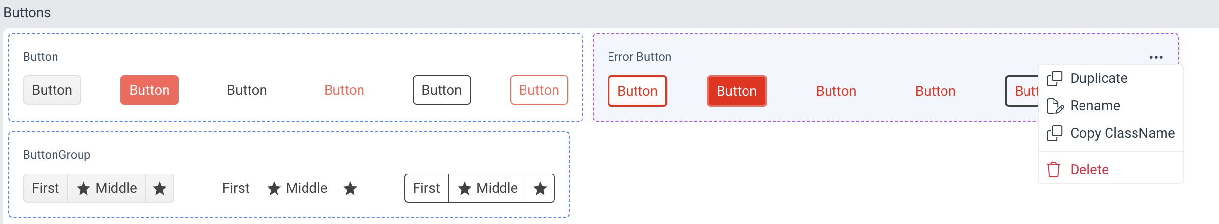
Select Duplicate from the drop-down menu.
-
In the DUPLICATE popup:
- Enter a name for the new component variant, for example,
Circle Error Button. -
Enter a class name, for example,
my-circle-error-button—this becomes the selector for the newly created component variant.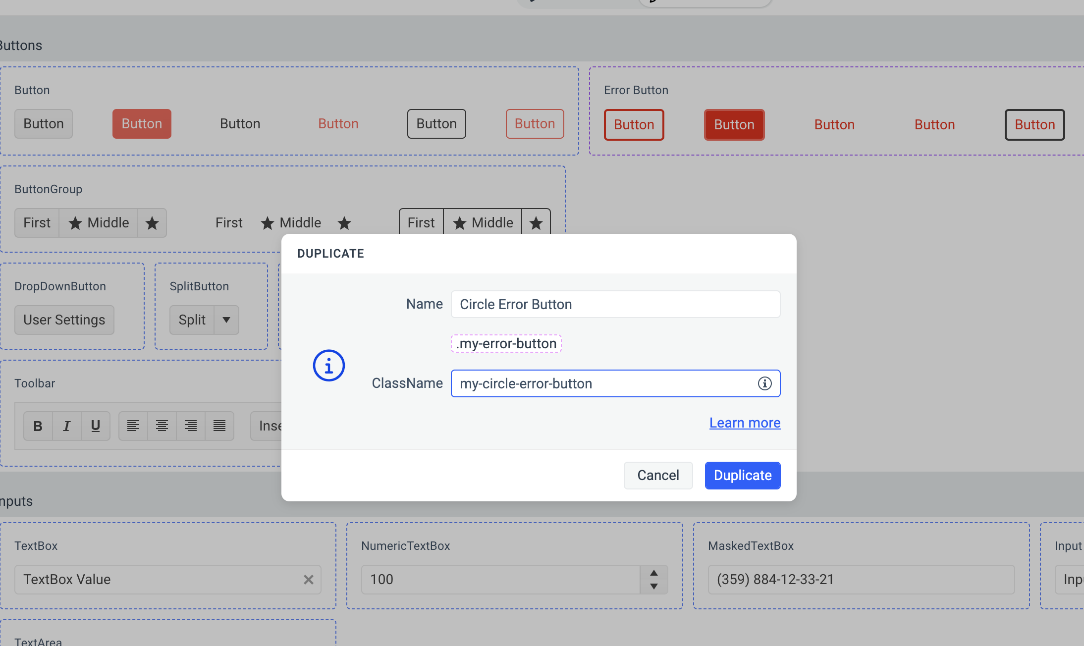
- Enter a name for the new component variant, for example,
Select Duplicate to add the new component variant.
The DUPLICATE popup displays a hint with the chained predecessor classes, for example,
.my-error-button. Use this information to deduce the complete selector for the newly created variant. For example,.my-circle-error-button.my-error-button.k-button, where.k-buttonis the selector for the root Button component,.my-error-buttonis the selector of the previously created variant, and.my-circle-error-buttonis the selector for the last variant in the chain.
Styling Component Variants
Consider the following when styling a component variant:
- Styling component variants works in the same way as with the base Telerik and Kendo UI components. For more details, see the Advanced Customization article.
- The component variant that you create inherits all styles from the duplicated component. For example, when duplicating the Button component, the new variant inherits all
.k-buttonstyles. For more information, see the article on styling strategies.
Components Supporting Added Configuration
The following components support creating new variants by adding component configuration—a feature first introduced with Telerik and Kendo UI themes version Q2 2024. These components have an Add Configuration button in their ... (more options). Every subsequent ThemeBuilder version will add more components that support this functionality.
| Component | Supports Added Configuration since |
|---|---|
| Button | Q2 2024 |
| TextBox | Q2 2024 |
When migrating projects with theme versions earlier than Q2 2024 and containing styled Button or TextBox components to projects with theme versions Q2 2024 or later, the corresponding component variants will be created automatically for you.