Scatter Charts
Scatter charts display data as points that are defined by the values of their items.
Scatter Charts are useful for displaying the relation between different sets of data (for example, scientific experimental results) and plotting two-dimensional data.
Creating the Scatter Chart
Each data point of a Scatter Chart is an array that contains the X and Y values.
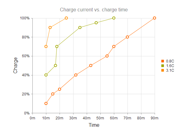
$("#chart").kendoChart({
    title: {
        text: "Charge current vs. charge time"
    },
    legend: {
        visible: true
    },
    seriesDefaults: {
        type: "scatterLine"
    },
    series: [{
        name: "0.8C",
        data: [[10, 10], [15, 20], [20, 25], [32, 40], [43, 50], [55, 60], [60, 70], [70, 80], [90, 100]]
    }, {
        name: "1.6C",
        data: [[10, 40], [17, 50], [18, 70], [35, 90], [47, 95], [60, 100]]
    }, {
        name: "3.1C",
        data: [[10, 70], [13, 90], [25, 100]]
    }],
    xAxis: {
        max: 90,
        labels: {
            format: "{0}m"
        },
        title: {
            text: "Time"
        }
    },
    yAxis: {
        max: 100,
        labels: {
            format: "{0}%"
        },
        title: {
            text: "Charge"
        }
    }
});
Setting the Line Type
The default line type of a Scatter Chart is solid. You can implement the dash line styles by using the dashType option.
series: [{ type: "scatterLine", name: "3.1C", data: [[10, 70], [13, 90], [25, 100]], dashType: "dot" }]

Removing Connecting Lines
To remove the connecting lines, specify "scatter" instead of "scatterLine".
