Line Charts
Line Charts are suitable for displaying quantitative data by using continuous lines passing through points defined by the values of their items.
Getting Started
You can use the Line Chart to render a trend over time and compare sets of similar data.
To create a Line series, use line in the series configuration.
Setting the Orientation
You can change the orientation of the Line Chart by setting the series type to verticalLine.
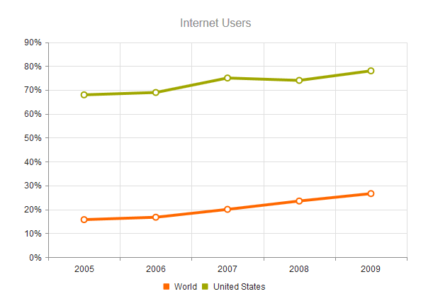
$("#chart").kendoChart({
    title: {
        text: "Internet Users"
    },
    legend: {
        position: "bottom"
    },
    seriesDefaults: {
        type: "line"
    },
    series: [{
        name: "World",
        data: [15.7, 16.7, 20, 23.5, 26.6]
    }, {
        name: "United States",
        data: [67.96, 68.93, 75, 74, 78]
    }],
    valueAxis: {
        labels: {
            format: "{0}%"
        }
    },
    categoryAxis: {
        categories: [2005, 2006, 2007, 2008, 2009]
    }
});
Configuring the Line Styles
You can render the lines between the points by setting different styles through the style option.
The supported line styles are:
- Normal—This is the default style. It produces a straight line between data points.
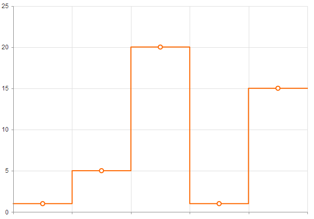
- Step—This style renders the connection between data points through vertical and horizontal lines. It is suitable for indicating that the value is constant between the changes.
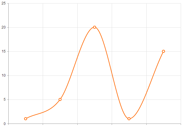
- Smooth—This style causes the Line Chart to display a fitted curve through data points. It is suitable when the data requires to be displayed with a curve, or when you wish to connect the points with smooth instead of straight lines.

The following image displays a smooth-line Line Chart.

Setting the Line Type
The default line type of a Line Chart is solid. You can implement the dash line styles by using the dashType option.
series: [{ name: "World", data: [15.7, 16.7, 20, 23.5, 26.6], dashType: "dot" }]
