Bar Charts
Bar Charts display data through horizontal or vertical bars whose lengths vary according to their value.
Getting Started
Bar Charts are suitable for displaying a comparison between sets of data—for example, a summary of unique and total site visitors over a certain period of time.
The Kendo UI Bullet Chart is a variation of a Kendo UI Bar Chart. You can use it as a replacement for dashboard gauges and meters. The bullet graph compares a given quantitative measure, such as temperature, against qualitative ranges, such as warm, hot, mild, cool, chilly, cold, and so on, and a symbol marker that encodes the comparative measure, such as the max temperature a year ago.
The Kendo UI Range Bar Chart is yet another variation of the Kendo UI Bar Chart. It displays data as bars where each bar represents a value range that spans between its minimum and maximum levels. A Range Bar type has floating bars unlike the standard Kendo UI Bar Chart that has bars that are anchored to its x-axis.
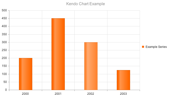
Defining the Column Chart
The Kendo UI Column Chart is the default chart rendered if a _type_ is not specified.
$("#chart").kendoChart({
    title: {
        text: "Kendo Chart Example"
    },
    series: [ {
        name: "Example Series",
        data: [200, 450, 300, 125]
    } ],
    categoryAxis:{
        categories: [ 2000, 2001, 2002, 2003 ]
    }
});
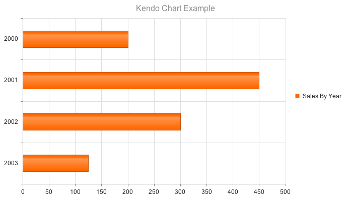
Defining the Bar Chart
Setting the type property on the series object to "bar" renders horizontal bars.
$("#chart").kendoChart({
    title: {
        text: "Kendo Chart Example"
    },
    series: [ {
        type: "bar",
        name: "Example Series",
        data: [200, 450, 300, 125]
    } ],
    categoryAxis:{
        categories: [ 2000, 2001, 2002, 2003 ]
    }
});