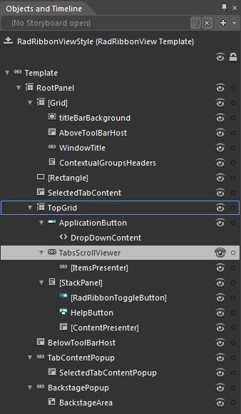
RadRibbonView Template Structure
This topic will explain you the structure of the RadRibbonView template and will describe the elements in it.
-
RootPanel - a Grid control that represents the main layout control in the RadRibbonView's template
-
[Grid] - a Grid control that hosts the RadRibbonView TitleBar elements
- titleBarBackground - a Border control that represents the background color of the RadRbbonView TitleBar
- AboveToolBarHost - a ContentPresenter that hosts the Quick Access Toolbar, when it is positioned above the RadRbbonView
- WindowTitle - a WinowTitle control that displays the RadRbbonView title and application name
- ContextualGroupsHeaders - a StackPanel control hosting the headers of the RadRbbonView RadRibbonContextualGroups
[Rectangle] - a Rectangle control representing the RadRibbonView background color
SelectedTabContent - a ContentPresenter control that displays the content of the selected RadRibbonTab.
-
TopGrid - a Grid control hosting the ApplicationButton, the HelpButton and the MinimizeButton as well as the RadRibbonTabs Headers
- ApplicationButton - a RadRibbonDropDownButton that represents the ApplicationButton
-
TabsScrollViewer - a RibbonScrollViewer control that hosts the RadRibbonTab Headers
- [ItemsPresenter] - an ItemsPresenter control used to display the RadRibbonTabs Headers
-
[StackPanel] - a StackPanel control hosting the HelpButton and the MinimizeButton
- [RadRibbonToggleButton] - a RadRibbonToggleButton control representing the MinimizeButton
- HelpButton - a RadRibbonButton control representing the MinimizeButton
- [ContentPresenter] - a ContentPresenter control that hosts the TabStripAdditionalContent
- BelowToolBarHost - a ContentPresenter that hosts the Quick Access Toolbar, when it is positioned below the RadRbbonView
-
TabContentPopup - a Popup control that is used to display the selected RadRibbonTab content, when the RadRbbonView is minimized
- SelectedTabContentPopup - a ContentPresenter control that displays the content of the selected RadRibbonTab, when the RadRbbonView is minimized
-
BackstagePopup - a Popup control that is used to display the RadRibbonBackstage menu
-
BackstageArea - a Canvas control that hosts the RadRibbonBackstage menu
-
BackstageArea - a Canvas control that hosts the RadRibbonBackstage menu
-