Styling the Ribbon GroupChrome
In order to style the GroupChrome control, which represents the uncollapsed group, you have to generate the default style for the RadRibbonGroup
and modify its template. To see how to do it take a look at the Styling the Ribbon Group topic.
From the resources generated for the RadRibbonGroup's style modify the RadRibbonGroupStyle, by clicking on its icon.
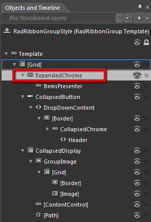
It will be loaded in the 'Objects and Timeline' pane. Right-click on it and choose Edit Template -> Edit Current. In the 'Objects and Timeline' the parts of the RadRibbonGroup's template will get loaded. Select the part called ExpandedChrome.
After generating the RadRibbonGroup's default template and loading it in the 'Objects and Timeline' pane, select the ExpandedChrome control.
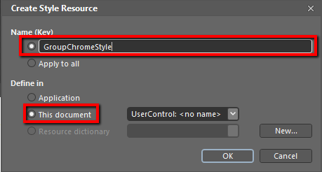
Right-click on it and choose Edit Template -> Edit a Copy. Expression Blend will wrap the template in a style and set it to the GroupChrome control. You will be for the name of the style and where to be placed.
If you choose to define the style in Application, it would be available for the entire application. This allows you to define a style only once and then reuse it where needed.
After clicking 'OK', Expression Blend will generate the default style of the GroupChrome control in the Resources section of your User Control.
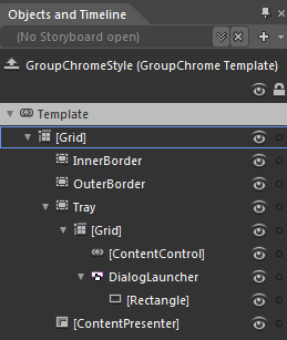
The template for the GroupChrome control will be loaded in the 'Objects and Timeline' pane.
Change the elements' properties until you get the desired look.
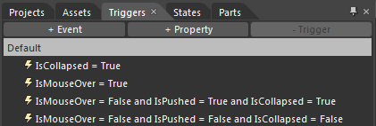
You can also modify the triggers defined for the GroupChrome. They are located in the 'Triggers' pane.