Styling the RadRibbonGroup
The RadRibbonGroup can be styled by creating an appropriate Style and setting it to the Style property of the control.
You have two options:
- To create an empty style and set it up on your own.
- To copy the default style of the control and modify it.
This topic will show you how to perform the second one.
Modifying the Default Style
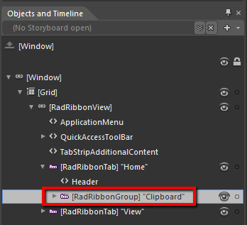
In order to copy the default style, load your project in Expression Blend and open the User Control that holds the RadRibbonView. In the 'Objects and Timeline' pane select the RadRibbonGroup you want to style.
From the menu choose Object -> Edit Style -> Edit a Copy. You will be prompted for the name of the style and where to be placed.
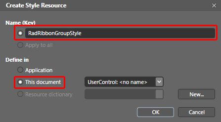
If you choose to define the style in Application, it would be available for the entire application. This allows you to define a style only once and then reuse it where needed.
After clicking 'OK', Expression Blend will generate the default style of the RadRibbonGroup control in the Resources section of your User Control. The properties available for the style will be loaded in the 'Properties' pane and you will be able to modify their default values.
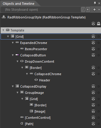
You can modify these properties to achieve the desired appearance. However the most of the visual parts of the RadRibbonGroup have to be styled in the template of it. To modify it select the style in the 'Objects and Timeline' pane, right-click on it and choose Edit Template -> Edit Current. In the same pane the element parts for the RadRibbonGroup's template will get loaded.
Change the elements' properties until you get the desired look.
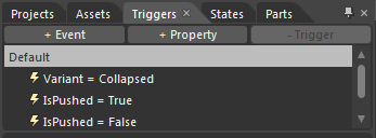
You can also modify the triggers defined for the RadRibbonGroup. They are located in the 'Triggers' pane.