Styling the ContextualTabs
The RadRibbonView ContextualTabs are of type RadRibbonTab and they can be styled by creating an appropriate Style and setting it to the RadRibbonView.ContextualTabsStyle property.
You have two options:
- To create an empty style and set it up on your own.
- To copy the default style of the control and modify it.
This topic will show you how to perform the second one.
Modifying the Default Style
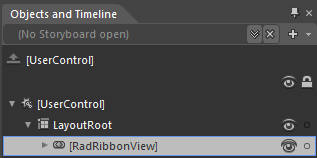
To copy the default style, load your project in Expression Blend and open the User Control that holds the RadRibbonView. In the 'Objects and Timeline' pane select the RadRibbonView whose ContextualTabs you want to style.
From the menu choose Object -> Edit Additional Templates -> Edit ContextualTabsStyle -> Edit a Copy.
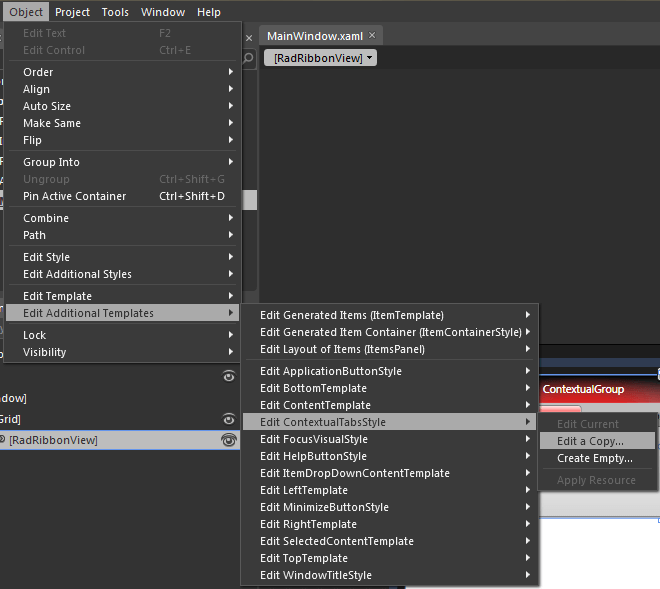
You will be prompted for the name of the style and where to be placed.
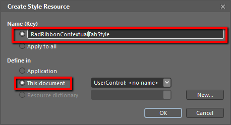
If you choose to define the style in Application, it would be available for the entire application. This allows you to define a style only once and then reuse it where needed.
After clicking 'OK', Expression Blend will generate the default style of the RadRibbonView ContextualTabs in the Resources section of your User Control. The properties available for the style will be loaded in the 'Properties' pane and you will be able to modify their default values.
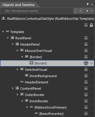
In the 'Objects and Timeline' pane the element parts for the ContextualTab's template will get loaded.
-
RootPanel - a Grid control that represents the main layout control in the ContextualTab's template.
-
HeaderPanel - a Grid control that hosts the ContextualTab.Header elements
-
MouseOverVisual - a Border control that represents the outer border of the ContextualTab.Header, when the mouse is over it
-
[Border] - a Border control that represents the inner border of the ContextualTab.Header, when the mouse is over it
-
[Border] - a Border control that represents the background of the ContextualTab.Header, when the mouse is over it
-
[Border] - a Border control that represents the background of the ContextualTab.Header, when the mouse is over it
-
-
SelectedVisual - a Border control that represents the outer border of the ContextualTab.Header, when it is selected
-
InnerBackground- a Border control that represents the background and the inner border of the ContextualTab.Header, when it is selected
-
InnerBackground- a Border control that represents the background and the inner border of the ContextualTab.Header, when it is selected
HeaderElement - a TabItemContentPresenter control the represents the content of the ContextualTab.Header
-
-
ContentPanel - a Grid control that hosts the ContextualTab.Content elements
-
OuterBorder - a Border control that represents the background and the outer border of the ContextualTab.Content
-
InnerBorder - a Border control that represents the inner border of the ContextualTab.Content
-
[RibbonScrollViewer] - a RibbonScrollViewer control that hosts the ContextualTab.Content
- [ItemsPresenter] - an ItemsPresenter control used to display the ContextualTab.Content
-
-
-
-
If you want to modify the default style of the RibbonScrollViewer control, you can follow the approach described in this article.