Styling the ApplicationButton
To style the ApplicationButton of the RadRibbonView you can set an appropriate Style to the RadRibbonView.ApplicationButtonStyle property. In order to modify the default style of the ApplicationButton you can:
Create an empty style and set it up on your own
Modify some of the properties generated for the RadRibbonView's style.
Modify the default style of the ApplicationButton
This article will demonstrate how to implement the last two approaches.
Modifying the properties generated for the RadRibbonView's style.
The RadRibbonViewControlTemplate contains an ApplicationButton element of type RadRibbonDropDownButton control, that represents the ApplicationButton. You can find more info about the RadRibbonViewControlTemplate elements in the TemplateStructure topic.
Modifying the default style of the ApplicationButton
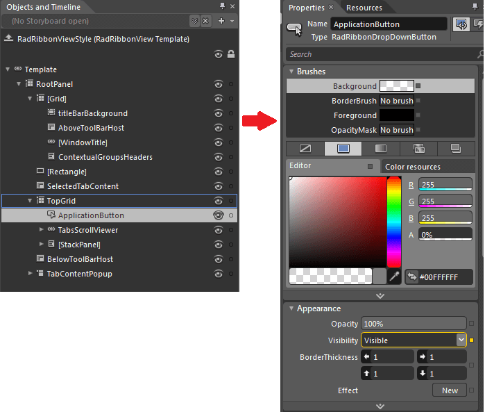
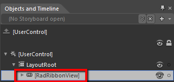
To copy the default style of the ApplicationButton, load your project in Expression Blend and open the UserControl that holds the RadRibbonView. In the 'Objects and Timeline' pane select the RadRibbonView, whose ApplicationButton you want to style.
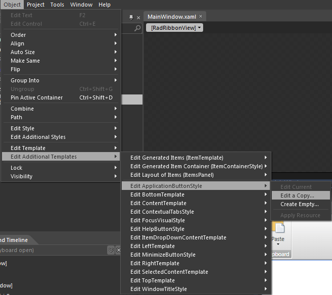
From the menu choose Object -> Edit Additional Templates -> Edit ApplicationButtonStyle -> Edit a Copy.
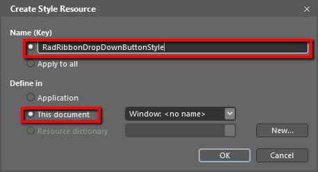
You will be prompted for the name of the style and where to be placed.
After clicking 'OK', Expression Blend will generate the default template of the ApplicationButton control in the Resources section of your User Control. The properties available for the template's elements will be loaded in the 'Properties' pane and you will be able to modify their default values.
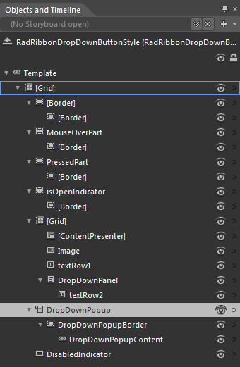
ApplicationButton default ControlTemplate structure
-
[Grid] - a Grid control, that represents the main layout control in the ApplicationButton's template.
-
[Border] - a Border control that represents the background of the ApplicationButton.
-
[Border] - a Border control that represents the inner background of the ApplicationButton.
-
[Border] - a Border control that represents the inner background of the ApplicationButton.
-
MouseOverPart - a Border control that represents the background of the ApplicationButton, when the mouse is over it.
-
[Border] - a Border control that represents the inner background of the ApplicationButton, when the mouse is over it
-
[Border] - a Border control that represents the inner background of the ApplicationButton, when the mouse is over it
-
PressedPart - a Border control that represents the background of the ApplicationButton, when the button is pressed.
-
[Border] - a Border control that represents the inner background of the ApplicationButton, when the button is pressed.
-
[Border] - a Border control that represents the inner background of the ApplicationButton, when the button is pressed.
-
IsOpenIndicator - a Border control that represents the background of the ApplicationButton, when the application/backstage menu is open
-
[Border] - a Border control that represents the inner background of the ApplicationButton, when the application/backstage menu is open
-
[Border] - a Border control that represents the inner background of the ApplicationButton, when the application/backstage menu is open
-
[Grid] - a Grid control that hosts the ApplicationButton content
- [ContentPresenter] - a ContentPresenter control, that is used to display the ApplicationButton content
- Image - an Image control that represents the ApplicationButtonImage
- textRow1 - a TextBlock control that represents the content of the ApplicationButton
-
DropwDownPanel - a StackPanel control hosting the second row of the ApplicationButton content
- textRow2 - a TextBlock control that represents the second row of the content of the ApplicationButton
-
DropDownPopup - is a Popup control that hosts the DropDownContent (ApplicationMenu/BackstageMenu) of the ApplicationButton
-
DropDownPopupBorder - is a Border control that represents the background color of the ApplicationButton DropDownContent
- DropDownPopupContent - is a ContentControl hosthe ApplicationButton DropDownContent (ApplicationMenu/BackstageMenu)
-
DisabledIndicator - is a Rectangle that represents the background of the ApplicationButton, when it is disabled(ApplicationMenu/BackstageMenu)
-