Styling the QuickAccessToolbar
The RadRibbonView QuickAccessToolBar control can be styled by creating an appropriate Style and setting it to the Style property of the control.
You have two options:
- To create an empty style and set it up on your own.
- To copy the default style of the control and modify it.
This topic will show you how to perform the second one.
Modifying the Default Style
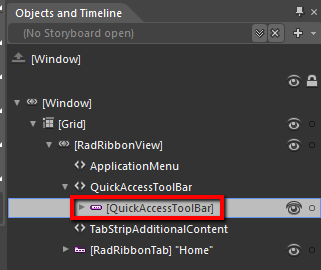
In order to copy the default style, load your project in Expression Blend and open the User Control that holds the RadRibbonView. In the 'Objects and Timeline' pane select the QuickAccessToolBar you want to style.

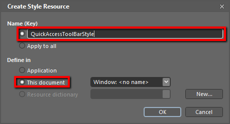
From the menu choose Object -> Edit Style -> Edit a Copy. You will be prompted for the name of the style and where to be placed.

If you choose to define the style in Application, it would be available for the entire application. This allows you to define a style only once and then reuse it where needed.
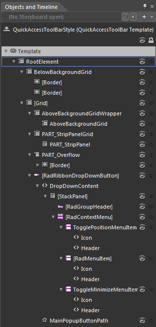
After clicking 'OK', Expression Blend will generate the default style of the QuickAccessToolBar control in the Resources section of your User Control. The properties available for the style will be loaded in the 'Properties' pane and you will be able to modify their default values.
You can modify these properties to achieve the desired appearance. However the most of the visual parts of the QuickAccessToolBar have to be styled in the template of it. To modify it select the style in the 'Objects and Timeline' pane, right-click on it and choose Edit Template -> Edit Current. In the same pane the element parts for the QuickAccessToolBar's template will get loaded.

Change the elements' properties until you get the desired look.
You can also modify the trigger defined for the QuickAccessToolBar. It is located in the 'Triggers' pane.
Styling QuickAccessToolbar items using ItemContainerStyleSelector
With R1 2017 we introduced predefined styles inside QuickAccessToolbar, so in order to style its items you can use QuickAccessToolbar's ItemContainerStyleSelector property.
First, define a RadRibbonView with a QuickAccessToolbar:
Example 1: RadRibbonView with QuickAccessToolbar
 <telerik:RadRibbonView ApplicationButtonContent="File">
    <telerik:RadRibbonView.QuickAccessToolBar>
        <telerik:QuickAccessToolBar>
           <telerik:RadRibbonButton Text="Save" Foreground="White" />
            <telerik:RadRibbonButton Text="Print" Foreground="White"/>
        </telerik:QuickAccessToolBar>
    </telerik:RadRibbonView.QuickAccessToolBar>
</telerik:RadRibbonView>
Then you will need a custom StyleSelector, which will choose a style for the RadRibbonButtons based on their text:
Example 2: Define ItemContainerStyleSelector
public class QATItemContainerStyleSelector : StyleSelector
{
    public Style SaveStyle { get; set; }
    public Style PrintStyle { get; set; }

    public override Style SelectStyle(object item, DependencyObject container)
    {
        var button = item as RadRibbonButton;
        if (button != null)
        {
            if(button.Text == "Save")
            {
                return this.SaveStyle;
            }
            else if(button.Text == "Print")
            {
                return this.PrintStyle;
            }
        }

        return base.SelectStyle(item, container);
    }
}
Public Class QATItemContainerStyleSelector
    Inherits StyleSelector
    Public Property SaveStyle() As Style
        Get
            Return m_SaveStyle
        End Get
        Set
            m_SaveStyle = Value
        End Set
    End Property
    Private m_SaveStyle As Style
    Public Property PrintStyle() As Style
        Get
            Return m_PrintStyle
        End Get
        Set
            m_PrintStyle = Value
        End Set
    End Property
    Private m_PrintStyle As Style

    Public Overrides Function SelectStyle(item As Object, container As DependencyObject) As Style
        Dim button = TryCast(item, RadRibbonButton)
        If button IsNot Nothing Then
            If button.Text = "Save" Then
                Return Me.SaveStyle
            ElseIf button.Text = "Print" Then
                Return Me.PrintStyle
            End If
        End If

        Return MyBase.SelectStyle(item, container)
    End Function
End Class
Finally, you shold define the two custom styles and assign the QATItemContainerStyleSelector to the ItemContainerStyleSelector property of the QuickAccessToolBar.
Example 3: Define custom styles and set ItemContainerStyleSelector
<Style x:Key="PrintStyle" TargetType="telerik:RadRibbonButton" BasedOn="{StaticResource RadRibbonButtonStyle}">
        <Setter Property="Background" Value="Red" />
        <Setter Property="Size" Value="Medium" />
</Style>

<Style x:Key="SaveStyle" TargetType="telerik:RadRibbonButton" BasedOn="{StaticResource RadRibbonButtonStyle}">
        <Setter Property="Background" Value="Blue" />
        <Setter Property="Size" Value="Medium" />
</Style>

<local:QATItemContainerStyleSelector x:Key="QATItemContainerStyleSelector"
                PrintStyle="{StaticResource PrintStyle}"
                SaveStyle="{StaticResource SaveStyle}" />

<Style BasedOn="{StaticResource QuickAccessToolBarStyle}" TargetType="telerik:QuickAccessToolBar">
    <Setter Property="ItemContainerStyleSelector" Value="{StaticResource QATItemContainerStyleSelector}" />
</Style>
This example is implemented with NoXaml Binaries and the styles are based on the default styles for the theme.
Figure 1: QuickAccessToolBar styled with ItemContainerStyleSelector

