Selection
The selection in the AutoCompleteBox will display the property of the selected item to which the DisplayMemberPath points.
Figure 1: Default Selection

Furthermore, the control exposes the following properties and events for handling the user selection.
- SelectedItem: Gets or sets the data item that is selected.
- SelectedItems: Gets the data items that participate in the selection. It is useful in case multiple selection is used.
- SelectedValue: Gets or sets the selected property value.
- SelectedIndex: Gets or sets the index of the selected item.
- SelectedValuePath: Gets or sets the property path of the property used for the selected value.
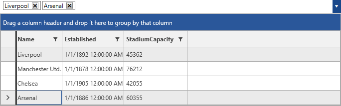
Multiple Selection
By default, RadMultiColumnComboBox will perform a single selection. In order to enable a multiple selection, the SelectionMode of the control can be set to Multiple.
Example 1: Setting the SelectionMode to Multiple
<telerik:RadMultiColumnComboBox VerticalAlignment="Top" DisplayMemberPath="Name" SelectionMode="Multiple">
        <telerik:RadMultiColumnComboBox.ItemsSourceProvider>
            <telerik:GridViewItemsSourceProvider ItemsSource="{Binding Clubs, Source={StaticResource MyViewModel}}"/>
        </telerik:RadMultiColumnComboBox.ItemsSourceProvider>
    </telerik:RadMultiColumnComboBox>
Figure 2: Multiple Selection
SelectionChanged event
Each time a select or deselect operation is applied, the SelectionChanged event will be fired.
Example 2: Handling the SelectionChanged event
    private void RadMultiColumnComboBox_SelectionChanged(object sender, SelectionChangeEventArgs e)
    {

    }
The event arguments expose the following collections.
- AddedItems: a collection of the item(s) that has/have been added to the selection
- RemovedItems: a collection of the item(s) that has/have been removed from the selection