SelectionBox Styles And Templates
RadMultiColumnComboBox exposes API for controlling the appearance of its SelectionBoxes. This can be achieved through the following mechanisms.
The Visibility of the SelectionBoxes can be controlled through the SelectionBoxesVisibility enumeration. By default they will be visible.
SelectionBoxStyle
Styling the SelectionBoxes can be achieved by defining a Style targeting the SearchAutoCompleteBoxItem element. In case when it needs to be applied as an explicit one, the SelectionBoxStyle property of RadMultiColumnComboBox comes in handy.
Example 1: Defining a Style targeting the SearchAutoCompleteBoxItem element
<Window.Resources>
    <Style TargetType="telerik:SearchAutoCompleteBoxItem" x:Key="selectionBoxStyle">
        <Setter Property="Background" Value="Red"/>
    </Style>
</Window.Resources>

 <telerik:RadMultiColumnComboBox SelectionBoxStyle="{StaticResource selectionBoxStyle}"/>
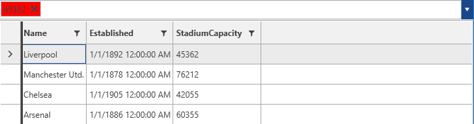
Figure 1: Setting a Background for the SelectionBox
SelectionBoxStyleSelector
The SelectionBoxStyleSelector can be used in cases when a conditional Style for each SelectionBox is needed. For the purpose of this example the following implementation will be used.
Example 2: Implementing a SelectionBoxStyleSelector
public class MySelectionBoxStyleSelector: StyleSelector
{
    public override Style SelectStyle(object item, DependencyObject container)
    {
        if (item is Club)
        {
            Club club = item as Club;
            if (club.StadiumCapacity > 50000)
            {
                return BigStadiumStyle;
            }
            else
            {
                return SmallStadiumStyle;
            }
        }
        return null;
    }
    public Style BigStadiumStyle { get; set; }
    public Style SmallStadiumStyle { get; set; }
}
Example 3: Adding the StyleSelector in XAML
 <Window.Resources>
    <my:MySelectionBoxStyleSelector x:Key="selectionBoxStyleSelector">
        <my:MySelectionBoxStyleSelector.BigStadiumStyle>
            <Style TargetType="telerik:SearchAutoCompleteBoxItem">
                <Setter Property="Background" Value="Red"/>
            </Style>
        </my:MySelectionBoxStyleSelector.BigStadiumStyle>
        <my:MySelectionBoxStyleSelector.SmallStadiumStyle>
            <Style TargetType="telerik:SearchAutoCompleteBoxItem">
                <Setter Property="Background" Value="Yellow"/>
            </Style>
        </my:MySelectionBoxStyleSelector.SmallStadiumStyle>
    </my:MySelectionBoxStyleSelector>
</Window.Resources>

 <telerik:RadMultiColumnComboBox SelectionBoxStyleSelector="{StaticResource selectionBoxStyleSelector}"/>
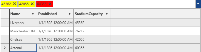
The final result will be similar to the one illustrated below.
Figure 2: RadMultiColumnComboBox with applied SelectionBoxStyleSelector
SelectionBoxTemplate
The SelectionBoxTemplate can be used in case a custom control needs to be defined as a template for the SelectionBox. It can be applied through the SelectionBoxTemplate property of RadMultiColumnComboBox.
Example 4: Defining a SelectionBoxTemplate
<DataTemplate x:Key="selectionBoxTemplate">
        <TextBox Text="{Binding ., Mode=TwoWay}"/>
</DataTemplate>
SelectionBoxTemplateSelector
Through the SelectionBoxTemplateSelector a different data template can be applied conditionally for the SelectionBoxes. An implementation similar to the one for the SelectionBoxStyleSelector can be used.
Example 5: Implementing a SelectionBoxTemplateSelector
public class MyCellTemplateSelector : DataTemplateSelector
{
    public override System.Windows.DataTemplate SelectTemplate(object item, System.Windows.DependencyObject container)
    {
        if (item is Club)
        {
            Club club = item as Club;
            if (club.StadiumCapacity > 50000)
            {
                return bigStadium;
            }
            else
            {
                return smallStadium;
            }
        }
        return null;
    }
    public DataTemplate bigStadium { get; set; }
    public DataTemplate smallStadium { get; set; }
}
The, the SelectionBoxTemplateSelector can be added similarly to the SelectionBoxStyleSelector.