Key Properties and Methods
The article lists the most important properties and methods of RadMultiColumnComboBox.
Text Change Without Delay
By default, the reaction of RadMultiColumnComboBox to a text change will be deferred. In case when updating needs to be done immediately, the DeferTextChange property can be set to False.
Disable Items Highlighting
With all settings for its AutoCompleteMode, RadMultiColumnComboBox will highlight its items. This can be switched off by setting the HighlightMatches property to False.
Setting Text for an Empty Selection
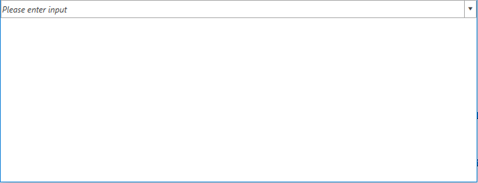
When there is no selection applied, the control will display an empty AutoCompleteBox. In case a custom text needs to be displayed in it, the NullText property comes in handy.
Example 1: Setting the NullText property
<telerik:RadMultiColumnComboBox VerticalAlignment="Top" DisplayMemberPath="Name"
                                     NullText="Please enter input">
        <telerik:RadMultiColumnComboBox.ItemsSourceProvider>
            <telerik:GridViewItemsSourceProvider ItemsSource="{Binding Clubs, Source={StaticResource MyViewModel}}"/>
        </telerik:RadMultiColumnComboBox.ItemsSourceProvider>
    </telerik:RadMultiColumnComboBox>
Figure 1: MultiColumnComboBox with NullText set
Open,Close and Toggle the DropDown
The following set of methods is provided for manipulating the visibility of the DropDown.
- OpenDropDown: Opens the DropDown if it is closed.
- CloseDropDown: Closes the DropDown if it is opened.
- ToggleDropDown: Toggles the opened/closed state of the DropDown.
DropDownElementStyle
Since R1 2019 SP1, RadMultiColumnComboBox exposes the DropDownElementStyle property. Through it, you can get or set a Style that will be applied to the dropdown element.
The TargetType of the Style should match the type of the dropdown element.
Search Mode
With R2 2019 we introduced a new SearchMode property which allows you to control how items are matched when search is executed. It has the following two possible values:
-
MatchAnyTerm: Items match the search operation when they fulfill any of the search terms. For example, if
John Terryis inputted, items containing any of the terms "John" and "Terry" in any of their properties will be matched. This is the default value. -
MatchAllTerms: Items match the search operation only when they fulfill all of the search terms. Continuing with the previous example, if
John Terryis entered as the search text, only items which contain both terms ("John" and "Terry") in any of their properties will be matched.
The SearchMode property takes effect only if the AutoCompleteMode of the control is Search.
SelectionOnFocus
With the R3 2020 SP1 version, the SelectionOnFocus property of the RadMultiColumnComboBox control was introduced, which allows you to specify what will happen with the cursor when the control gets focus.
This property is respected when the SelectionBoxesVisibility property is set to Collapsed.
The values for the SelectionOnFocus property are predefined in the SelectionOnFocus enumeration. It exposes the following members:
SelectAll: Once the control is focused, it will select its whole text.
CaretToBeginning: Once the control is focused, the cursor will be positioned at its beginning.
CaretToEnd: Once the control is focused, the cursor will be positioned at its end.
Unchanged: Once the control is focused, the cursor's position won't be changed. This is the default value for the SelectionOnFocus property.
Default: Once the control is focused, the cursor will be positioned at its end.
DefaultSelectAll: This property changes the SelectionOnFocus behavior of the control depending on the source of the focus. If the control is focused on mouse click, the Default SelectionOnFocus behavior will be used. If, on the other hand, the control is focused using the Tab key, the SelectAll SelectionOnFocus behavior will be used.