DropDown Properties
This article describes the set of properties that can be used for manipulating the DropDown of RadMultiColumnComobBox.
- Height of the DropDown
- Width of the DropDown
- Set Min and Max Height or Width of the DropDown
- Disable DropDown Resizing
- Keep the DropDown Open
- Open the DropDown on Input
- Position of the DropDown
- Closing the DropDown when Selecting
Height of the DropDown
The Height of the DropDown element can be set through the DropDownHeight property.
Example 1: Setting the DropDownHeight property
 <telerik:RadMultiColumnComboBox DisplayMemberPath="Name" DropDownHeight="200">
        <telerik:RadMultiColumnComboBox.ItemsSourceProvider>
            <telerik:GridViewItemsSourceProvider ItemsSource="{Binding Orders}" />
        </telerik:RadMultiColumnComboBox.ItemsSourceProvider>
    </telerik:RadMultiColumnComboBox>
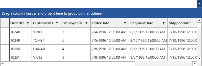
Figure 1: Setting the DropDownHeight property
Width of the DropDown
The Width of the DropDown element can be set through the DropDownWidth property.
Set Min and Max Height or Width of the DropDown
The minimum and maximum Width or Height space that the DropDown can take can be controlled by the following set of properties.
-
DropDownMaxHeight
- DropDownMaxWidth
- DropDownMinHeight
- DropDownMaxHeight
Disable DropDown Resizing
By default, the user is able to resize the DropDown of the control. This can be altered by setting the boolean CanUserResizeDropDown property of the control to False.
Keep the DropDown Open
When the DropDown of RadMultiColumnComboBox is opened, it will be closed on losing focus. In order to keep it open the KeepDropDownOpen property can be set to True.
Open the DropDown on Input
When receiving an input in the AutoCompleteBox the control will automatically open its DropDown. To disable this, the OpenDropDownOnInput property can be set to False.
Position of the DropDown
RadMultiColumnComboBox provides a predefined set of options for setting the position of the DropDown. They are exposed through the DropDownPlacement property. It is a PlacementMode enumaration and has the following values.
- Absolute
- AbsolutePoint
- Bottom
- Center
- Left
- Mouse
- MousePoint
- Relative
- RelativePoint
- Right
- Top
Closing the DropDown when Selecting
The CloseDropDownAfterSelectionInput property is respected only in Single SelectionMode
By default, the DropDown of RadMultiColumnComboBox will be kept open when the user performs selection. The CloseDropDownAfterSelectionInput property of RadMultiColumnComboBox can be used in order to close the DropDown each time the user applies a new selection. This can be achieved by setting its value to True.
Example 2: Setting the CloseDropDownAfterSelectionInput property
<telerik:RadMultiColumnComboBox CloseDropDownAfterSelectionInput="True"
                                    DisplayMemberPath="Name" SelectionMode="Multiple">
        <telerik:RadMultiColumnComboBox.ItemsSourceProvider>
            <telerik:GridViewItemsSourceProvider ItemsSource="{Binding Clubs}" />
        </telerik:RadMultiColumnComboBox.ItemsSourceProvider>
    </telerik:RadMultiColumnComboBox>