GridView ItemsSourceProvider
By default, RadMultiColumnComboBox will have the RadGridView component integrated as its DropDown. For this purpose, the control utilizes the GridViewItemsSourceProvider. This article will go through the different functionalities of RadGridView supported by the GridViewItemsSourceProvider.
Alternation
In case when readability needs to be improved, the alternation support comes in handy. The following set of properties are provided for manipulating it.
More information can be found in the Alternating Rows and RowStyleSelector topics.
- AlternationCount: The interval for each alternated row. For example, if each second row needs to be alternated the value can be set to 2.
- AlternateRowStyle: The alternated GridViewRow can be styled through it.
- AlternateRowStyleSelector: Conditional styling support for the alternated rows.
Columns
The topic is discussed in details in the Defining Columns article.
These properties affect only the Columns manually defined through the GridViewItemsSourceProvider. All Columns can be accessed through the GridViewDropDownContentManager.Columns after the grid is loaded.
Both manual and automatic column definitions are supported. Also, the width of the columns of RadGridView can be set. The following two properties are exposed by GridViewItemsSourceProvider for this purpose.
- AutoGenerateColumns: A boolean property determining whether the columns will be automatically or manually generated. Its default value is True.
- ColumnWidth: The value set to it will be applied to all columns of RadGridView.
Rows Styling
More info can be found in the Styling Rows and RowStyleSelector topics.
In order to style the rows of RadGridView the GridViewItemsSourceProvider provides the following two mechanisms.
- RowStyle: Through it a Style targeting all GridViewRow elements can be defined.
- RowStyleSelector: Used in case styling the rows needs to be applied conditionally based on the bound data.
Keyboard support
This functionality is covered in details in the Keyboard Command Provider topic.
By default, RadGridView will execute a certain command corresponding to a given keyboard scenario. GridViewItemsSourceProvider supports implementing a custom Keyboard Command Provider through the CustomCommandProvider property. Thus, the whole user interaction with the control through the keyboard can be customized.
Column Headers and Footers
The visibility of the column headers and footers can be controlled through the following boolean properties of GridViewItemsSourceProvider.
- ShowColumnHeaders: The default value is True meaning that the column headers will be visible. Setting it to False will hide them.
- ShowColumnFooters: The default value is False meaning that the column footers will be hidden. Setting it to True will make them visible.
IsReadOnly
Since R1 2019 SP1, the GridViewItemsSourceProvider exposes the IsReadOnly property through which you can control the IsReadOnly property of the RadGridView control in the dropdown.
RowIndicatorVisibility
More information can be found in the Hiding the Row Indicator topic.
By default the first cell of a row represents row indicator, which appears when the row is set as current. Since R2 2019, the GridViewItemsSourceProvider exposes the RowIndicatorVisibility property which controls the visibility of the row indicator.
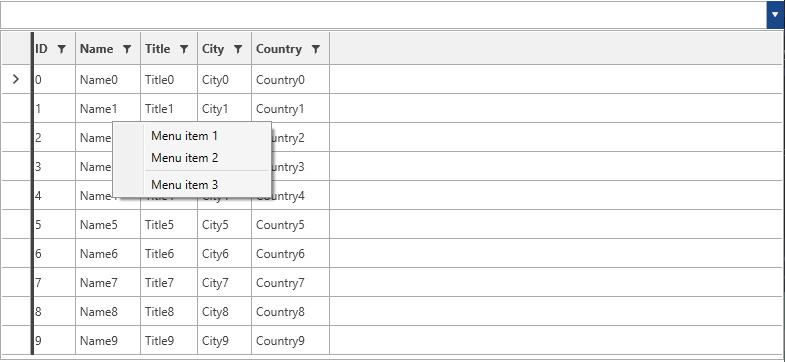
ContextMenu
The ContextMenu property of the GridViewItemsSourceProvider allows you to set a custom context menu.
This feature was introduced in R2 2019.
The example below shows how to set the ContextMenu property of GridVIewItemsSourceProvider:
Example 1: Set custom context menu
<Window.Resources>
    <local:MyModel x:Key="MyModel"/>
    <ContextMenu x:Key="contextMenu">
        <MenuItem Header="Menu item 1" />
        <MenuItem Header="Menu item 2" />
        <Separator />
        <MenuItem Header="Menu item 3" />
    </ContextMenu>
</Window.Resources>
<Grid DataContext="{StaticResource MyModel}">
    <telerik:RadMultiColumnComboBox VerticalAlignment="Top" OpenDropDownOnFocus="True">
        <telerik:RadMultiColumnComboBox.ItemsSourceProvider>
            <telerik:GridViewItemsSourceProvider ContextMenu="{StaticResource contextMenu}" ItemsSource="{Binding MyObjects}"/>
        </telerik:RadMultiColumnComboBox.ItemsSourceProvider>
    </telerik:RadMultiColumnComboBox>
</Grid>
Figure 1: Result of Example 1
Can User Search In Hidden Columns
Since R3 2020, the GridViewItemsSourceProvider exposes the CanUserSearchInHiddenColumns property through which you can control whether the search engine should search in hidden columns.
Exclude Columns From Search
With the R3 2020 version of our controls, you can exclude columns from the built-in search functionality. To exclude a column, you can set the IsSearchable property of the column to false.
Example 2: Exclude second column from search
<telerik:RadMultiColumnComboBox>
    <telerik:RadMultiColumnComboBox.ItemsSourceProvider>
        <telerik:GridViewItemsSourceProvider ItemsSource="{Binding MyObjects}" AutoGenerateColumns="false">
            <telerik:GridViewItemsSourceProvider.Columns>
                <telerik:GridViewDataColumn DataMemberBinding="{Binding ID}" />
                <telerik:GridViewDataColumn DataMemberBinding="{Binding FirstName}" IsSearchable="False"  />
                <telerik:GridViewDataColumn DataMemberBinding="{Binding LastName}" />
            </telerik:GridViewItemsSourceProvider.Columns>
        </telerik:GridViewItemsSourceProvider>
    </telerik:RadMultiColumnComboBox.ItemsSourceProvider>
</telerik:RadMultiColumnComboBox>