Scrolling
RadGridView has inbuilt default scrolling mechanism. There are also options provided to additionally configure it for a better user experience.
Scroll Modes
RadGridView provides two built-in scrolling modes, which allow you to manipulate the type of scrolling. This is controlled by the ScrollMode enumeration property which has the following entries:
- RealTime: Updates the content in view in real time as the user scrolls.
- Deferred: Keeps the content in view static until scrolling is complete.
By default the ScrollMode property is set to the RealTime mode.
There is also an option to implement programmatic scrolling. To learn more read the Scroll to a particular row or column article.
ScrollPositionIndicator
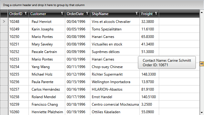
When RadGridView's ScrollMode is set to Deferred, a small tooltip appears when scrolling which previews the current scroll position. This is an element of type ScrollPositionIndicator and by default its content will be that of the first column's cells. You can define a custom DataTemplate for it by setting RadGridView's ScrollPositionIndicatorTemplate property in order to display content of your choice.
If you want to prevent the ScrollPositionIndicator from showing, you can set the ShowScrollPositionIndicator property of the RadGridView to False. This property is available since the 2018.3.1029 version. Setting the ShowScrollPositionIndicator property will only have an effect when the ScrollMode is set to Deferred.
Example 1: Defining ScrollPositionIndicatorTemplate
<telerik:RadGridView.ScrollPositionIndicatorTemplate>
    <DataTemplate>
        <StackPanel>
            <StackPanel Orientation="Horizontal">
                <TextBlock Text="Contact Name: " />
                <TextBlock Text="{Binding Customer.ContactName}" />
            </StackPanel>
            <StackPanel Orientation="Horizontal">
                <TextBlock Text="Order ID: " />
                <TextBlock Text="{Binding OrderID}" />
            </StackPanel>
        </StackPanel>
    </DataTemplate>
</telerik:RadGridView.ScrollPositionIndicatorTemplate>
Figure 1: Custom ScrollPositionIndicator

Additionally, you can style the element by creating the appropriate style and setting the TargetType property to telerik:ScrollPositionIndicator as demonstrated in Example 2:
Example 2: Styling ScrollPositionIndicator
<Style TargetType="telerik:ScrollPositionIndicator">
    <Setter Property="Foreground" Value="Yellow" />
    <Setter Property="Background" Value="Red" />
    <Setter Property="Padding" Value="30" />
</Style>
If you're using Implicit Styles, you should base your style on the ScrollPositionIndicatorStyle.
ScrollingSettingsBehavior
This feature enables customizing the scrolling behavior of RadGridView while dragging items. It uses the ScrollingSettingsBehavior class.
You can refer to the ScrollingSettingsBehavior API Reference
The following behavior settings are exposed for customization:
Enabling and disabling the Scrolling behavior
You can enable and disable the behavior by setting a value to the Boolean property IsEnabled.
Example 3: Setting the IsEnabled property
<telerik:RadGridView telerik:ScrollingSettingsBehavior.IsEnabled="False"/>
ScrollAreaPadding
By setting this property you can customize at which point the scrolling begins. Its default value is 0px. You need to set a value bigger than the default one in order to be able to use the ScrollStep and ScrollStepTime properties.
Example 4: Setting the ScrollAreaPadding property
<telerik:RadGridView telerik:ScrollingSettingsBehavior.ScrollAreaPadding="5 20"/>
ScrollStep
You can manipulate how many pixels will be skipped while scrolling by setting this property. It expects double values and its default one is 0.0
Example 5: Setting the ScrollStep property
<telerik:RadGridView telerik:ScrollingSettingsBehavior.ScrollStep="1.5"/>
ScrollStepTime
This property determines the time between each scroll step. It has no default value.
Example 6: Setting the ScrollStepTime property
<telerik:RadGridView telerik:ScrollingSettingsBehavior.ScrollStepTime="00:00:00.5"/>
Number of Scrolled Rows
RadGridView scrolls 3 rows with each scroll step of the mouse wheel. To change the number of rows that are scrolled, set the MouseWheelScrollDelta property.
Example 7: Setting MouseWheelScrollDelta
<telerik:RadGridView MouseWheelScrollDelta="20" />