Composition API Support
The RadChart provides separate rendering implementation for some of the chart's visual elements. By using it some of the visual elements are drawn using the Composition API.
This article will provide information about the visual elements drawn with the Composition API and how you can modify the drawing implementaion.
Visuals Rendered with Composition API
The following visual elements are drawn using the SpriteVisual element of the Composition API:
- Axis
- Ticks
- ScatterLineSeries
- BarSeries
- RangeBarSeries
- LineSeries
- StepLineSeries
- CandleStickSeries
- OhlcSeries
- Trend Line and Financial Indicator
By default, the visuals listed above will be drawn using the Composition API. If the visual elements have a custom Style or Template set - the Composition won't be used for the drawing functionality.
Customize Composition API Visuals
The visuals that are part of the Composition API are prepared by the ContainerVisualsFactory class. The class comes with a set of methods that creates ContainerVisuals objects that will be used for the rendering of the chart control.
To customize the rendering behavior (for example to change the Brush of the SpriteVisual), you can implement a custom ContainerVisualsFactory class and override its methods. The custom factory can be assigned to the ContainerVisualsFactory property of the chart.
The methods of the factory that could be overridden are:
CanDrawContainerVisual—Indicates whether the visual element can be drawn using the Composition API. If the method returns false the element won't be drawn as aSpriteVisualelement. Using that method the composition mechanism could easily be disabled and the elements to be drawn using theUIElementsprovided by the framework.CreateContainerVisual—It creates a newSpriteVisualinstance that will be used for the visualization of the elements. The method returnsContainerVisualtype of element and you could easily return any otherContainerVisualthat will be used for the drawing - currently, we suggest you to use theSpriteVisualas the onlyContainerVisualelement from the Composition API that provides aCompositionBrush.PrepareTickVisual—Prepares theSpriteVisualused for the visualization of the ticks of the Axis by setting itsSize,ColorandOffset.PrepareCartesianChartGridLineVisual—Prepares theSpriteVisualused for the visualization of the lines of the CartesianChartGrid by setting its Size, Color and Offset. You can also pass aDoubleCollectionto the method that represents the dash array for the lines that will be used when drawing theSpriteVisuals.PreparePointTemplateSeriesVisual—Used for setting theOffset,BrushandSizeof the series that are drawn with the Composition API.PrepareCartesianAxisLineVisual—Prepares theSpriteVisualthat will be visualized as an axis. The method also provides information about the AxisType that is currently drawn.PrepareLineRenderVisual—Prepares the Trend Lines and Financial Indicators by setting theirSize,OffsetandBrush.PrepareBarIndicatorVisual—Prepares theBarIndicatorBaseinstances by setting theirSize,OffsetandBrush.
The following example demonstrates how to implement a custom ContainerVisualsFactory that will change the Brush of the BarSeries of a RadCartesianChart and change the dash array of the CartesianChartGrid.
-
Create a custom class that inherits the default
ContainerVisualsFactory.Inheriting from ContainerVisualsFactory
public class CustomContainerVisualFactory : ContainerVisualsFactory { } -
Override the
CreateContainerVisualmethod which returns aContainerVisualinstance, used for the rendering of the chart control. TheCompositorparameter is used for the creation of theSpriteVisualelement and the type gives you information of the currently created element.Overriding the CreateContainerVisual method
public class CustomContainerVisualFactory : ContainerVisualsFactory { protected override ContainerVisual CreateContainerVisual(Compositor compositor, Type elementType) { var containerVisual = base.CreateContainerVisual(compositor, elementType) as SpriteVisual; if (containerVisual != null && elementType == typeof(BarSeries)) { containerVisual.Brush = compositor.CreateColorBrush(Color.FromArgb(0xFF, 0x93, 0xC8, 0x49)); } return containerVisual; } } -
Override the
PrepareCartesianChartGridLineVisualmethod in order to change the dash array for the lines used for the drawing of theCartesianChartGrid.Overriding the PrepareCartesianChartGridLineVisual method
public class CustomContainerVisualFactory : ContainerVisualsFactory { protected override ContainerVisual CreateContainerVisual(Compositor compositor, Type elementType) { var containerVisual = base.CreateContainerVisual(compositor, elementType) as SpriteVisual; if (containerVisual != null && elementType == typeof(BarSeries)) { containerVisual.Brush = compositor.CreateColorBrush(Color.FromArgb(0xFF, 0x93, 0xC8, 0x49)); } return containerVisual; } protected override ContainerVisual PrepareCartesianChartGridLineVisual(ContainerVisual containerVisual, RadRect layoutSlot, Orientation orientation, DoubleCollection dashArray) { return base.PrepareCartesianChartGridLineVisual(containerVisual, layoutSlot, orientation, new DoubleCollection() { 1, 0}); } } -
Set the
CustomContainerVisualFactoryinstance to theContainerVisualsFactoryproperty of theRadCartesianChart.Applying the custom ContainerVisualsFactory
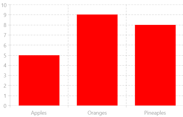
RadCartesianChart with a custom ContainerVisualsFactory<Grid xmlns:telerikChart="using:Telerik.UI.Xaml.Controls.Chart" xmlns:telerikCharting="using:Telerik.Charting"> <telerikChart:RadCartesianChart x:Name="barSeries" > <telerikChart:RadCartesianChart.ContainerVisualsFactory> <local:CustomContainerVisualFactory /> </telerikChart:RadCartesianChart.ContainerVisualsFactory> <telerikChart:RadCartesianChart.Grid> <telerikChart:CartesianChartGrid MajorGridLinesVisibility="XY" /> </telerikChart:RadCartesianChart.Grid> <telerikChart:RadCartesianChart.VerticalAxis> <telerikChart:LinearAxis/> </telerikChart:RadCartesianChart.VerticalAxis> <telerikChart:RadCartesianChart.HorizontalAxis> <telerikChart:CategoricalAxis/> </telerikChart:RadCartesianChart.HorizontalAxis> <telerikChart:BarSeries> <telerikChart:BarSeries.DataPoints> <telerikCharting:CategoricalDataPoint Category="Apples" Value="5" /> <telerikCharting:CategoricalDataPoint Category="Oranges" Value="9" /> <telerikCharting:CategoricalDataPoint Category="Pineaples" Value="8" /> </telerikChart:BarSeries.DataPoints> </telerikChart:BarSeries> </telerikChart:RadCartesianChart> </Grid>