(Android-only) .NET MAUI ToggleButton Ripple Effect
Apply a ripple effect to the ToggleButton, by using the following attached properties of the RadEffects class:
-
RippleColor(Color)—Specifies the color of the ripple effect. -
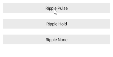
RippleMode(enum of typeTelerik.Maui.Theming.RippleMode)—Specifies the mode in which the ripple effect can be visualized. The options are:- (Default)
Pulse—The element produces a ripple effect when pressed. The ripple fades away even when held. -
Hold—The element produces a ripple effect when pressed and floods the element while held. -
None—The element does not render ripple effects.
- (Default)
The ripple effect is available on Android.

Customizing the Ripple Effect
The following example demonstrates how to customize the ripple effect of the ToggleButton by changing the RippleMode and RippleColor.
1. Define the buttons in XAML:
2. To customize the RippleColor when the ToggleButton is toggled and pressed, add the following code to the page's resources.
3. Add the telerik namespace:
This is the result on Android:
For a runnable example demonstrating the customization of the ToggleButton ripple effect, see the SDKBrowser Demo Application and go to ToggleButton > Features category.