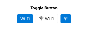
.NET MAUI ToggleButton Overview
The Telerik UI for .NET MAUI ToggleButton component represents a button that can be toggled between two states: toggled and untoggled. It allows end users to select or toggle an option or a state in an application's user interface.
The ToggleButton is commonly used in scenarios to capture and represent a binary choice, such as enabling or disabling a feature, activating or deactivating a setting, or toggling between two different modes or views.
The ToggleButton is part of Telerik UI for .NET MAUI, the most comprehensive UI suite for .NET MAUI! To try it out, sign up for a free 30-day trial and kickstart your cross-platform app development today.

Key Features of the .NET MAUI ToggleButton
- Toggled states—The ToggleButton delivers options for setting its state to toggled and untoggled, and provides an additional indeterminate state which indicates the control is neither toggled nor untoggled.
-
Setting three states—You can apply an indeterminate state through the UI by setting the
IsThreeStateproperty. -
Content and ContentTemplate—The ToggleButton allows you to define a
Content. In addition, there is an option for settingContentTemplate. - Text alignment—The ToggleButton enables you to control the horizontal and vertical positioning of the text inside the content.
-
Visual states—You can change the ToggleButton appearance for different visual states like,
Normal,Pressed,MouseOver(desktop-only),Toggled,Disabled, and more. - Exhaustive number of events—You can use the events exposed by the ToggleButton to execute various operations on user interaction such as click, press, release, and changing toggle state.
- Command—The ToggleButton provides a command, that executes when the button is clicked.
- Styling—You can apply different styling options to the button such as changing its background color, border color, border thickness and more.
- Ripple effect—You can apply a ripple effect on Android when pressing the ToggleButton.