New to Telerik UI for .NET MAUI? Start a free 30-day trial

.NET MAUI TimePicker Templates

In case the default templates of the TimePicker control do not suit your needs, you can define a custom template.

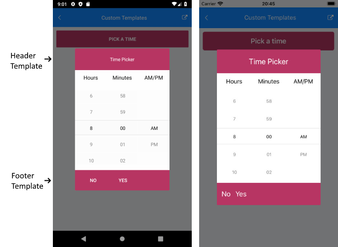
The available templates for customization are:

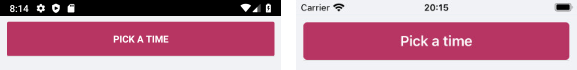
  • PlaceholderTemplate(ControlTemplate)—Defines the template visualized for the placeholder.
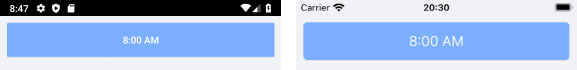
  • DisplayTemplate(ControlTemplate)—Defines the template visualized when the picked time is displayed.
  • HeaderTemplate(ControlTemplate)—Defines what will be displayed inside the dialog (popup) header.
  • FooterTemplate(ControlTemplate)—Defines what will be displayed inside the dialog (popup) footer.

The example below shows a sample TimePicker definition with the listed above template properties applied:

1. Define the TimePicker:

<telerik:RadTimePicker SpinnerFormat="H:mm"
                       PlaceholderTemplate="{StaticResource placeholderTemplate}"
                       DisplayTemplate="{StaticResource displayTemplate}"
                       AutomationId="timePicker">
    <telerik:RadTimePicker.PopupSettings>
        <telerik:PickerPopupSettings HeaderTemplate="{StaticResource headerTemplate}"
                                     FooterTemplate="{StaticResource footerTemplate}"/>
    </telerik:RadTimePicker.PopupSettings>
    <telerik:RadTimePicker.DropDownSettings>
        <telerik:PickerDropDownSettings FooterTemplate="{StaticResource footerTemplate}"/>
    </telerik:RadTimePicker.DropDownSettings>
</telerik:RadTimePicker>

2. Add the following namespace:

xmlns:telerik="http://schemas.telerik.com/2022/xaml/maui"

For the example, the template definitions are added to the page resources as follows.

Placeholder Template

<ControlTemplate x:Key="placeholderTemplate">
    <Button Text="Pick a time" 
            FontAttributes="Bold" 
            TextColor="White"
            BackgroundColor="#B73562" 
            HeightRequest="50" Command="{TemplateBinding ToggleCommand}" />
</ControlTemplate>

TimePicker Placeholder Template

Display Template

<ControlTemplate x:Key="displayTemplate">
    <Button Text="{TemplateBinding DisplayString}" 
            TextColor="White" 
            BackgroundColor="#7BAEFF"
            HeightRequest="50"
            Command="{TemplateBinding ToggleCommand}" />
</ControlTemplate>

TimePicker Display Template

Header Template

<ControlTemplate x:Key="headerTemplate">
    <Grid>
        <Label Text="Time Picker"
               Padding="20"
               TextColor="White"
               VerticalTextAlignment="Center"
               HorizontalTextAlignment="Center"
               BackgroundColor="#B73562"/>
    </Grid>
</ControlTemplate>
<ControlTemplate x:Key="footerTemplate">
    <StackLayout Orientation="Horizontal" Spacing="0" HorizontalOptions="FillAndExpand" BackgroundColor="#B73562">
        <telerik:RadButton Text="No"
                           WidthRequest="75"
                           TextColor="White"
                           BackgroundColor="Transparent"
                           Command="{TemplateBinding CancelCommand}" />
        <telerik:RadButton Text="Yes"
                           WidthRequest="75"
                           TextColor="White"
                           BackgroundColor="Transparent"
                           Command="{TemplateBinding AcceptCommand}" />
    </StackLayout>
</ControlTemplate>

TimePicker Footer Template

See Also

In this article