.NET MAUI TimePicker Modes
The TimePicker for .NET MAUI provides a popup and a drop-down picker mode for picking a value from the selector.
Picker Mode
Use the PickerMode (enum of type Telerik.Maui.Controls.PickerMode) property to specify which UI to open for selecting a value from the picker selector. The options are:
-
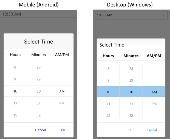
Popup—Shows the UI for picking a time inside a popup. It's the default value for mobile (Android and iOS); -
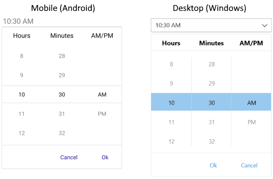
DropDown—Opens the UI for picking a time inside a drop-down. It's the default value for Desktop (Windows, macOS);
Here is a sample of PickerMode set to Popup:
<telerik:RadTimePicker Time="10:30:00"
                            PickerMode="Popup" />
Check below the result on mobile and desktop:

Quick example of PickerMode set to DropDown:
<telerik:RadTimePicker Time="10:30:00"
                            PickerMode="DropDown" />
Check the result of DropDown mode on mobile and desktop:

Picker Toggle State
You can control whether the picker popup or drop-down is opened or closed by using the IsOpen (bool) property.
Toggle Button
In addition, TimePicker exposes IsToggleButtonVisible property which when set to True renders an "arrow" button for opening the UI for picking a time. By default, IsToggleButtonVisible is enabled for Desktop and is disabled for mobile platforms. You can explicitly apply it in both cases:
<telerik:RadTimePicker Time="10:30:00"
                            PickerMode="DropDown"
                            IsToggleButtonVisible="True" />