.NET MAUI TimePicker Visual Structure
This article describes all visual elements that are used in the TimePicker for .NET MAUI.
Before and After Time Value Selection

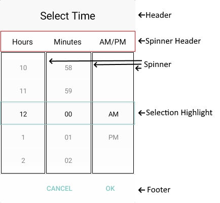
Popup Visual Structure

Legend
-
Placeholder—The text visualized before picking a time value. You can customize the placeholder through thePlaceholderTemplateproperty. -
DisplayStringFormat—The text visualized after a time value is picked. -
Header—The text displayed in the popup header. You can set it to a direct text input through theHeaderLabelTextproperty or customize the popup header by using theHeaderTemplateproperty. -
SpinnerHeader—The text visualized for the spinner header depending on the values that are picked. For example, if theSpinnerFormatStringisgandAreSpinnerHeadersVisible="True", the text visualized for the spinner header will be Hour Minutes AM/PM. -
Spinner—Displays items in a list. -
SelectionHighlight—Highlights the currently selected time when the popup is open. -
Footer—The footer of the popup. By default, it contains the OK and Cancel buttons. It can be customized through theFooterTemplateproperty.