Orientation
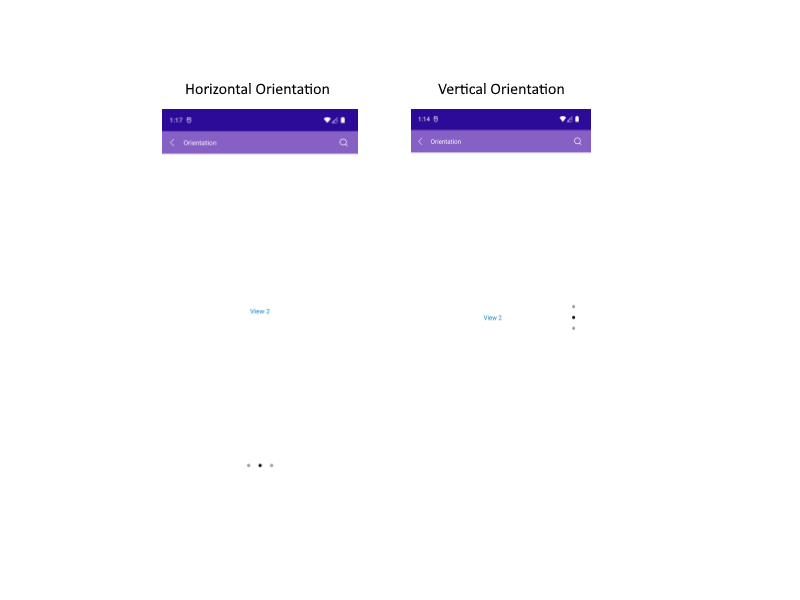
The SlideView control exposes a Orientation property(enum of type Telerik.Maui.Orientation) which can change the orientation of the slides and the indicators. The property has two options:
HorizontalVertical
Example
<telerik:RadSlideView x:Name="slideView"
                      ItemsSource="{Binding Views}"
                      Orientation="Vertical">
    <telerik:RadSlideView.ItemTemplate>
        <DataTemplate>
            <Label Text="{Binding Content}"
                   TextColor="#007ACC"
                   HorizontalTextAlignment="Center"
                   VerticalOptions="CenterAndExpand"/>
        </DataTemplate>
    </telerik:RadSlideView.ItemTemplate>
</telerik:RadSlideView>
Add the ViewModel:
public class ViewModel
{
    public ObservableCollection<MyItem> Views { get; set; }

    public ViewModel()
    {
        this.Views = new ObservableCollection<MyItem>()
        {
            new MyItem() { Content = "View 1" },
            new MyItem() { Content = "View 2" },
            new MyItem() { Content = "View 3" },
        };
    }
}
See the result in the images below:
For a runnable example with the SlideView Orientation scenario, see the SDKBrowser Demo Application and go to SlideView > Features.