.NET MAUI Calendar Templates
If the default look how the days, months, years and decades are presented do not match your use case, you can define custom templates. The available templates for customizing are:
-
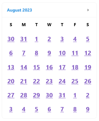
DayTemplate
(DataTemplate
)—Specifies the content templates for the days in the month view of the Calendar. -
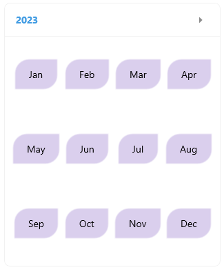
MonthTemplate
(DataTemplate
)—Specifies the content templates for the months in the year view of the Calendar. -
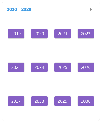
YearTemplate
(DataTemplate
)—Specifies the content templates for the years in the decade view of the Calendar. -
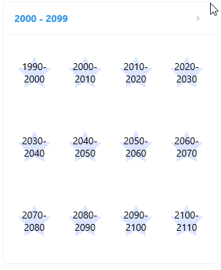
DecadeTemplate
(DataTemplate
)—Specifies the content templates for the decades in the century view of the Calendar.
Day Template
<telerik:RadCalendar DisplayMode="Month" DayTemplate="{StaticResource DayLabelTemplate}" />
Here is a sample day template definition for customizing the days in the MonthView
.
<ContentView.Resources>
<DataTemplate x:Key="DayLabelTemplate">
<telerik:RadBorder>
<Label TextColor="#8660C5"
TextDecorations="Underline"
Text="{Binding Text}"
HorizontalTextAlignment="Center"
VerticalTextAlignment="Center"
FontSize="20"
FontAttributes="Bold"/>
</telerik:RadBorder>
</DataTemplate>
</ContentView.Resources>
Month Template
<telerik:RadCalendar DisplayMode="Year" MonthTemplate="{StaticResource MonthLabelTemplate}" />
Here is a sample month template definition for customizing the months in the YearView
.
<ContentView.Resources>
<DataTemplate x:Key="MonthLabelTemplate">
<Grid>
<Border StrokeShape="RoundRectangle 20,0,0,20"
Background="#4D8660C5"
HorizontalOptions="Center"
VerticalOptions="Center"
Padding="16, 8">
<Label Text="{Binding Text}"
Padding="{OnPlatform Default=0, WinUI=4}" />
</Border>
</Grid>
</DataTemplate>
</ContentView.Resources>
Year Template
<telerik:RadCalendar DisplayMode="Decade" YearTemplate="{StaticResource YearLabelTemplate}" />
Here is a sample year template definition for customizing the years in the DecadeView
.
<ContentView.Resources>
<DataTemplate x:Key="YearLabelTemplate">
<Grid>
<Button BackgroundColor="#8660C5"
TextColor="White"
Text="{Binding Text}"
HorizontalOptions="Center"
VerticalOptions="Center" />
</Grid>
</DataTemplate>
</ContentView.Resources>
Decade Template
<telerik:RadCalendar DisplayMode="Century" DecadeTemplate="{StaticResource DecadeLabelTemplate}" />
Here is a sample decade template definition for customizing the decades in the CenturyView
.
<ContentView.Resources>
<DataTemplate x:Key="DecadeLabelTemplate">
<Grid>
<telerik:RadPath Fill="#4D8AAAFF"
Geometry="{x:Static telerik:RadGeometry.Star}"
WidthRequest="48"
HeightRequest="48" />
<Label Text="{Binding Text}"
HorizontalTextAlignment="Center"
VerticalTextAlignment="Center" />
</Grid>
</DataTemplate>
</ContentView.Resources>
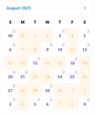
Template Selectors
You can apply a template selector the calendar templates as they are of type DataTemplate
.
The following example demonstrates a DayTemplate
that uses a Template Selector.
<telerik:RadCalendar DisplayMode="Month" DayTemplate="{StaticResource SpecialDayTemplateSelector}" />
And the template selectors definition
<ContentView.Resources>
<local:SpecialDayTemplateSelector x:Key="SpecialDayTemplateSelector">
<local:SpecialDayTemplateSelector.SpecialDayTemplate>
<DataTemplate>
<Grid>
<Label FontFamily="TelerikFontExamples"
Text=""
FontSize="12"
TextColor="#8660C5"
HorizontalOptions="End"
VerticalOptions="Start"
Margin="0, 2, 2, 0" />
<Label Text="{Binding Text}"
TextColor="#8660C5"
FontAttributes="Bold"
HorizontalTextAlignment="Center"
VerticalTextAlignment="Center" />
<telerik:RadBorder IsVisible="{Binding IsSelected}"
BorderThickness="2"
BorderColor="#8660C5" />
</Grid>
</DataTemplate>
</local:SpecialDayTemplateSelector.SpecialDayTemplate>
<local:SpecialDayTemplateSelector.NormalDayTemplate>
<DataTemplate>
<Grid>
<Label Text="{Binding Text}"
TextColor="#FFAC3E"
BackgroundColor="#19FFAC3E"
HorizontalTextAlignment="Center"
VerticalTextAlignment="Center" />
<telerik:RadBorder IsVisible="{Binding IsSelected}"
BorderThickness="2"
BorderColor="#FFAC3E" />
</Grid>
</DataTemplate>
</local:SpecialDayTemplateSelector.NormalDayTemplate>
</local:SpecialDayTemplateSelector>
</ContentView.Resources>
And the Template Selector logic:
public class SpecialDayTemplateSelector : DataTemplateSelector
{
public DataTemplate NormalDayTemplate { get; set; }
public DataTemplate SpecialDayTemplate { get; set; }
protected override DataTemplate OnSelectTemplate(object item, BindableObject container)
{
var node = item as CalendarNode;
var date = node.Date;
if (date == null)
{
return null;
}
if (date.Value.Day % 3 == 0 || date.Value.Day % 5 == 0)
{
return this.SpecialDayTemplate;
}
return this.NormalDayTemplate;
}
}
For the Calendar Templates examples refer to the SDKBrowser Demo Application Calendar -> Templates category.