.NET MAUI Calendar Header Styling
The .NET MAUI Calendar component comes with built-in styling options that allow you to customize the appearance of its header.
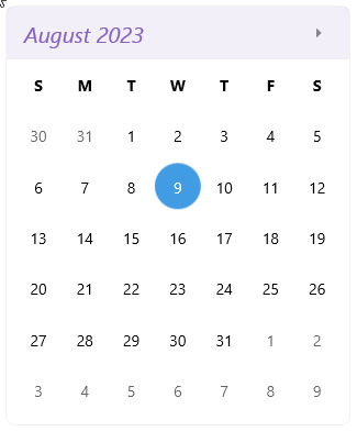
Styling the Header Border and Label
To style the border around the Calendar header, use the
HeaderBorderStyle(of typeStylewith target typetelerik:RadBorder).To style the label in the header, use the
HeaderLabelStyle(of typeStylewith target typeLabel).
The following example demonstrates how to apply custom styles to the header label and the border around the header:
1. Define the Calendar:
2. Add the HeaderBorderStyle style:
3. Add the HeaderLabelStyle style:
For a runnable example that demonstrates how to style the Calendar header buttons, see the SDKBrowser Demo Application and go to Calendar > Styling.
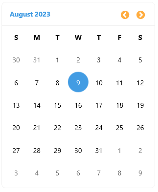
Styling the Navigation Buttons
To style the navigation buttons in the header of the Calendar, use the following properties:
-
NavigateToPreviousViewButtonStyle(of typeStylewith target typeButton)—Specifies the style for the button in the header that navigates to the previous view. -
NavigateToNextViewButtonStyle(of typeStylewith target typeButton)—Specifies the style for the button in the header that navigates to the next view.
The following example demonstrates how to apply custom styles to the navigation buttons:
1. Define the Calendar:
2. Add the NavigateToPreviousViewButtonStyle style:
3. Add the NavigateToNextViewButtonStyle style:
For a runnable example that demonstrates how to style the Calendar header buttons, see the SDKBrowser Demo Application and go to Calendar > Styling.