.NET MAUI Calendar Display Modes
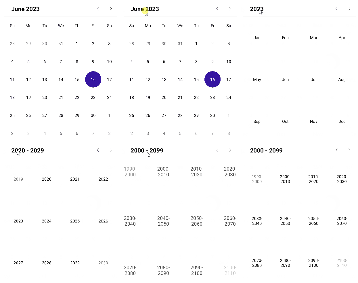
The Telerik .NET MAUI Calendar is a control that allows the user to select a date from a standard view that can represent various time spans. The Calendar views define what is visible in the Calendar, for example, month, year, decade, or century.
Setting the Display Mode Programmatically
The DisplayMode property (enum of type Telerik.Maui.Controls.Calendar.CalendarDisplayMode) defines the current view of the RadCalendar control. The available display modes are:
-
Month(Default) YearDecadeCentury
Changing the Display Mode through the UI
The user can effortlessly change the DisplayMode through the UI by tapping (for mobile) or clicking (for desktop) the header text.

Setting Min and Max Display Mode
You can define a range of display modes that will be available to the user through the following properties:
-
MinDisplayMode(enum of typeTelerik.Maui.Controls.Calendar.CalendarDisplayMode)—Specifies the minimum display mode of the Calendar. The available options areMonth,Year,Decade, andCentury. WhenMinDisplayModeisYear, users can select months from this year. -
MaxDisplayMode(enum of typeTelerik.Maui.Controls.Calendar.CalendarDisplayMode)—Specifies the maximum display mode of the Calendar. The available options areMonth,Year,Decade, andCentury.
Month View
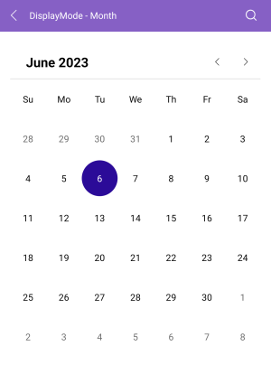
The month view represents all days in a single month.

Year View
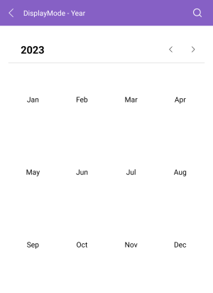
The year view represents all months in a year.

Decade View
The decade view represents all years in a decade.

Century View
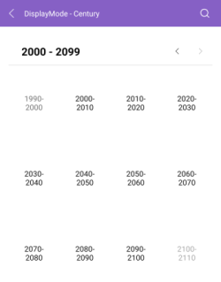
The century view represents all decades in a century.

For all examples with the display modes of the Calendar, check the SDKBrowser Demo Application and go to Calendar > Display Modes category.