Using Variable Modes
If your application needs multiple color modes or metrics, you must use different values for the same variables. Utilizing diverse variable modes allows you to address the needs of users with different preferences, for example, dark themes or larger fonts.
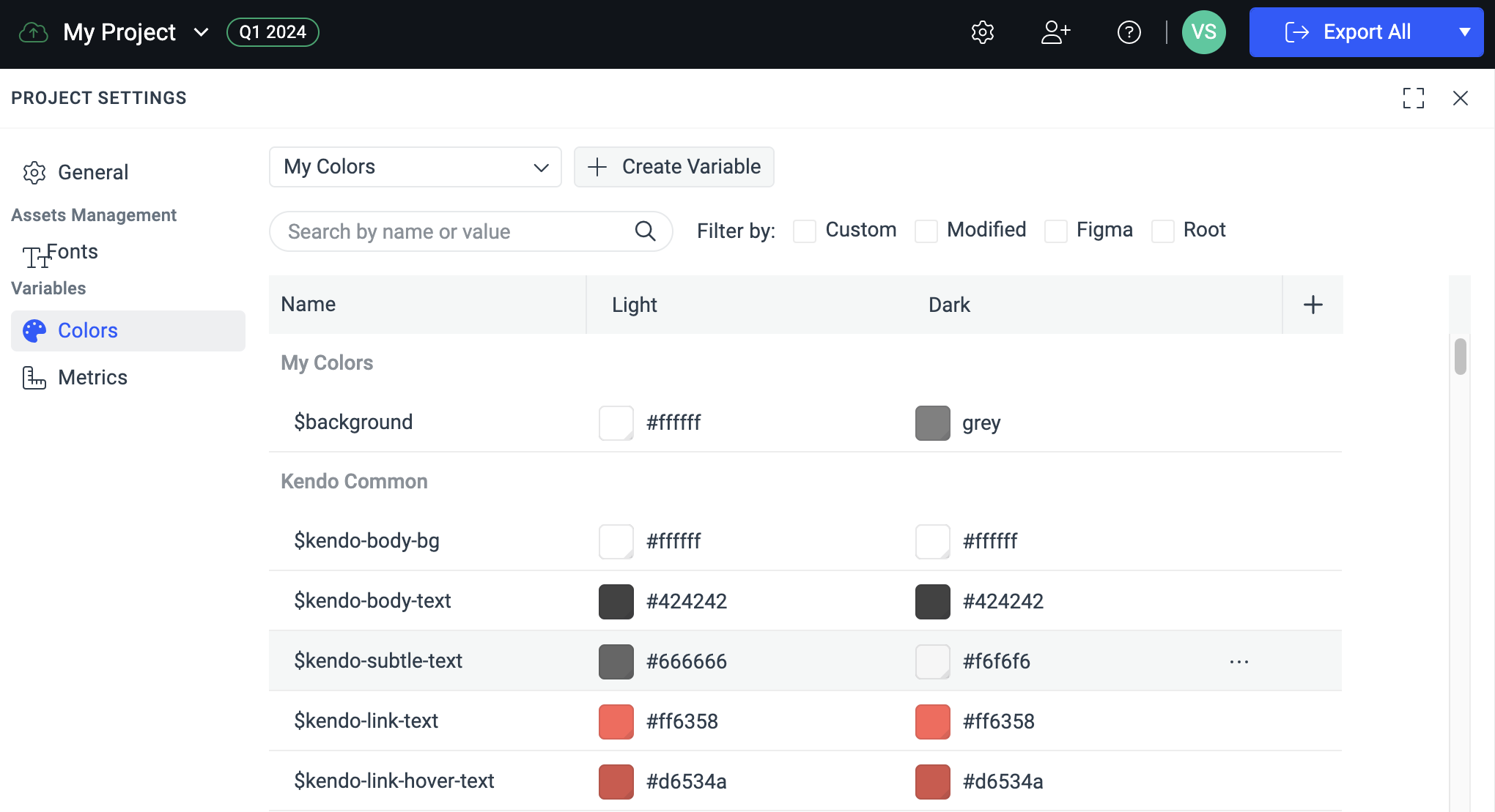
The following image shows a ThemeBuilder project with two variable modes (Light and Dark) and the variable values for each mode.
Creating Variable Modes
You can create modes for two types of variables:
- Color—They allow you to set alternative variable values for colors or palettes, for example, for the
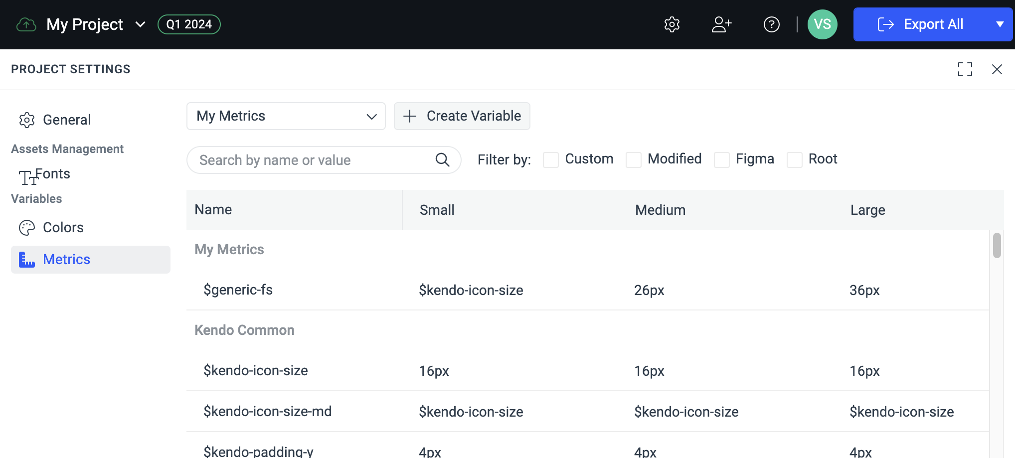
$kendo-color-primaryvariable. By adding modes for the color variables, you can create theme variations like Light, Dark, High Contrast, and so on. - Metric—They allow you to set alternative variable values for the metrics, for example, for the
$kendo-border-radiusvariable. By adding modes for the metric variables, you can create size variations for the UI components like Small, Medium, Large, and so on.
To create new variable modes in your ThemeBuilder project:
- In the toolbar, click the Project Settings button to open the settings dialog.
- In the Variables section, select either Colors or Metrics.
- In the Name row, click the + to add a new variable mode.
Applying Variable Modes
When you create the first variable mode in your project, it will be applied to all variables from the corresponding type (metric or color).
To change the applied variable mode in your ThemeBuilder project:
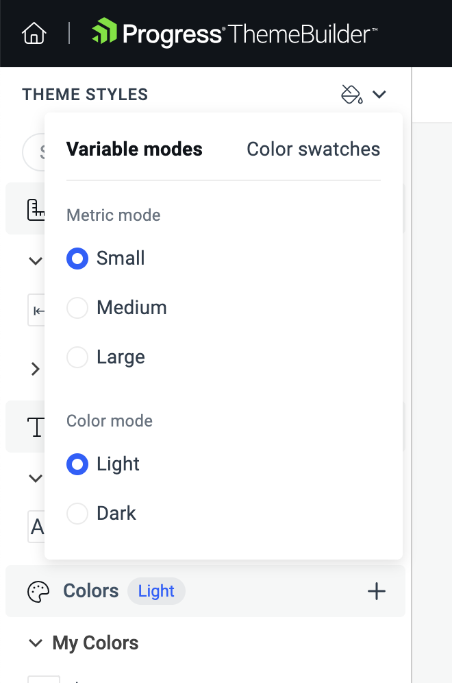
- Go to the THEME STYLES pane and select the DropDown button to access the available variable modes.
-
Select the desired metric and color mode.
Creating and Editing Variables when Using Modes
You can create new variables and change the variable values for each mode that you create in two ways:
Using the Project Settings
To create variables that have multiple modes:
- In the toolbar, click the Project Settings button to open the settings dialog.
- In the Variables section, select either Colors or Metrics.
- In the ComboBox, select a category for the new variable.
-
Select Create Variable.
Creating a color variable in the Project Settings dialog automatically applies a
solidcolor. To create a variable with agradientcolor type, use the THEME STYLES pane.
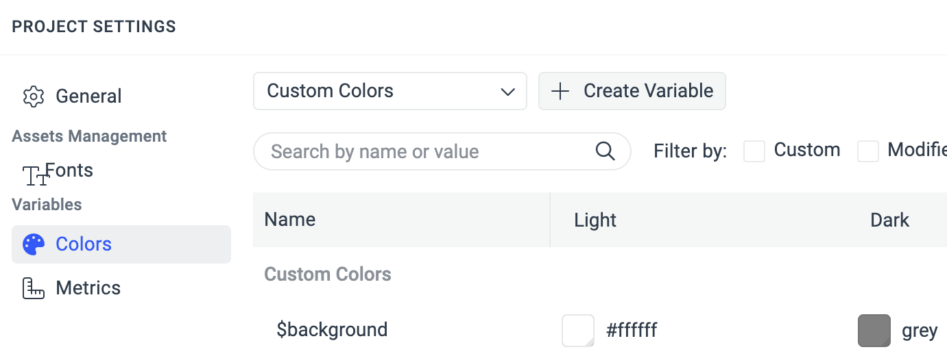
In the Project Settings dialog, you can also:
Delete a variable that you created. You cannot delete built-in theme variables, for example,
$kendo-color-primary.-
Edit the values for all variable modes in a single step.
-
Edit the properties of the variable: change its category, name, and description.
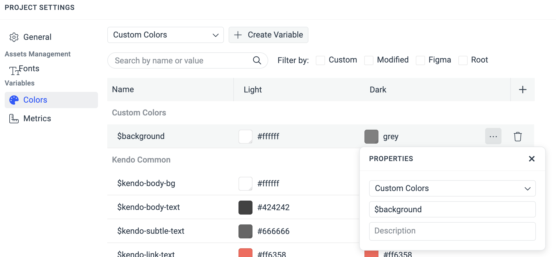
-
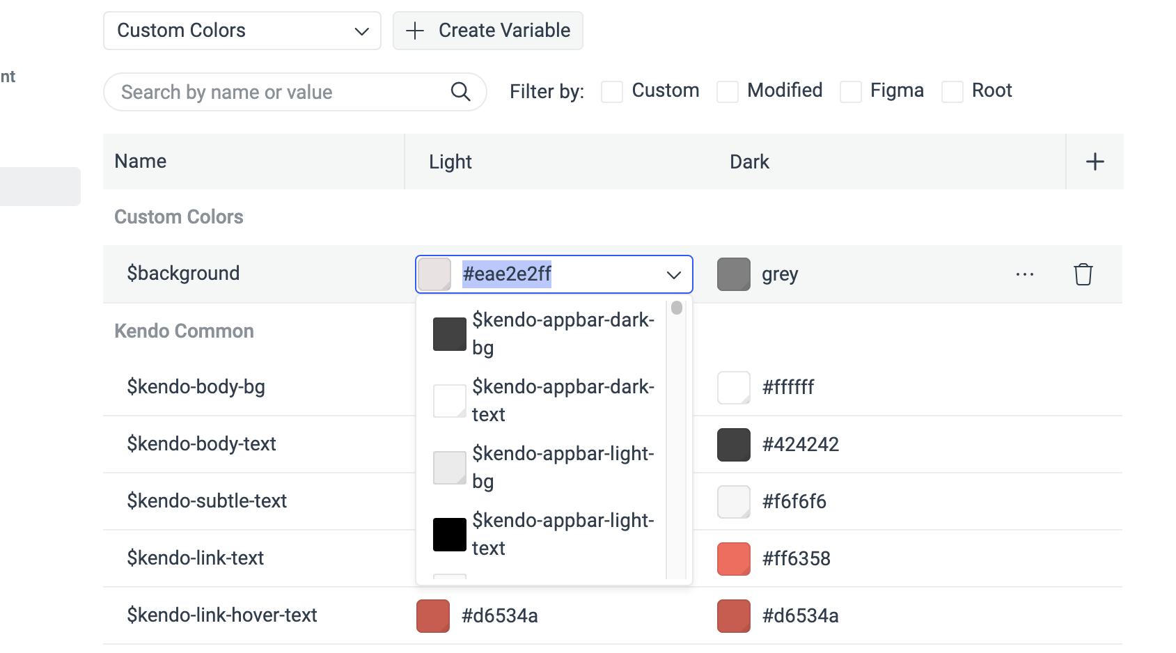
Edit the value of a color variable by using the ComboBox to select another variable or enter a value.
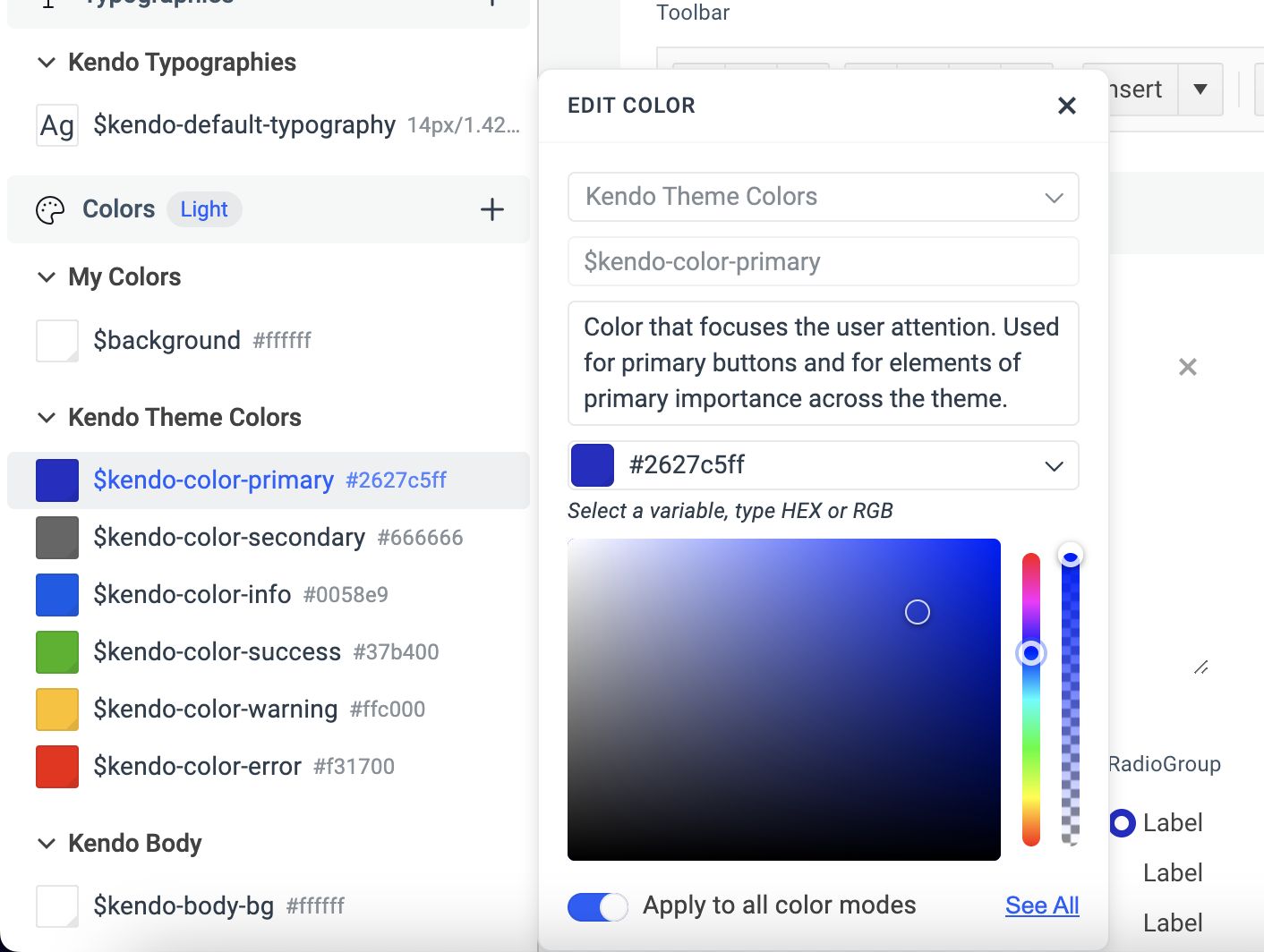
Using the THEME STYLES pane
To edit a variable value from the THEME STYLES pane:
- Go to the THEME STYLES pane and find the variable that you need to edit.
-
Apply the desired changes in the EDIT dialog.
To apply the changes to all modes, activate the Apply to all color modes switch.
Exporting Styles When Using Modes
When you export styles from a project that uses variable modes, only the variables for the currently applied mode will be exported.
For example, if you define two color modes: Light and Dark. Then, for the $kendo-color-primary value, you set white and black for the color modes respectively:
- When you apply the Light mode, the exported SCSS/CSS output will have the value
whitefor the$kendo-color-primaryvariable. - When you apply Dark mode, the exported SCSS/CSS output will have the value
blackfor the$kendo-color-primaryvariable.
To use both the Light and Dark component styles in your application, and to change them dynamically:
- Export both modes.
- Copy the files inside the
cssfolders and paste them in your application. - Refer to them dynamically based on your workflow:
- To apply the Light mode, load the exported light theme CSS file.
- To apply the Dark mode, load the exported dark theme CSS file.
Since the ThemeBuilder styles for each mode are intended to be loaded dynamically, using the ThemeBuilder SCSS output as an NPM package is not feasible. This is because you need to know the path to the source CSS files to load them dynamically. You can either compile the SCSS output before using it or use the CSS output instead. The CSS output is automatically compiled from the SCSS by ThemeBuilder during the export.