ChartView for Xamarin.Android: RangeBarSeries
RadCartesianChartView visualizes each data point from the RangeBarSeries as a rectangle. These rectangles (or bars) can be displayed either horizontally, or vertically, depending on whether the CategoricalAxis is the vertical axis or the horizontal. When the horizontal axis is categorical, the rectangles are displayed vertically. This means that they have equal width while their height represents the difference between the numerical values of each of the data points. The low value is the rectangle's start point, while the high value is the end point. On the other hand, when the vertical axis is categorical, the rectangles have equal height, while their width represents the difference between the values of the data point. The RangeBarSeries extend RangeSeriesBase and are also require one CategoricalAxis and one LinearAxis.
Example
You can read from the Getting Started page how to define the MonthResult type and declare the initData() method.
After you create the method for initialization of sample data, you can create a RadCartesianChartView with RangeBarSeries by adding the following code to the onCreate() method of your Activity. For the purposes of the example, we are going to use the Result property of our data object for both low value and high value. In order to actually have different values so that bars that are visible, we will multiply the original value by a constant and the product will be our high value.
InitData();

RadCartesianChartView chartView = new RadCartesianChartView(this);

RangeBarSeries rangeBarSeries = new RangeBarSeries();
rangeBarSeries.CategoryBinding = new MonthResultDataBinding ("Month");
rangeBarSeries.LowBinding = new MonthResultDataBinding ("Result");
rangeBarSeries.HighBinding = new MonthResultHighBinding ("Result");
rangeBarSeries.Data = (Java.Lang.IIterable)this.monthResults;
chartView.Series.Add(rangeBarSeries);

CategoricalAxis horizontalAxis = new CategoricalAxis();
chartView.HorizontalAxis = horizontalAxis;

LinearAxis verticalAxis = new LinearAxis();
chartView.VerticalAxis = verticalAxis;

ViewGroup rootView = (ViewGroup)FindViewById(Resource.Id.container);
rootView.AddView(chartView);

...

// Usually RangeBarSeries will be used with data, where each data item contains
// 2 values - one low and one high. However, since in this example we are using
// data items which have only one value, in order to display range bars, we can
// create another binding which will retrieve a value which is higher than the
// original.
class MonthResultHighBinding : MonthResultDataBinding {
    public MonthResultHighBinding(string propertyName)
        :base(propertyName) {
    }
    public override Java.Lang.Object GetValue (Java.Lang.Object p0)
    {
        return (double)base.GetValue (p0) * 4;
    }
}
This example assumes that your root container has id
container
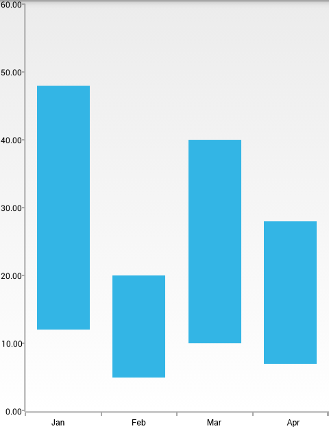
Here's the result:

Properties and customization
Rounded edges
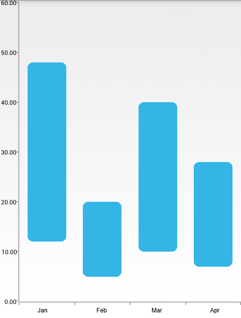
The bars that are used to represent the data points in RangeBarSeries can have their corners rounded. This can be achieved by using the AreBarsRounded property. When the value that is set is true, the corners are rounded. The rounding radius can be checked and modified by using the RoundBarsRadius property. If you try to set a negative value, an IllegalArgumentException will be thrown.
Here's how the RangeBarSeries look when their round bar radius is set to 10:
rangeBarSeries.AreBarsRounded = true;
rangeBarSeries.RoundBarsRadius = 10;
And here's the result:

Customization
Similarly to BarSeries, RangeBarSeries provide the following way to change their style:
- StrokeColor: changes the color used to draw lines around the bars.
- StrokeWidth: changes the width of the lines around the bars.
- FillColor: changes the color used to fill the bar shapes.
You can also customize the appearance of RangeBarSeries by using Palettes.