ChartView for Xamarin.Android: PieSeries
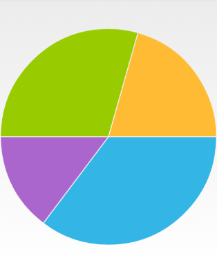
RadPieChartView visualizes the PieSeries in the shape of a pie. Each data item is visually represented by a pie slice. The ratio between the space consumed by each slice and the space consumed by the whole chart is the same as the ratio between the value of the data point that it represents and the total value of all data points in the series.
Example
You can read from the Getting Started page how to define the MonthResult type and declare the initData() method.
After you create the method for initialization of sample data, you can create a RadPieChartView with PieSeries by adding the following code to the onCreate() method of your Activity.
InitData();

RadPieChartView chartView = new RadPieChartView(this);

PieSeries pieSeries = new PieSeries();

pieSeries.ValueBinding = new MonthResultDataBinding ("Result");
// The name binding is used in the legend to show what the given pie slice value means.
pieSeries.NameBinding = new MonthResultDataBinding ("Name");
pieSeries.Data = (Java.Lang.IIterable)this.monthResults;
chartView.Series.Add(pieSeries);

ViewGroup rootView = (ViewGroup)FindViewById(Resource.Id.container);
rootView.AddView(chartView);
Here's the result:

Properties and customization
Radius Factor
Before the RadPieChartView instance is drawn, its radius needs to be calculated. By default the radius is set to value so that the whole chart will fill the whole available space. Then the radius factor is applied. The default value for the radius factor is 1.0. This means that the radius will remain to a value significant to fill the entire space that is available for RadPieChartView. You can use the RadiusFactor property in order to change it. For example, here's how to modify the radius factor, so that the pie consumes only half of the available space:
pieSeries.RadiusFactor = 0.5;
Angle Range
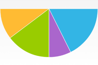
The default value of the angle range used to visualize the data from PieSeries is the range [0, 360]. If you want to change this, you can use the AngleRange property and specify a new range. For example, here's how you can set a new range so that the data is presented in a semicircle:
pieSeries.AngleRange = new AngleRange(0,180);
And this is the result:

Styles
The default colors used for PieSeries come from the default palette, you can change the palette as described in this article or use the styles as demonstrated here
Slice Styles
The SliceStyle class allow you to create a set of stroke and fill colors which you can easily apply to the slices in a pie chart. Here's one simple SliceStyle:
SliceStyle style1 = new SliceStyle();
style1.FillColor = Color.Argb(255, 51, 181, 229);
style1.StrokeColor = Color.Argb(255, 0, 130, 173);
style1.StrokeWidth = 2;
style1.ArcColor = Color.White;
style1.ArcWidth = 2;
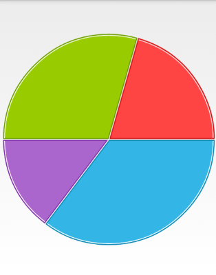
As you can see, you can modify the color of the fill of the segments, their stroke color and width and additionally you can add an arc that is drawn between the stroke and the fill. Please note, that the arc is drawn not around the whole segment but only on its arc. Once you have create a few styles, you can add them in a List<SliceStyle> and set it to your PieSeries instance:
List<SliceStyle> styles = new List<SliceStyle>();
styles.Add(style1);
pieSeries.SliceStyles = styles;
Here's the result when we add a collection of four styles similar to the one in the example:

Slice Offset
As you may have noticed, there is a thin line between the segments. You can change its width through the SliceOffset property. If you set it to 0, the line will be removed:
pieSeries.SliceOffset = 0;