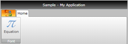
Ribbon Button
The RadRibbonButton represents the basic button in the set of the RadRibbonView buttons. It inherits the RadButton control and extends its functionality in order to provide a better interaction with the RadRibbonView control.
To learn more about the RadButton control read its documentation.
Here is a sample definition of a RadRibbonButton:
<telerik:RadRibbonButton CollapseToMedium="Never"
                         CollapseToSmall="WhenGroupIsMedium"
                         IsAutoSize="True"
                         LargeImage="Icons/32/Equation.png"
                         Size="Large"
                         SmallImage="Icons/16/Equation.png"
                         Text="Equation" />
This button has its initial size set to Large and its text label set to "Equation". As the IsAutoSize property is set to True, the button will change its size depending on the RadRibbonGroup's size. The button will also never collapse to its Medium size and will collapse to its Small size when the RadRibbonGroup collapses to Medium.
